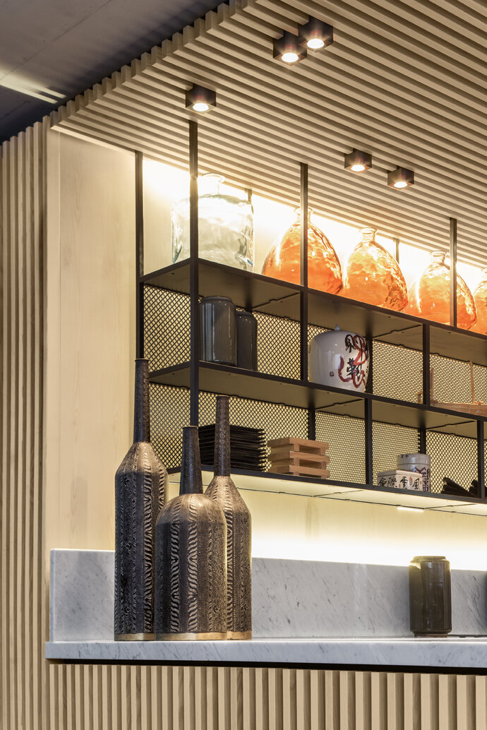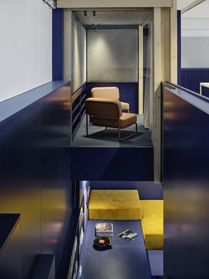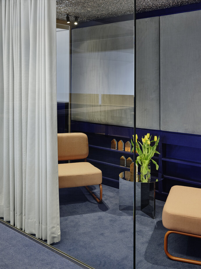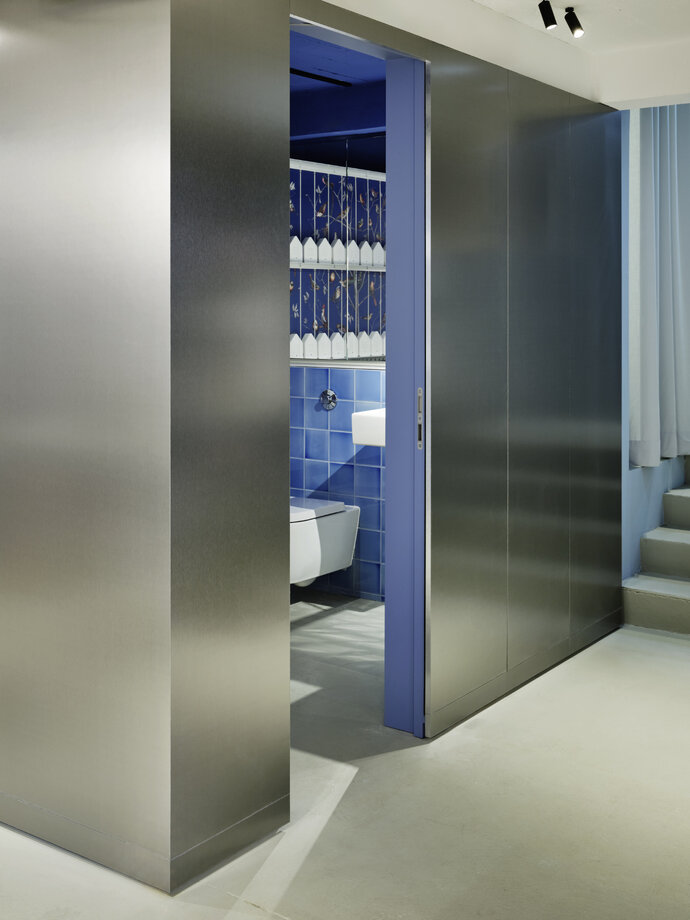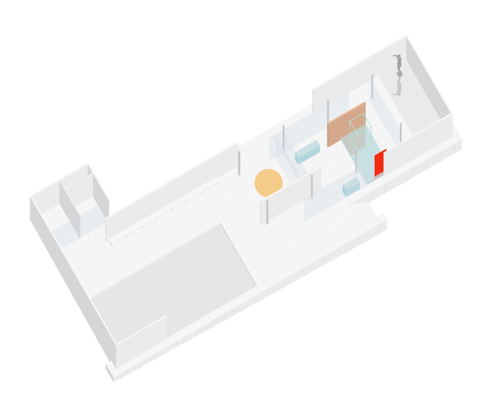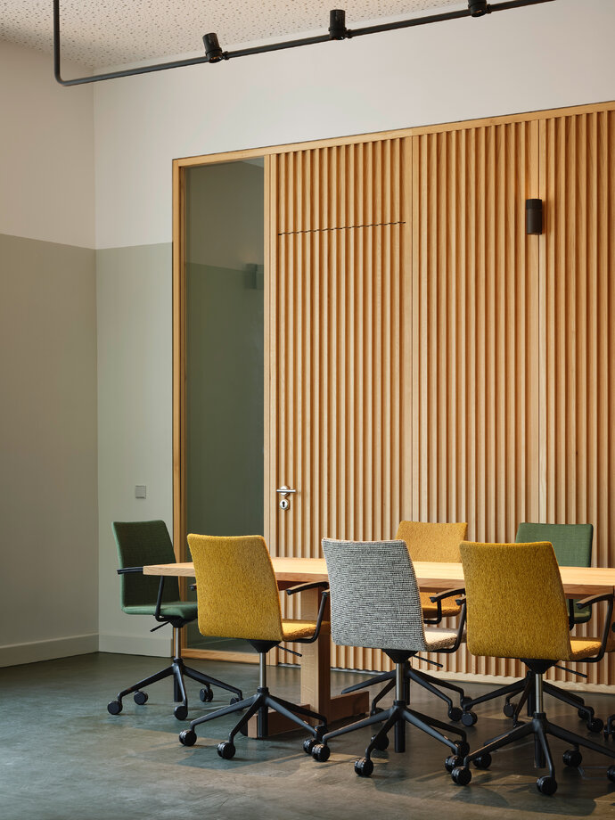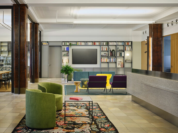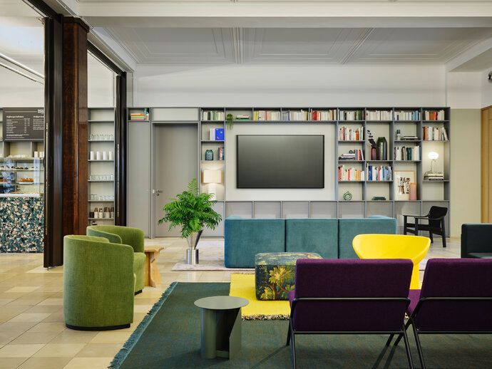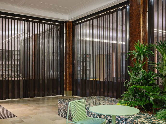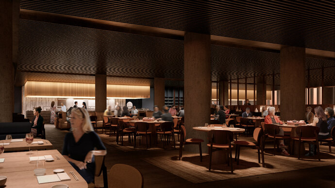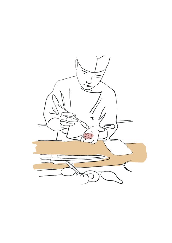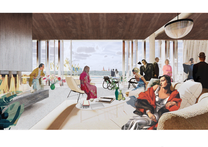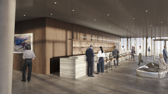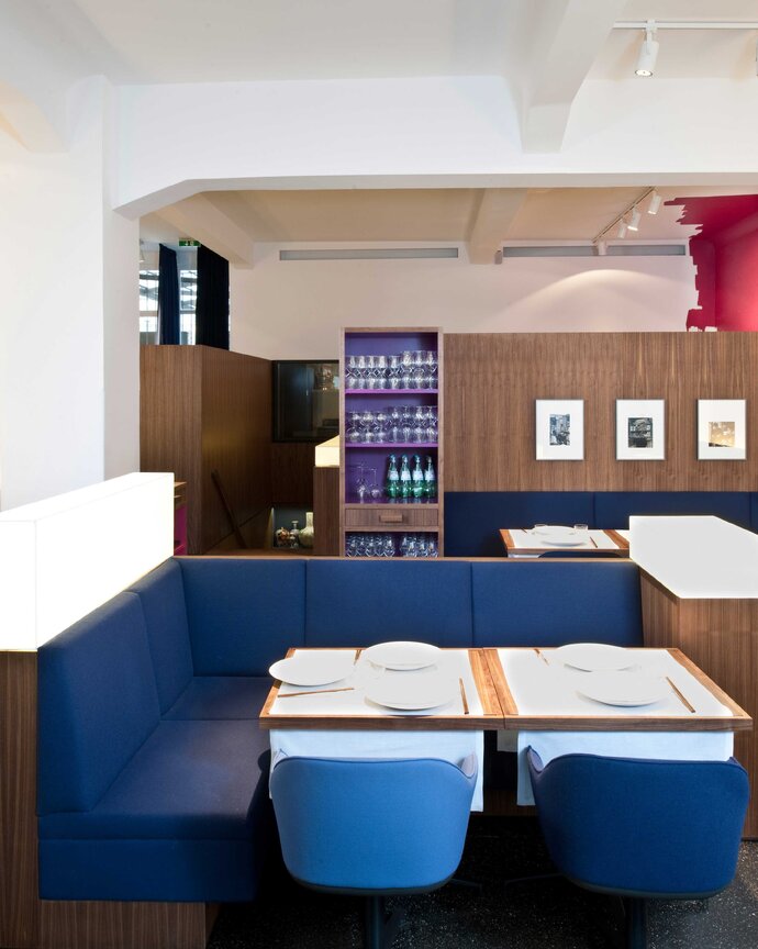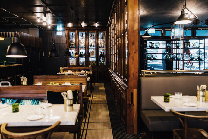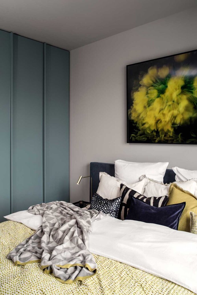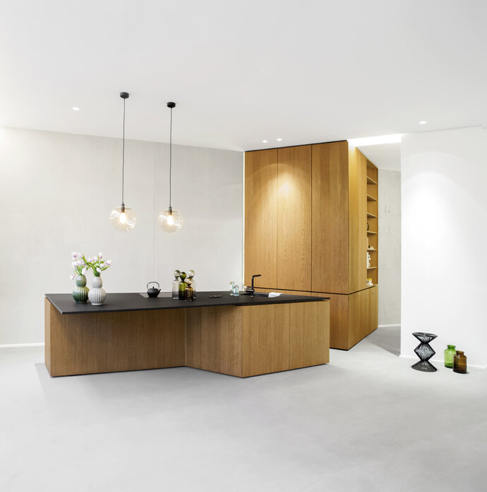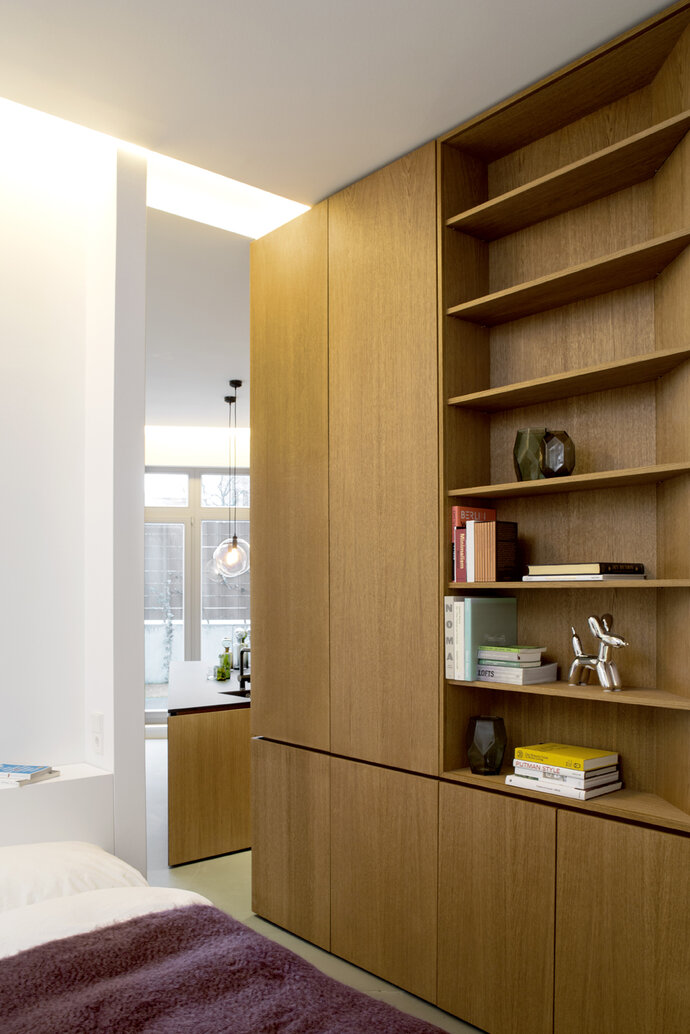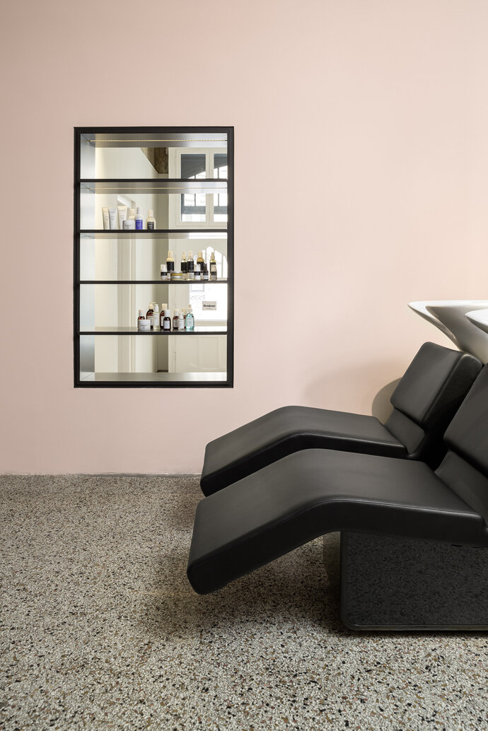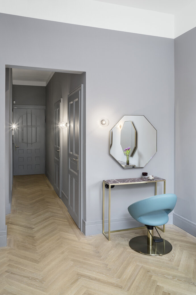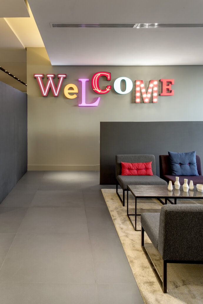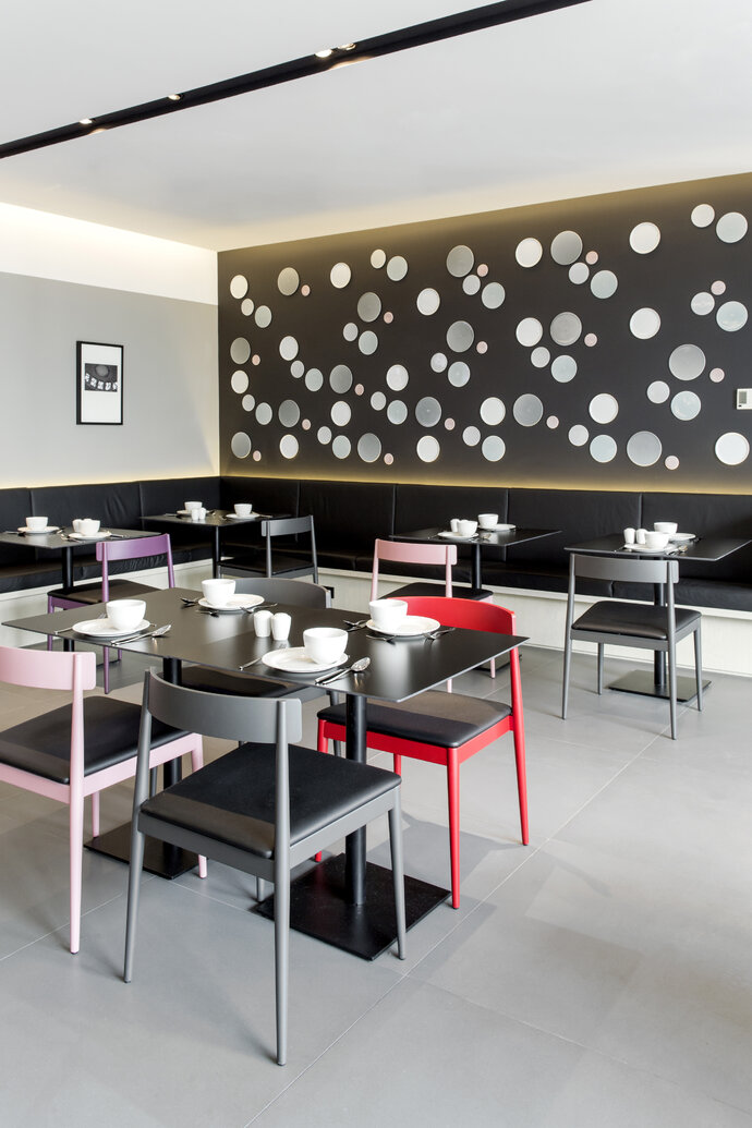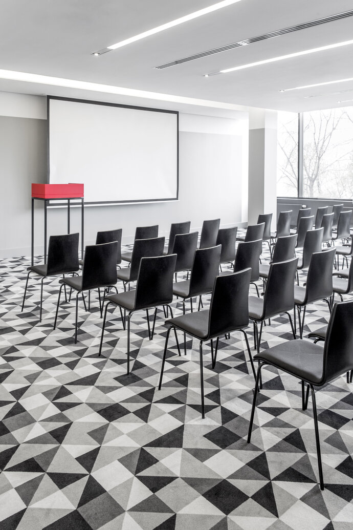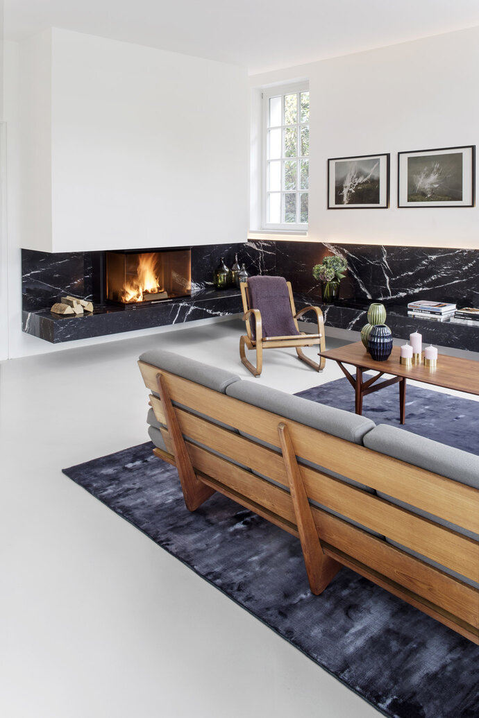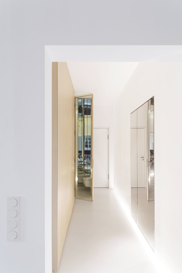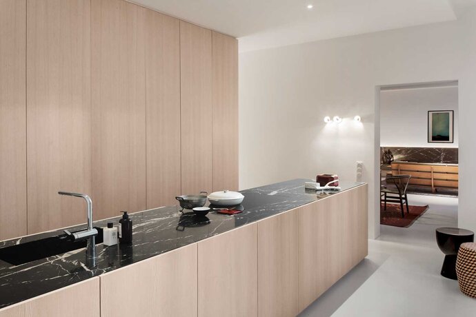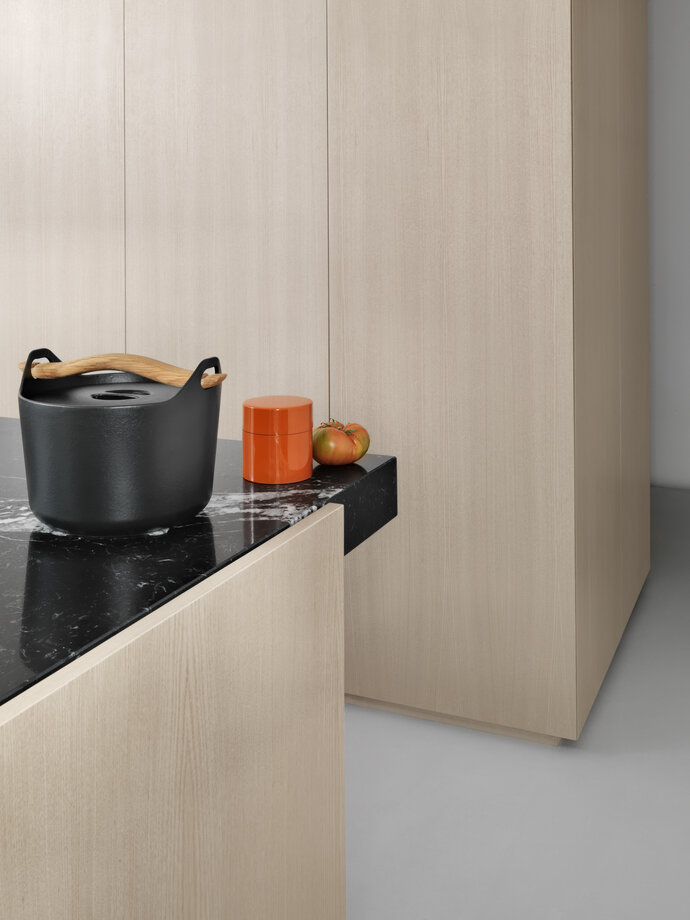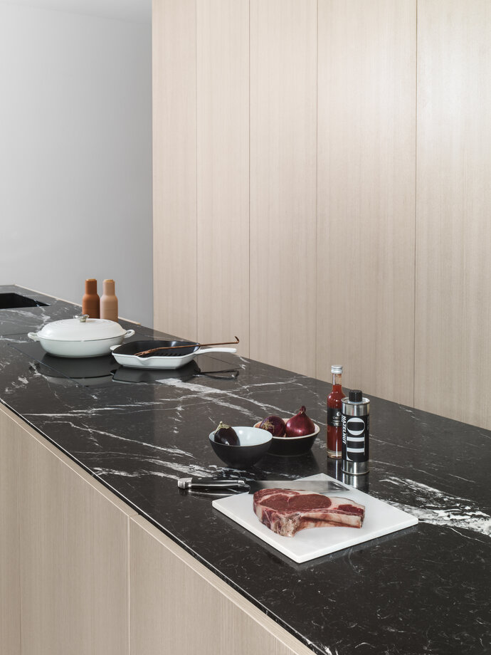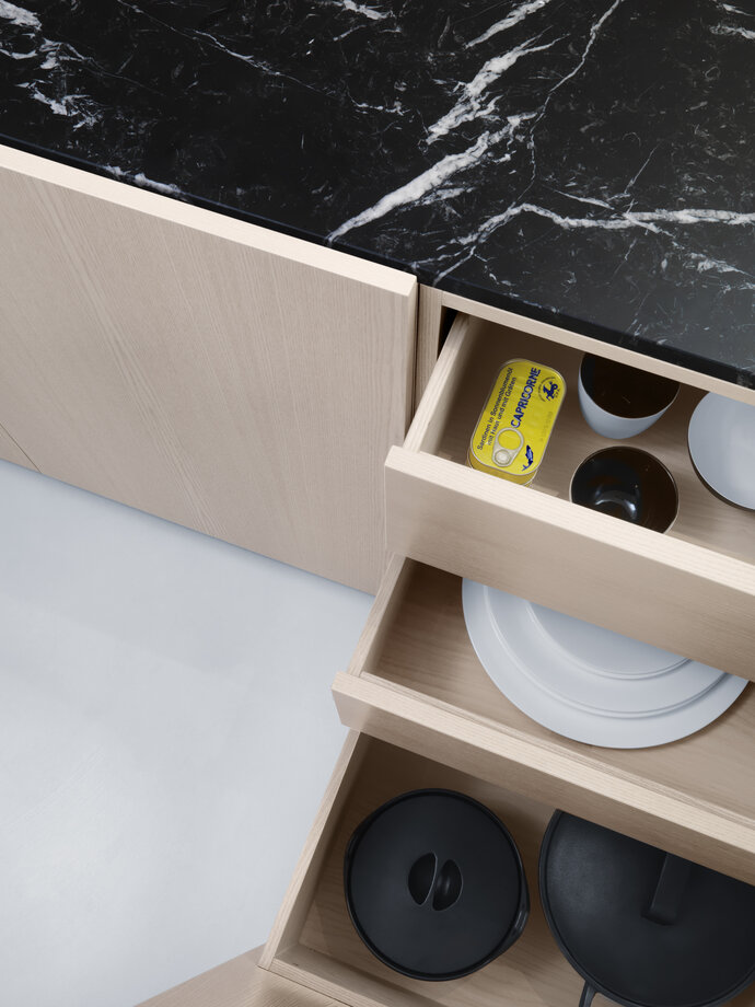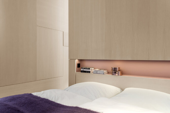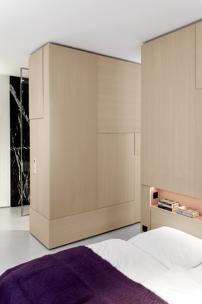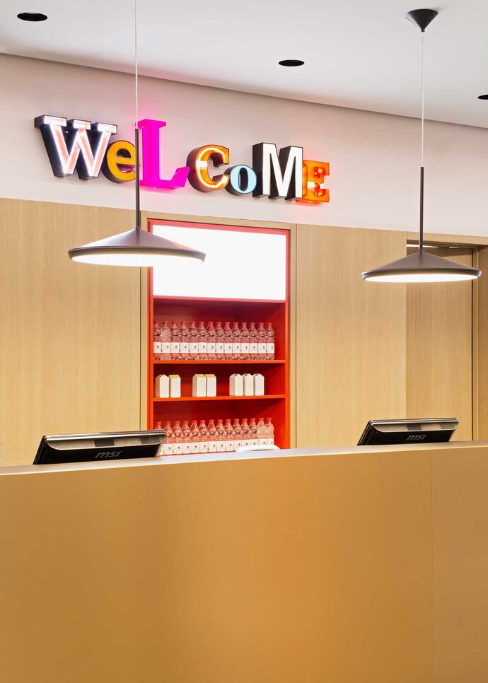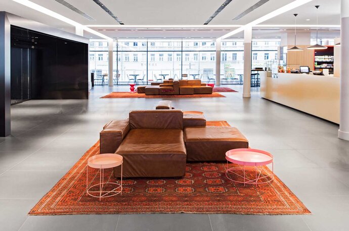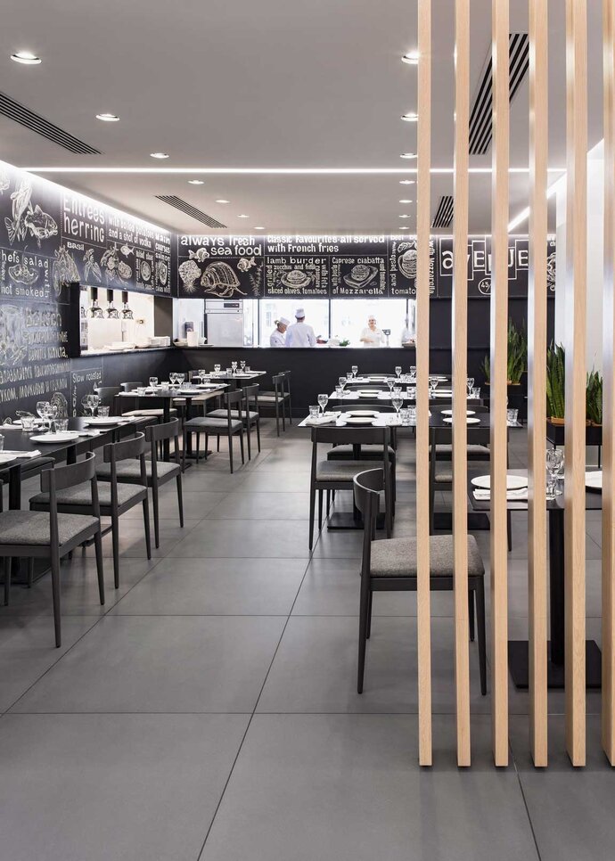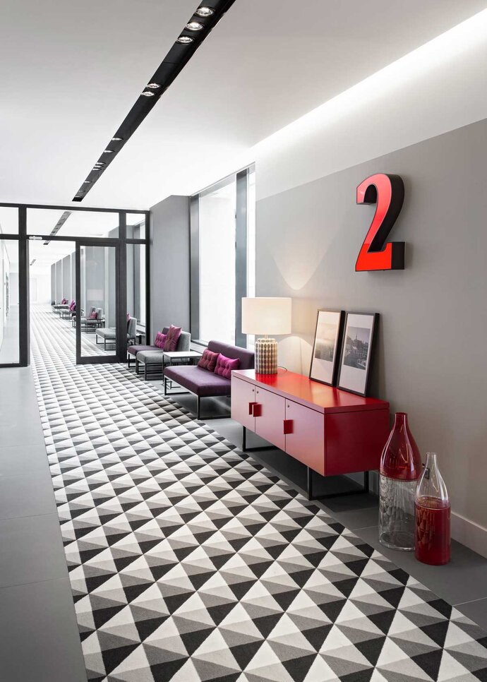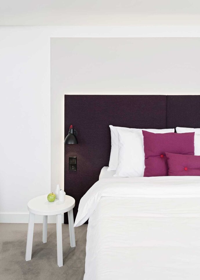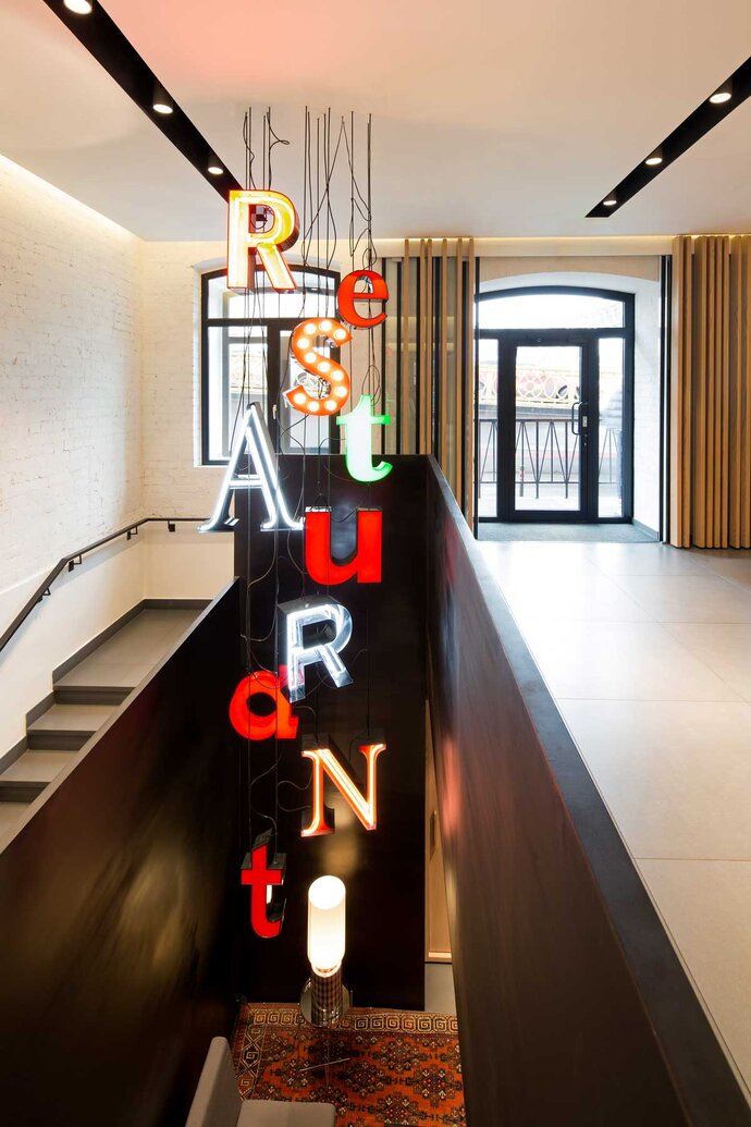




















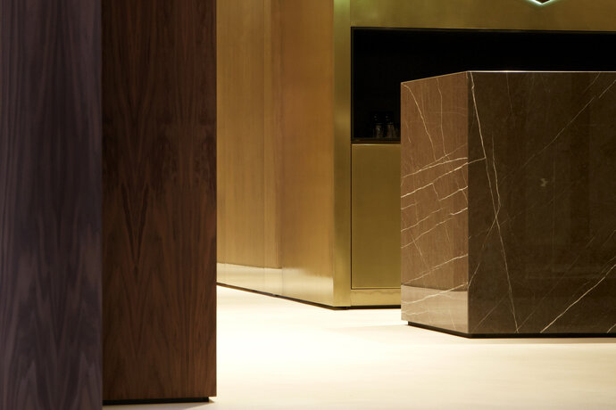
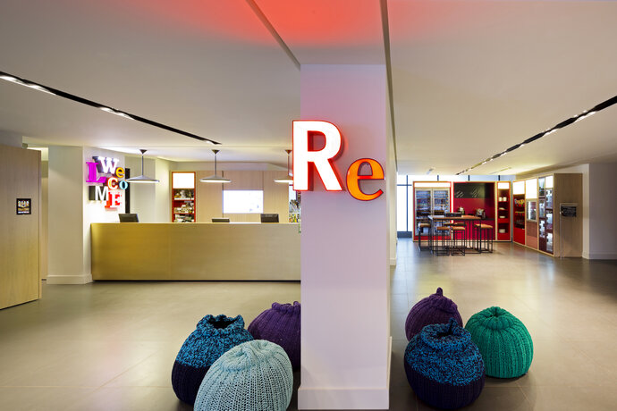


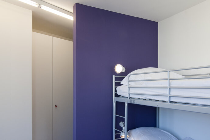
The space below Holbein’s world-renowned restaurant at the Städel Museum in Frankfurt was transformed into a minimalist sushi bar.
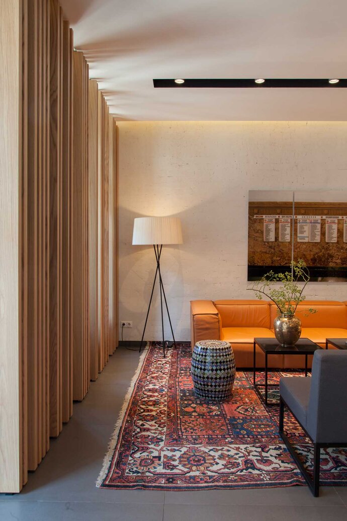
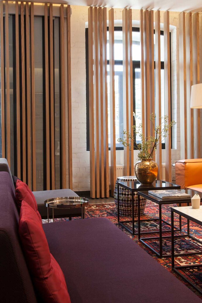
The pale wood floor-to-ceiling slatted cladding evokes the individual layers that make up the flesh of a fish. The design is detailed to present these slats as a series of parallel planes of wood. Built-in spotlights are located between the ceiling slats.
The Japanese dishes are prepared directly at the white Carrara marble counter, separated from diners by a narrow panel of smoked glass. A shelf with backlit stamped-metal ornaments hangs behind the bar.
| Location: | Frankfurt on the Main, Germany |
| Year: | 2012 |
| Client: | Meyer Catering + Service GmbH |
| Area: | 150 sq m |
| Scope of work: | LPH 1-7 Interior Design |
| Light: | PSLab |
| Photography: | Jens Bösenberg |
| Team: | Ester Bruzkus, Patrick Batek, Ulrike Wattenbach, Kerstin Günther (for Bruzkus Batek) |
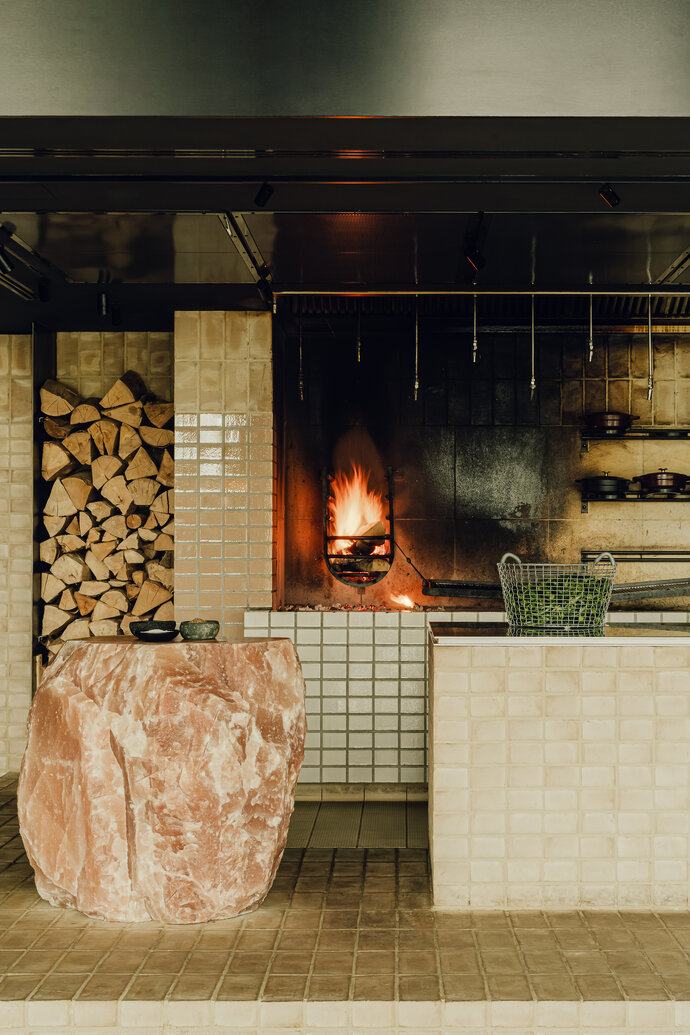
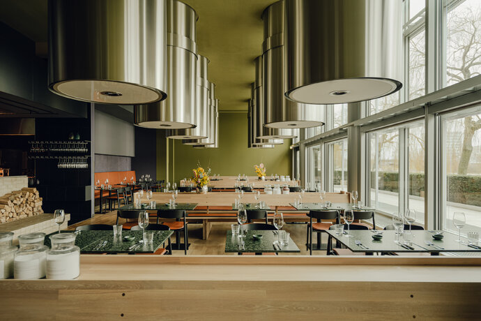
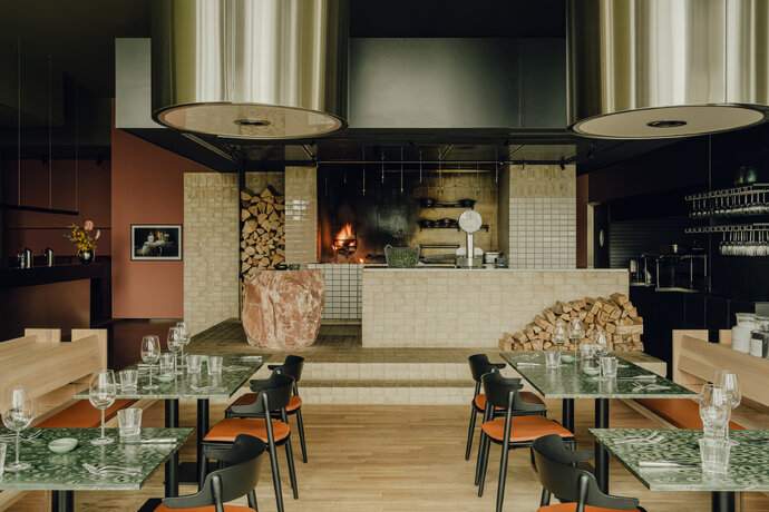
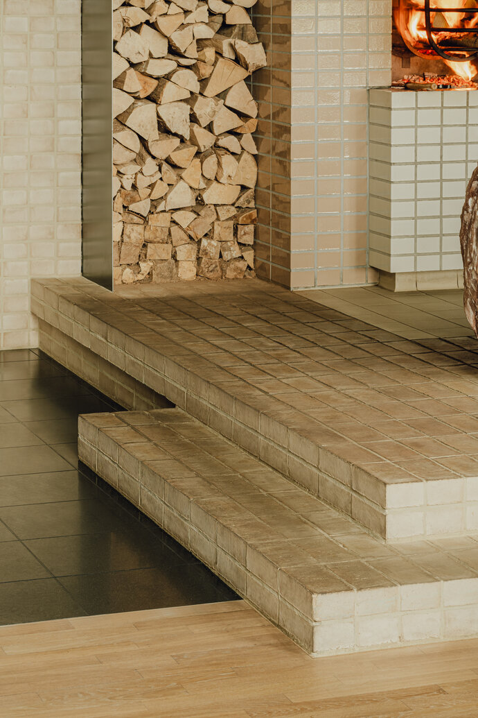
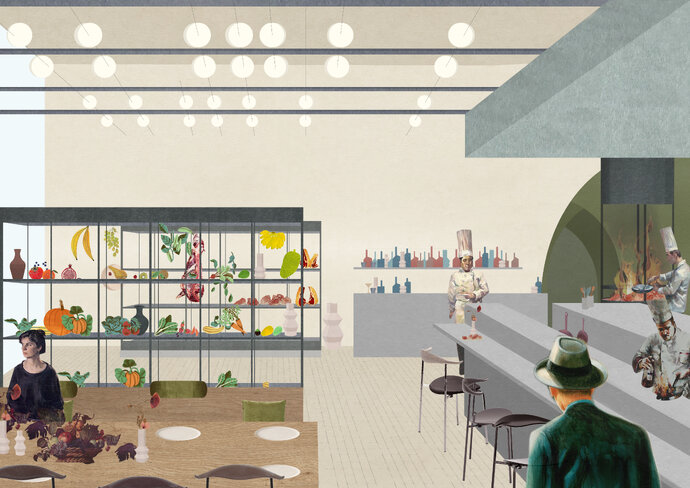
Beef Club is the radical refresh of a beloved eatery on the corporate campus of the German automobile manufacturer Volkswagen. The new design offers two different dining rooms for different kinds of atmospheres: a joyful social area in the front that overlooks an outdoor terrace and an elegant private area in the rear where small groups can gather for celebrations or more confidential meals. At the center of the pub is the theatrical preparation of food on a grill – the menu of Beef Club features both grilled meats and vegetables. An open brick fireplace is positioned in a location where everyone can see it, recalling the power of an archaic fire at the center of a shared dining experience.
The theme of the dining menu is “Fire + Salt” – so, in the interior design, building materials are used that are similarly formed from this theme. The open part of the kitchen is made from brick – baked earth. This hearth is made from a composition of three kinds of fired brick – glazed and unglazed in different formats. The brick grill grows out of the podium in an assemblage of inter-related volumes. Outside, the brick becomes the floor of the terrace and becomes built-in benches. A lightweight metal pergola creates a framework that makes outdoor rooms.
Salt is also used as a building material. A large block of solid salt sits on the brick plinth as a table for display; dining tables are made from woods that have been salted to bring out a unique color and texture. The whole ensemble is brought together in a colorful and joyous composition of discrete rooms within rooms.
| Location: | Wolfsburg, Germany |
| Year: | 2022 |
| Client: | Autostadt GmbH |
| Area: | 345 sqm |
| Scope of work: | LPH 1-8 Interior Design |
| Photography: | Ester Bruzkus Architekten |
| Team: | Ester Bruzkus, Peter Greenberg, Arianna Petrulli, Ana Knežević, Svenja Bechtel, Giulia Di Marco, Jacqueline Pehlemann, Lucia Amaddeo |
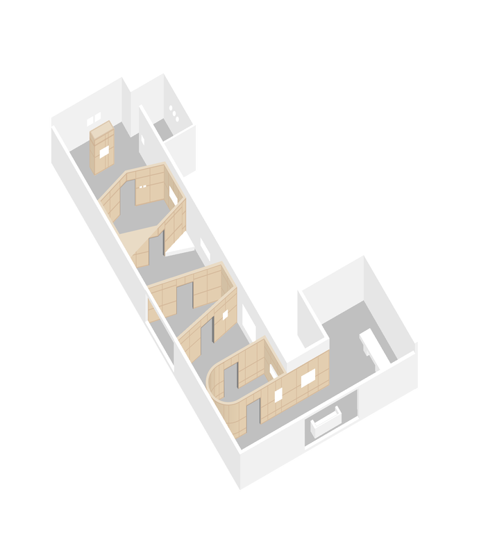
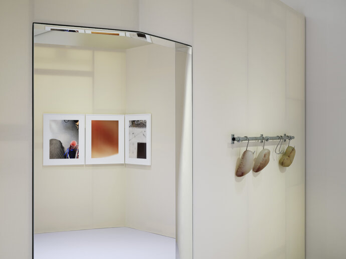
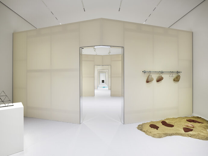
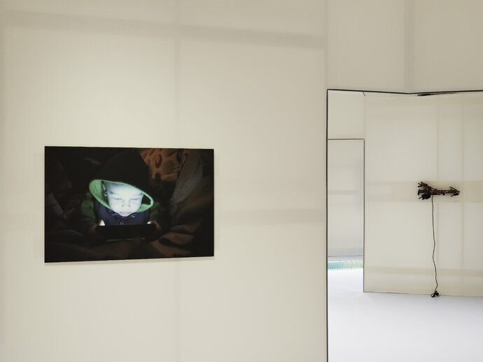
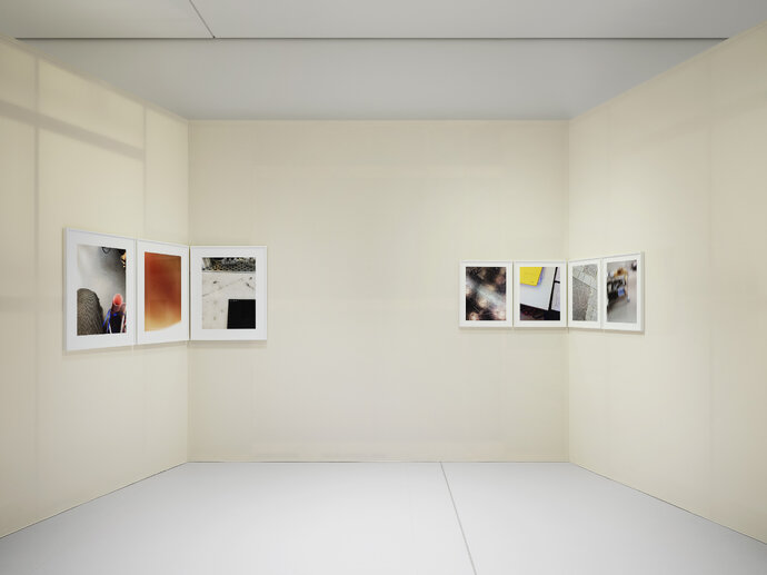
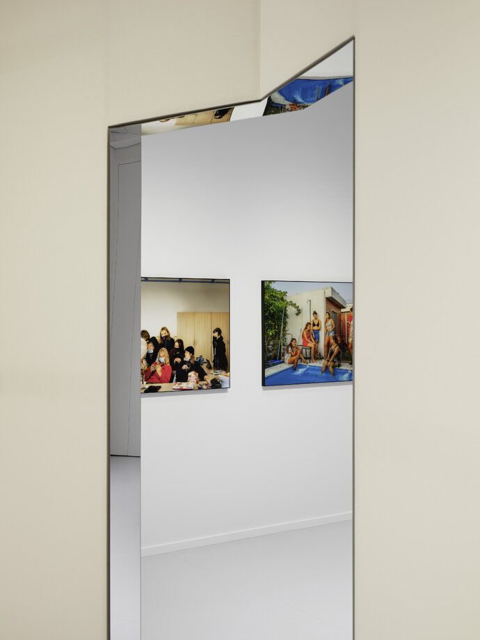
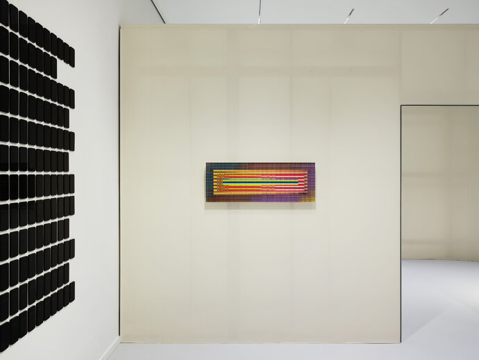
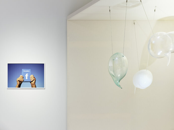
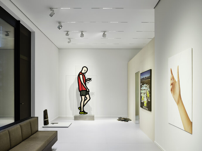
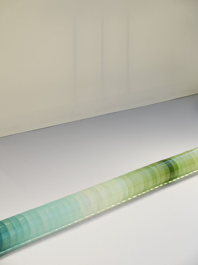
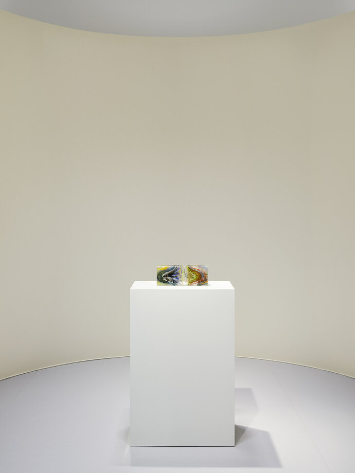
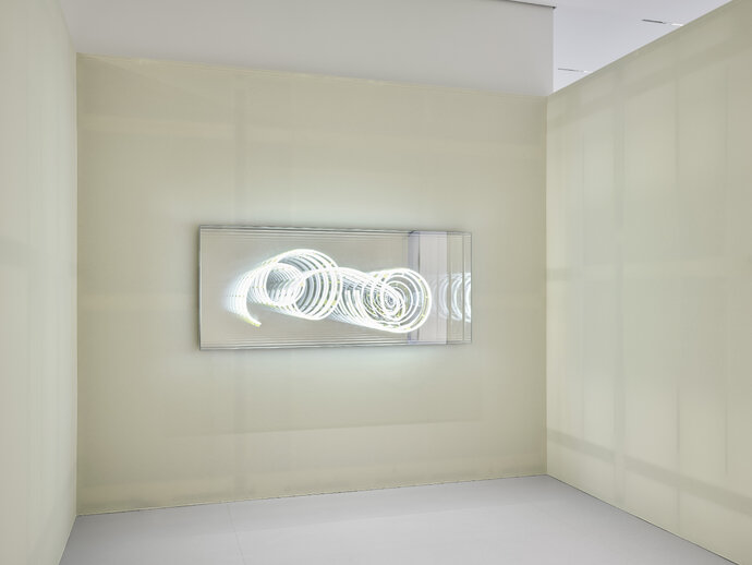
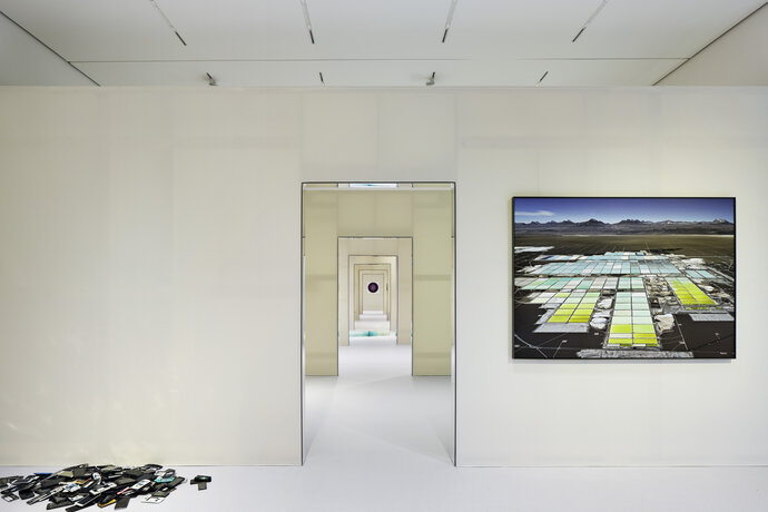
The idea for the exhibition design was to transform the unitary white box of the Alexander Tutsek Stiftung Gallery into a series of “rooms,” aligned along their centers, recalling the origins of public art display in old palaces. EBA also aspired to transform the material experience of the gallery space. Instead of the de-materialized white box - which aspires to become a neutral background – a material reality was proposed that heightens one’s awareness of the ways architecture mediates our experience of space and the perception of the art object itself.
Spatially, three material figures were inserted - one with a rounded apse, one which has converging walls and is defined by an existing garden window, and one which is a hexagonal shape. When one experiences these figures, one is either outside or inside of them: outside, the space is defined by existing gallery walls; inside, one experiences the materiality of the figural spaces.
With works from:
1: Edward Burtynsky, Zeller & Moye x Katie Paterson and Zsuzsanna Kóródi
2: Karin Sander and Ariane Forkel, © VG Bild-Kunst, Bonn 2024
3: Julija Pociūtė, Ariane Forkel, Zeller & Moye x Katie Paterson and Zsusanna Kóródi, © VG Bild-Kunst
4: Sergey Melnitchenko, James Akers and Zeller & Moye x Katie Paterson
5: Karin Sander, © VG Bild-Kunst, Bonn 2024
6: Valentin Goppel
7: Tornike Abuladze and Zsusanna Kóródi
8: Artem Humilevskyi and Alejandra Seeber
9: Ai Weiwei and Tillie Burden
11: Rebecca Ruchti, Julian Opie, Edward Burtynsky and Aram Bartholl
12: Zeller & Moye x Katie Paterson
13: James Akers, Shige Fujishiro and Zeller & Moye x Katie Paterson
14: Jeffrey Sarmiento
15: Brigitte Kowanz, © VG Bild-Kunst, Bonn 2024
| Location: | Munich, Germany |
| Year: | 2024 |
| Client: | Alexander Tutsek Stiftung |
| Scope of work: | LPH 1-8 |
| Photography: | NOSHE |
| Team: | Ester Bruzkus, Peter Greenberg, Anna Kopeina |
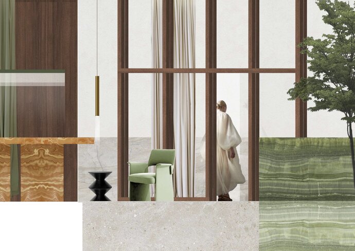
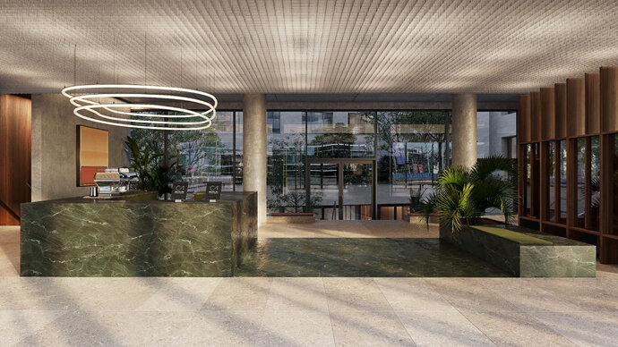
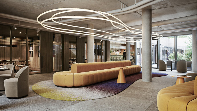
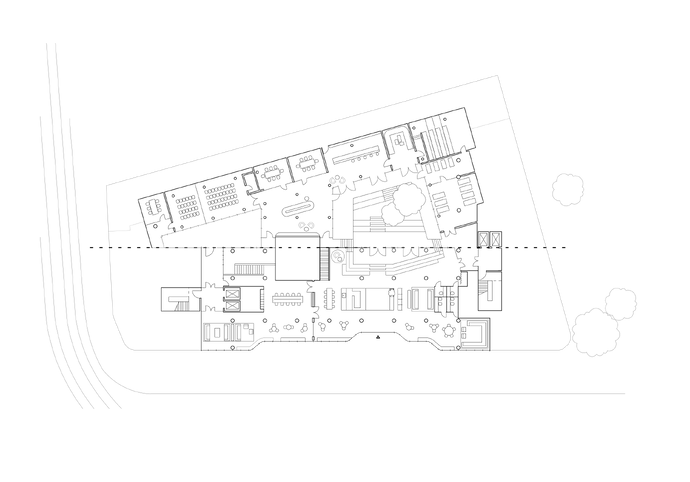
EBA planned and designed all the public spaces and office space for the ground-up office building in Berlin’s Alexanderplatz. The design combines EBA’s expertise in hospitality design to mix comfortable, fashionable, and social spaces to make the new office a place that is especially attractive to employees. Using the set pieces of a cafe, a library, a cinema, a living room, a bar, a conference facility, the lobby spaces on the Ground and Lower Floors offer building tenants places to work, meet, have coffee, get away from the upstairs hustle, to feel a generous sense of openness and productivity and to work in different ways. The design language is reduced but opulent.
Upstairs, the offices similarly combine aspects of hospitality, workplace, and residential design to create comfortable and effective spaces to work. Offices are designed around a shared kitchen/dining area which provides a collective sense of team unity and shared identity. Lots of distributed meeting rooms give teams the opportunity to collaborate. And individual spaces are grouped into well-scaled neighborhoods that allow employees to focus in quiet.
The design intends to combine what employees like about the “home office” and migrate that to the shared office – to have choices where you work, to work in a comfortable and relaxed way, to use domestic furniture and lighting conditions – to not feel so much like an old-fashioned “office.” The design offers office workers something more from their “shared office” than they could get from their “home office”- social interactions, a sense of being part of a team, nicer and larger scaled furniture than they have at home, settings like you’d see in a hotel lobby or a hip bar or a nice restaurant. This approach embraces the sharing economy – that you can get more than what you have in your own home by sharing it with the people you work with.
The project is currently under construction.
| Location: | Berlin, Germany |
| Year: | 2024 (projected) |
| Client: | C1 - Central One Midtown Offices GmbH |
| Area: | 12.000 sqm |
| Scope of work: | LPH 1-5 |
| Light: | Lichtvision |
| Photography: | Renderings: XOIO |
| Team: | Ester Bruzkus, Peter Greenberg, Max Werner, Anna Kopeina, Sina Hartmann |
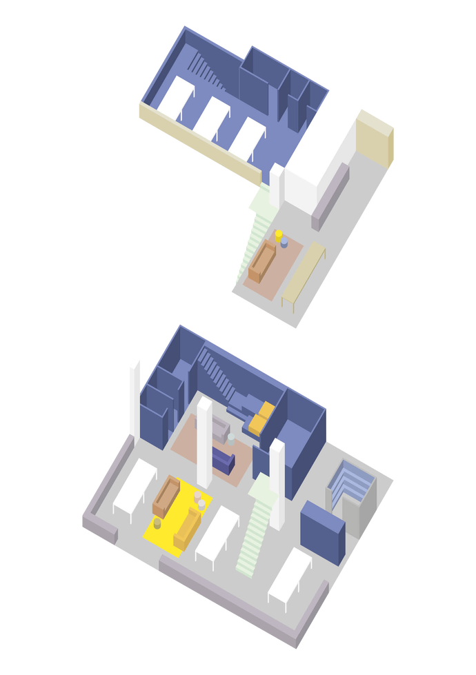
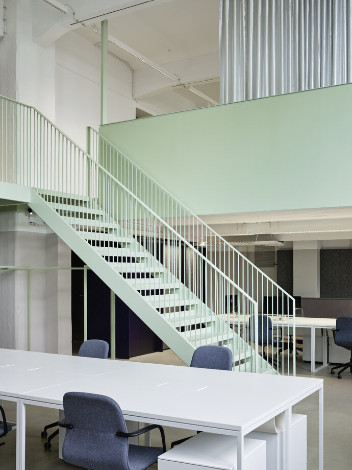
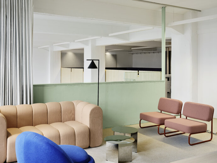
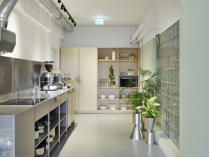
The colorful and flexible workplace for Relaxound offers employees a choice of the spaces where they want to do their work – as well as giving them a strong sense of unified purpose – feeling good about being part of a team. The design is based on social contact – collaborating in real time and space - but also refuge from social contact – for concentrating or withdrawing to do focused work. The office for Relaxound makes a strong argument for the importance of physical office space to a company’s collective culture – even after we have gotten used to the liberties and trust associated with working from home.
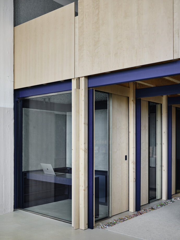
In order to create a sense of shared identity, a new mezzanine was introduced perpendicular to an existing one to together overlook a double-height studio space. In the areas with lower ceilings, very small rooms with sliding doors create spaces for employees to work alone or in small groups with acoustical privacy. A variety of other spaces offer employees a sense of shared openness while providing opportunity for refuge.
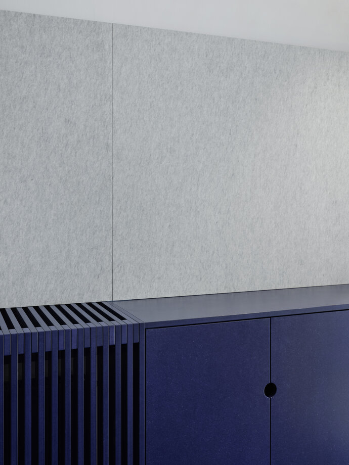
All building materials are used in a way to make one aware of the nature of the materials used – for example, through-dyed MDF is blue all the way through, so when you cut it, it shows the same color inside as out. Planes of MDF, exposed wood beams and columns, and the exposed steel of the mezzanine structure become an interlocked system of walls and doors for the small acoustically isolated rooms. These small rooms are designed for acoustical control: walls are made from thin but massive layers of MDF and echo is controlled by sound absorbing materials (fabrics, felt, and open cell aluminum). To prevent the sense that people are hiding behind closed doors, large glass walls connect employees visually to each other – even when they need acoustical privacy.
Color and light are used to create spaces of different qualities: small spaces are darker and cozier and the large space is brighter and louder. In the social areas where people come together, bright color is used - but in the general studio space the palette is simple and reduced, and not filled with visual noise. The small spaces are dark and atmospheric and might invite you to work in a different way. The design intends to be coherent but varied: the idea is to have real atmospheric choices.
Relaxound is a company that makes products to introduce relaxing natural sounds to physical environments - and its physical office space fulfills a collective and symbolic purpose that a virtual office cannot do by itself. To work in a relaxed way is part of the brand: so integrating choices of formal and informal spaces to do work, to socialize, to chill, to work in a cheerful and colorful place, to eat together - these are all part of how the office works.
| Location: | Berlin |
| Year: | 2023 |
| Client: | Relaxound GmbH |
| Area: | 490 sqm |
| Scope of work: | LPH 1-8 Interior Design |
| Light: | Dinnebier Licht GmbH |
| Photography: | Noshe |
| Team: | Ester Bruzkus, Peter Greenberg, Arianna Petrulli, Ana Knežević, Svenja Bechtel, Giulia Di Marco |
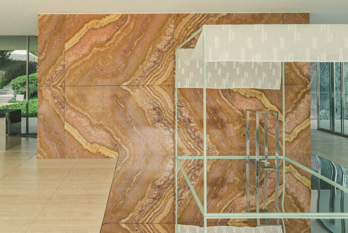
EBA’s installation of reflective and colorful surfaces reinforces the reading of the Barcelona Pavilion as a hall of symmetries: book-matched stones, glossy reflections, material joints at the eye-level horizon – emphasizing what critic Robin Evans referred to as “paradoxical symmetries.” The mirrored surfaces and colored objects that EBA added double the symmetrical conditions and make explicit what is implicit in the original design.
Mies van der Rohe and Lilly Reich had created a design that emphasized the nature and effects of the materials they used – by using reflective and transparent materials, they made a space where one can simultaneously see oneself in the reflection, see what is behind, and see what is ahead. These material reflections are reinforced by the locations of stone joints - in particular the horizontal line of the original onyx wall, which falls exactly halfway up the wall and occurs at eye-level, establishing a horizon line that appears as a mirror image of floor and ceiling. The effect is to blur the classical definition and perception of space. Further symmetries are established at the ground plane by the reflectivity of the shallow pools of water.
By replacing the original opaque black carpet with a shallow reflective box on the floor, and by inserting three additional boxes - two with mirrored surface and one, a thin colored outline, EBA temporarily transformed the Pavilion to reinforce the reading of these doubled surfaces and the perception of expanded spaces. A large circular curry-colored carpet and a green outlined steel cube were added to further the dialogue between the geometries and colors of the original Pavilion.
We hoped to reinforce the reading of the Pavilion as a kaleidoscope, a Hall of Mirrors.
| Location: | Barcelona, Spain |
| Year: | 2023 |
| Scope of work: | LPH 1-8 Interior Design |
| Photography: | La Dichosa |
| Team: | Ester Bruzkus, Peter Greenberg, Anna Kopeina |
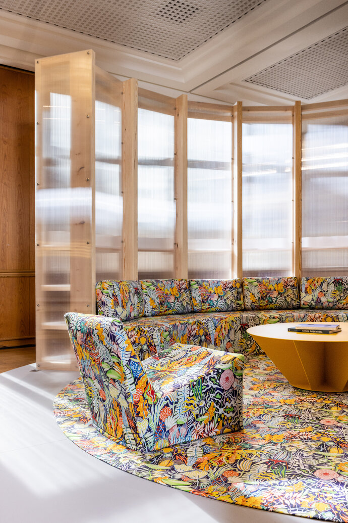
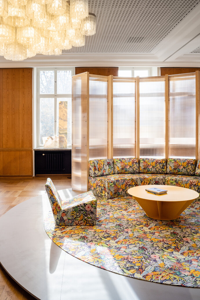
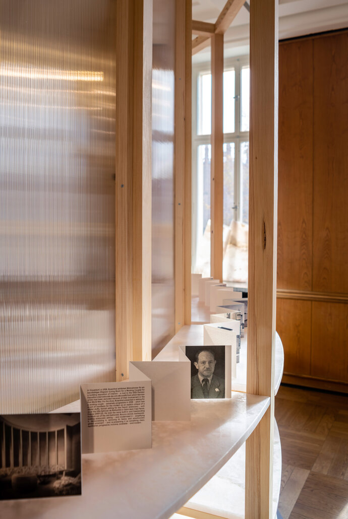
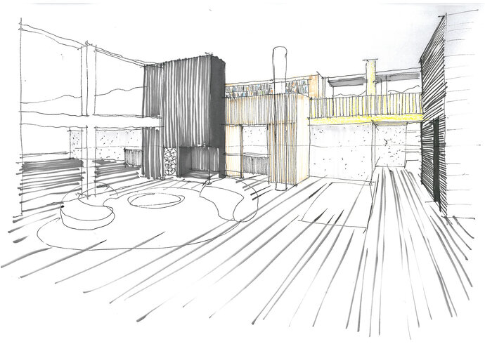
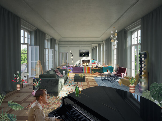
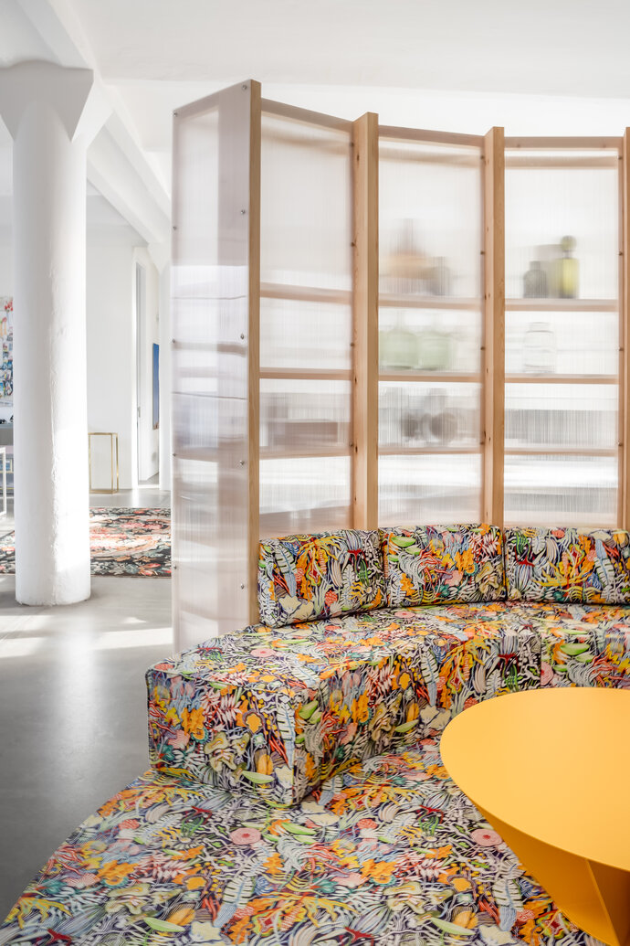
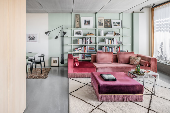
The “Living Room for a Working Couple’s Office” is a combination of architecture and furniture that brings some of the comfort of home to the office - and also an homage to Harry Rosenthal, the largely forgotten Berlin-based architect who practiced in the 1920s. EBA first installed the piece at the 2022 exhibition “AD New Perspectives” at the Kronprinzenpalais in Berlin but the project was always intended for two other sites - one piece became part of EBA’s office and one piece part of Ester and Peter’s home.
When they were asked to participate in the show for Architectural Digest to represent great German contemporary design, they thought of a similar challenge that Rosenthal had faced in 1928. Back then, Harry Rosenthal had exhibited an interior setting that combined architecture and furniture that he called “Wohnzimmer für ein berufstätiges Ehepaar” (Living Room for a Working Couple) – extremely progressive and inclusive for the era. For Rosenthal, the exhibit was a translation of a traditional built-in aristocratic setting for a “modern” couple - a critique of the stuffy, over-decorated furniture of the time, and re-presenting it instead as something clean, egalitarian, progressive, inclusive, available – and modern. Just as Rosenthal translated this setting to comment on his own era, EBA transferred the living room to their office to bring the advantages of the home office to the work place.
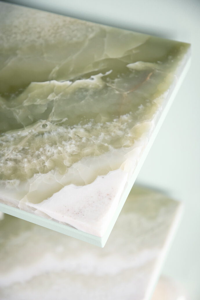
The second piece from the AD New Perspectives show, a delicate bookshelf of powdered steel and exquisite transluscent onyx, was installed in Ester and Peter’s apartment. The thin lines of the steel align precisely with the seams of the overhead precast concrete ceiling, extending Rosenthal’s ideas of subordinating all furnishings to the design idea derived from the architecture of the room.
| Location: | Berlin |
| Year: | 2022 |
| Client: | Architectural Digest |
| Scope of work: | LPH 1-8 Interior Design |
| Photography: | Jens Bösenberg |
| Partner: | Pierre Frey, Solid Nature, Matthias Hickl |
| Team: | Ester Bruzkus, Peter Greenberg, Yining Liu, Giulia Di Marco |
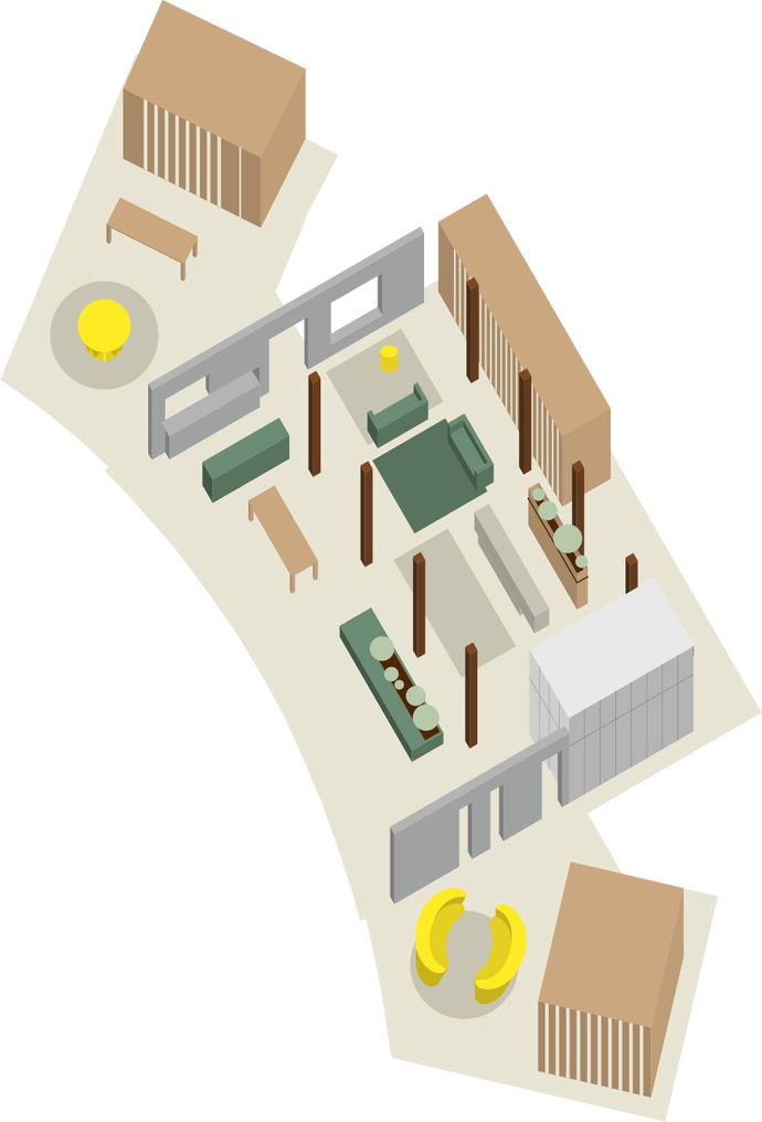
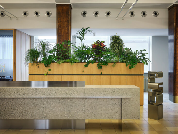
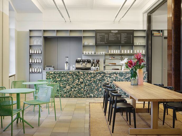
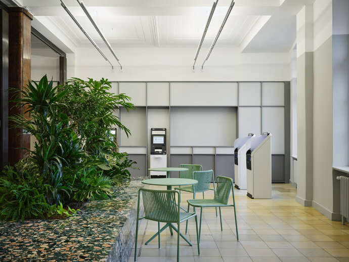
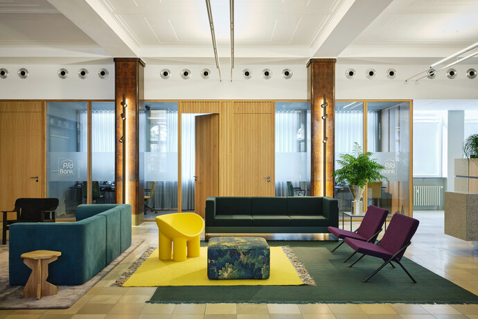
A Bank as a Community Living Room. Located inside a historic Post Office in Berlin- Friedenau, the design transforms the bank into a generous and welcoming neighborhood center. In addition to traditional banking services like ATMs, consulting rooms, and help desks, there are also unexpected spaces for a bank: a café, a colorful community living room, an interior garden, exhibition spaces, and public meeting rooms. While most banks are closing their brick and mortar locations, the PSD Bank has opened as a neighborhood center to welcome everyone in the community.
The project has a strong social, formal, and material idea. Socially, the room presents itself as a comfortable living room, with a welcoming café at the front, inviting guests to linger and feel at home. In particular, the inclusive design is intended to appeal to guests, such as Seniors, for whom modern digital banking may feel impersonal and alienating. Formally, the design introduces new architectural “boxes inside boxes” that sit within the restored banking hall and have a dialogue between new and old. Materially, the design mixes fresh new materials with historic ones – warm woods, shiny metals, pickled woods, terrazzo with recycled content - mixed with historic stone flooring, original dark wood columns, and historically accurate colors found under a hundred years of paint layers.
As a bank dedicated to the community where it is located, the design features local and German material manufacturers, furniture companies, suppliers, and crafts. And the design reuses and recycles as much as possible – so the historic shell was repaired - the flooring, the original wood paneled columns, and the plaster ceiling.
But the project is not just a historic renovation: it is intended to feel new and fresh and contemporary and vibrant and connected to the active life of the community. New materials live in happy dialogue with the old. And young and old alike are welcomed into their own neighborhood community center.
| Location: | Berlin-Friedenau |
| Year: | 2022 |
| Client: | PSD Bank Berlin-Brandenburg eG |
| Area: | 950 sqm |
| Scope of work: | LPH 1-8 |
| Light: | PSLab |
| Photography: | Noshe |
| Team: | Ester Bruzkus, Peter Greenberg, Edo Albano, Giulia Di Marco, Stephanie Meine, Ana Knežević, Arianna Petrulli, Lorenzo Soldi, Max Werner |
The international competition for the interior of the NOBU Hotel and Restaurant has been won by architects David Chipperfield Architects Berlin with Ester Bruzkus Architekten. Pritzker-Prize winning David Chipperfield is also the architect for the entire building in which the hotel will be located – the new 61-story Elbtower in Hamburg’s HafenCity district, built by the developer Signa. The team is currently developing the interior design as the tower is being constructed.
The Hamburg Nobu Hotel’s design, materiality and color scheme are based on authentic representations of the local northern German natural landscape - with its harbor, sea, sand, shells, and plants. Simple, natural materials of high quality create an atmosphere characterized by the contrast between cool concrete, natural stone, and warm woods. The clear, reduced design language with finely crafted details approaches Japanese design principles and finds its inspiration in the simplicity of the preparation of Japanese food.
| Location: | Hamburg |
| Year: | 2026 (projected) |
| Client: | Signa Prime Selection AG for Nobu Hospitality, LLC |
| Area: | 16.500 sqm, 188 hotel rooms |
| Scope of work: | LPH 1-5, Interior Architecture |
| Team: | David Chipperfield Architects Berlin with |
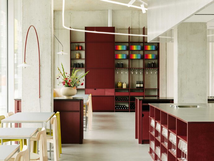
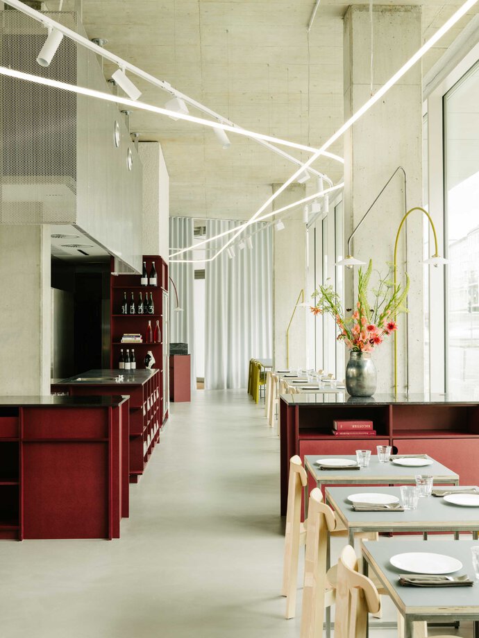
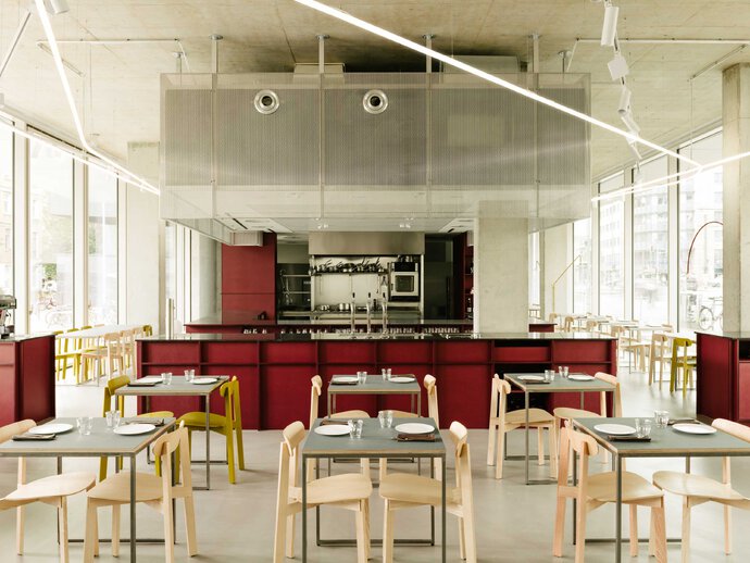
Ester Bruzkus Architekten approached the design of the new Berlin-Mitte restaurant REMI for chefs Lode van Zuylen and Stijn Remi by using architectural materials that are high in quality, carefully sourced and crafted, with rigorous attention to detail. This is the very approach to ingredients that the chefs bring to crafting a meal, so the success of the project results from a synergy between the architects and the chefs. The design is intended to emphasize simplicity and quality - and to enhance a dining experience that is authentic, straightforward and fun.
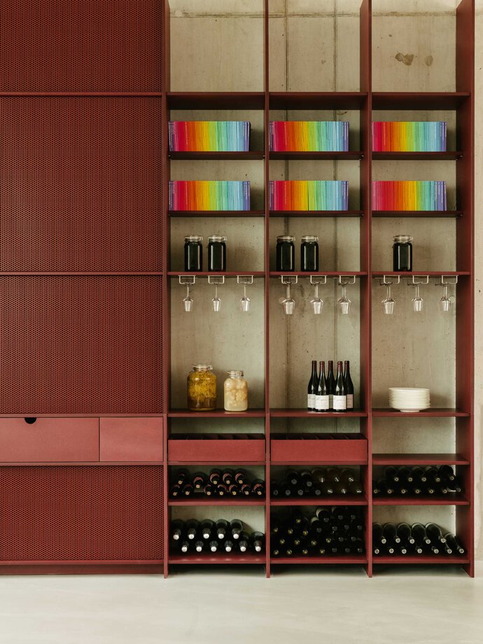
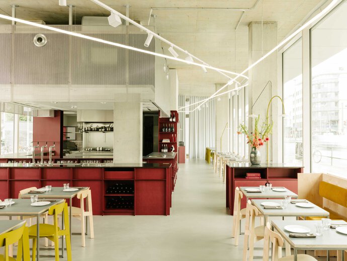
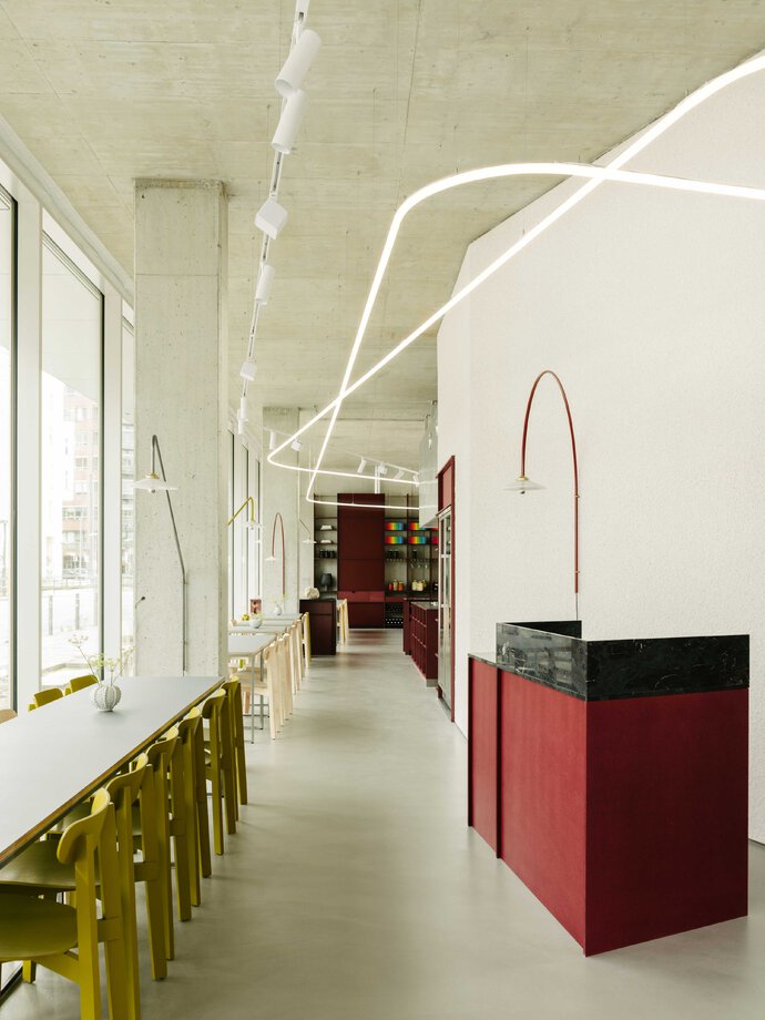
At the center of the space is the open kitchen – surrounded by materials working together like diverse ingredients for a good meal: unfinished perforated aluminum, rough stucco, red-colored MDF cabinetry, transparent lacquered birch, pale blue curtains, stainless steel and a natural deep red granite that combines all the colors used in REMI. The volumes that make up the kitchen are framed by overhead rings of lighting, enhancing and unifying the clean and transparent design.
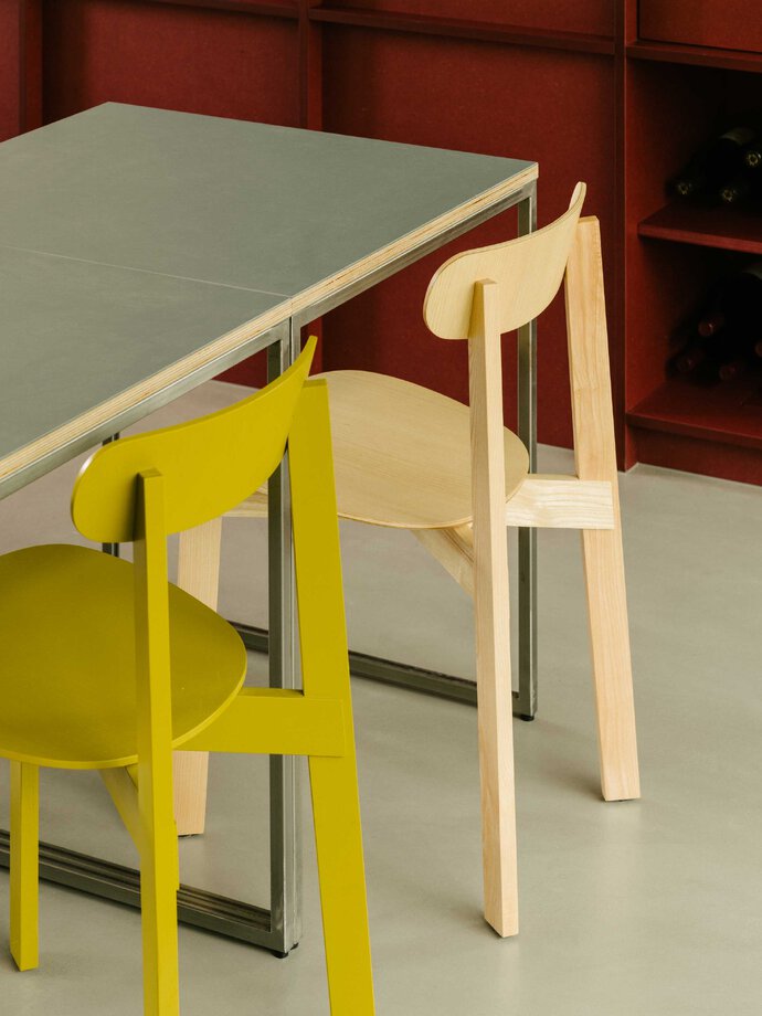
The detailing reveals the inherent qualities of the materials - what they look like in cross-section, their thickness and depth, and how the different materials make outside corners. The best example of this material approach is how the red-colored MDF is used - the color is not applied to the surface but all the interior fibers are stained - so when it is cut, it reveals its interior like a stick of butter.
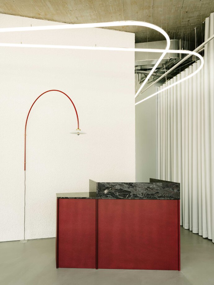
The design takes advantage of the best attributes of the site in the ground floor of the new Suhrkamp Verlag building by Bundschuh Architekten. An important goal of the design was to retain the feeling of openness that comes from the high exposed concrete ceilings and the expansive glass fronts on either side of the restaurant. A triangular welcome desk resolves the complicated geometry of the site so that the dining areas have a placid atmosphere.
The dining area furniture, provided by Studio Coucou, combines custom-made tables in fine plywood, polished steel and Forbo linoleum with chairs by Please Wait To Be Seated, custom wood banquettes upholstered with corduroy fabric by Kvadrat and lighting by Valerie Objects. The large overhead rings of light were designed by Ester Bruzkus Architekten.
The design for REMI shows the parallels between good design and a modern dining experience. By treating architectural materials with the same approach as the chefs approach the meal, Ester Bruzkus Architekten have created a restaurant for chefs Lode van Zuylen and Stijn Remi that is bright, carefully detailed, and made from architectural materials that come together like a well crafted meal.
| Location: | Berlin, Germany |
| Year: | 2020 |
| Client: | Lode van Zuylen, Stijn Remi |
| Area: | 230 sq m |
| Scope of work: | LPH 1-9, Interior Architecture, Furniture Design |
| Light: | GKW Lichtsysteme |
| Photography: | Robert Rieger |
| Team: | Ester Bruzkus, Peter Greenberg, Stephanie |
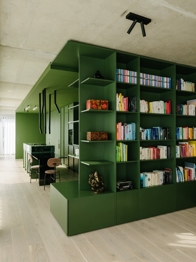
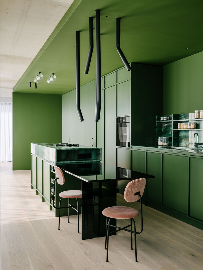
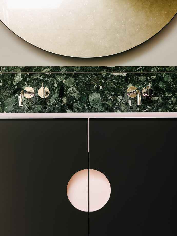
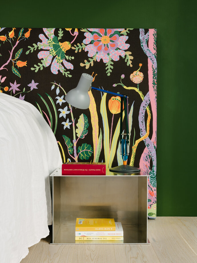
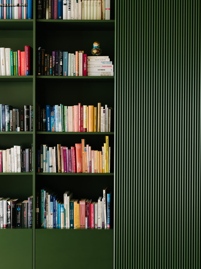
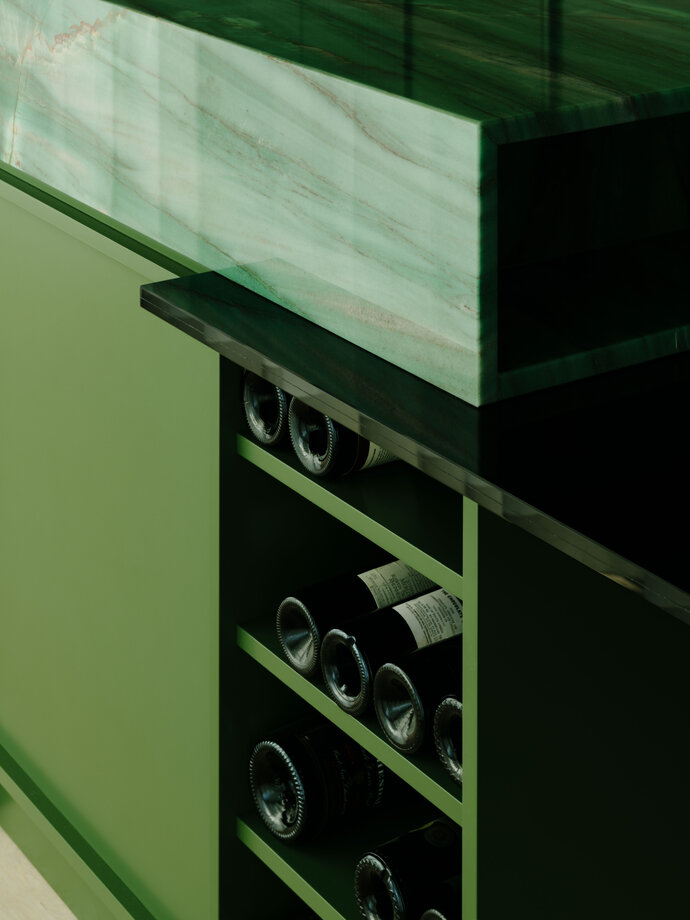
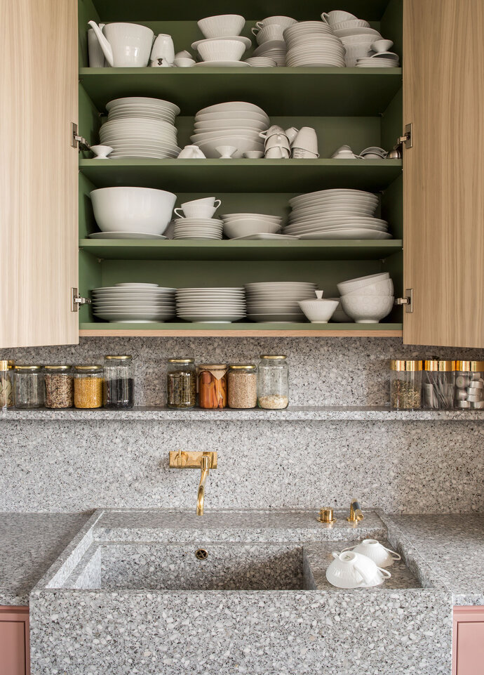
By locating a single but complex green millwork box at the center of the long apartment, circulation can flow around all sides. In the box are hidden all the kitchen and bath services; around it are public rooms that face a view of the city on two sides and, on the interior, a more private enfilade of rooms for bathing. The palette of rich colors contrasts with neutral raw concrete walls and ceilings; in addition to the deep green of the central millwork are richly colored natural quartzite stones, terrazzo, brass, botanical silks and colorful fabrics designed by Josef Frank.
| Location: | Berlin, Germany |
| Year: | 2020 |
| Area: | 120 sq m |
| Scope of work: | LPH 1-9, Interior Architecture, Furniture Design |
| Light: | PsLab |
| Photography: | Robert Rieger |
| Team: | Ester Bruzkus, Peter Greenberg, Svenja Bechtel, Martina Durrant, Arianna Petrulli |
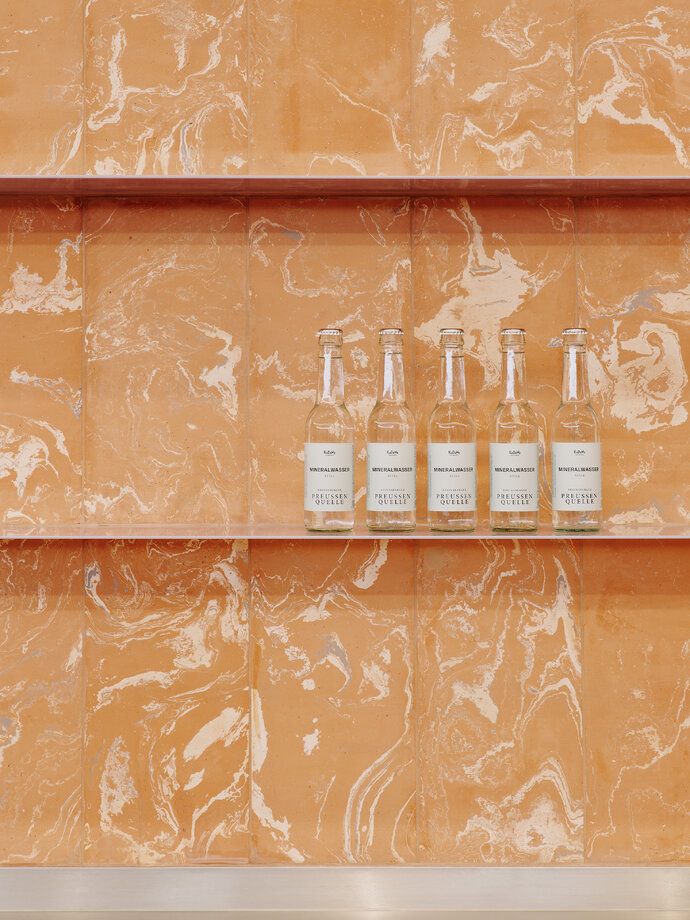
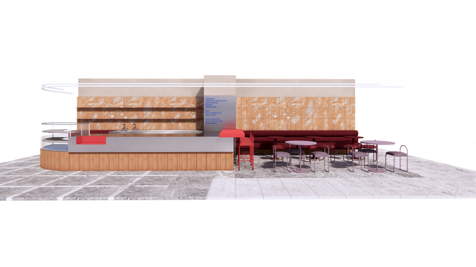
The café, located on the sixth floor of Berlin’s KaDeWe Department Store, is a play of materials, textures, colors, and forms. Through the selection and juxtaposition of different materials, the project combines contrasts of smooth and textured, refined and raw, natural and synthetic, glossy and matte, muted and bright, traditional and new. The overall composition is made from boxes of different materials and colors in dialogue with each other.
The design offsets cool stainless steel, mirrored metals, and glossy orange and lavender powder coats with clay paint and two types of warm and natural terra cotta tiles by Fornace Brioni: marbled tiles on the walls and fluted tiles under the counter, like a skirt. Unlike the crisp machine-aesthetic of the metals that are also used next to them, the terra cotta tiles are made by expert age-old hand-crafting techniques that produce a unique marbled surface by mixing different clays. The contrast emphasizes the inherent qualities of each material.
The result attempts to bring together material opposites - natural and artificial, colorful and muted, hand-crafted and machined – in order to make a fun place to get a cup of coffee when you are shopping at the KaDeWe.
| Location: | Berlin, Germany |
| Year: | 2022 |
| Client: | KaDeWe |
| Area: | 32,5 sq m |
| Scope of work: | LPH 1-3, Interior Architecture |
| Photography: | Robert Rieger |
| Team: | Ester Bruzkus, Peter Greenberg, Alice Maffi, Lena Heiß |
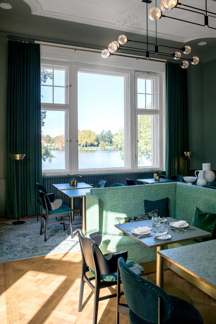
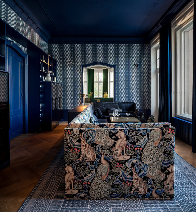
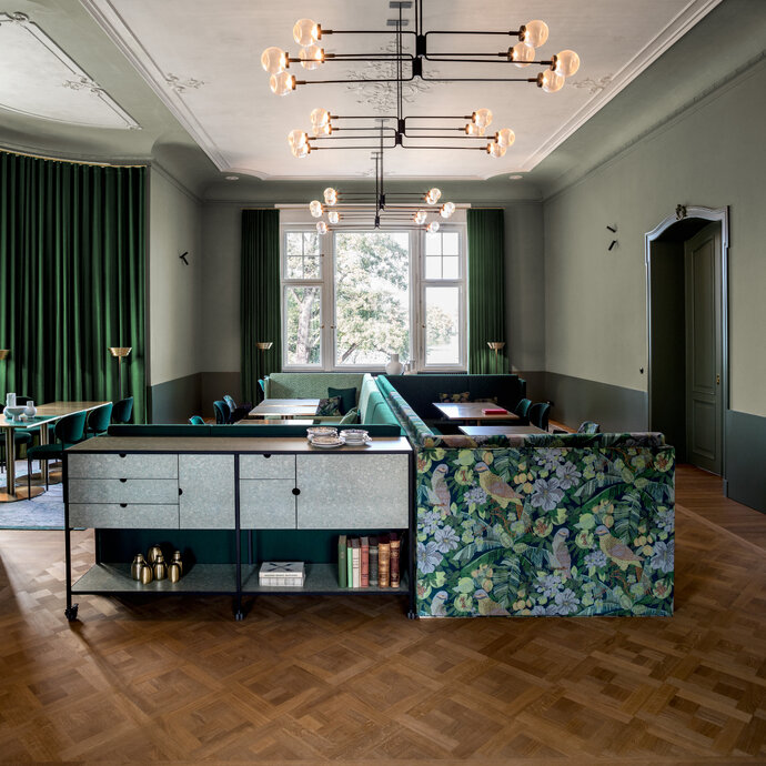
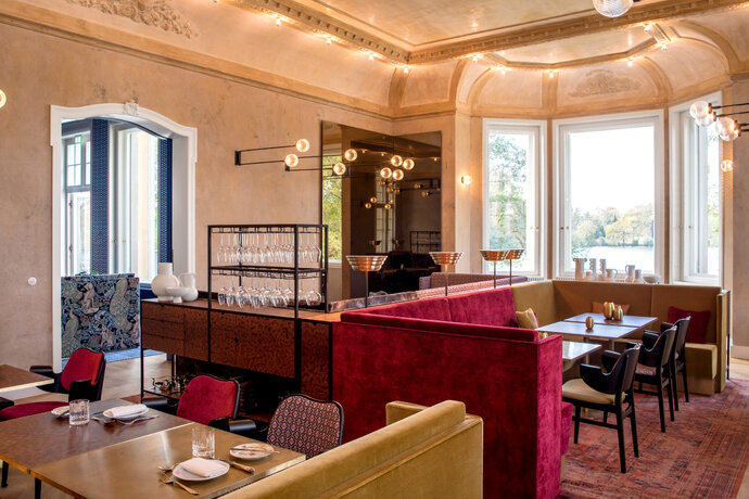
For the design of Tim Raue’s restaurant in the historic Villa Kellermann in Potsdam, Ester Bruzkus Architekten have combined a series of contrasts: old and new, traditional and innovative, familiar and surprising. Like the recipes that Tim presents to the diners, the architecture of the dining areas are designed to be a fresh and surprising take on familiar themes.
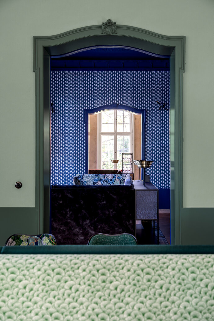
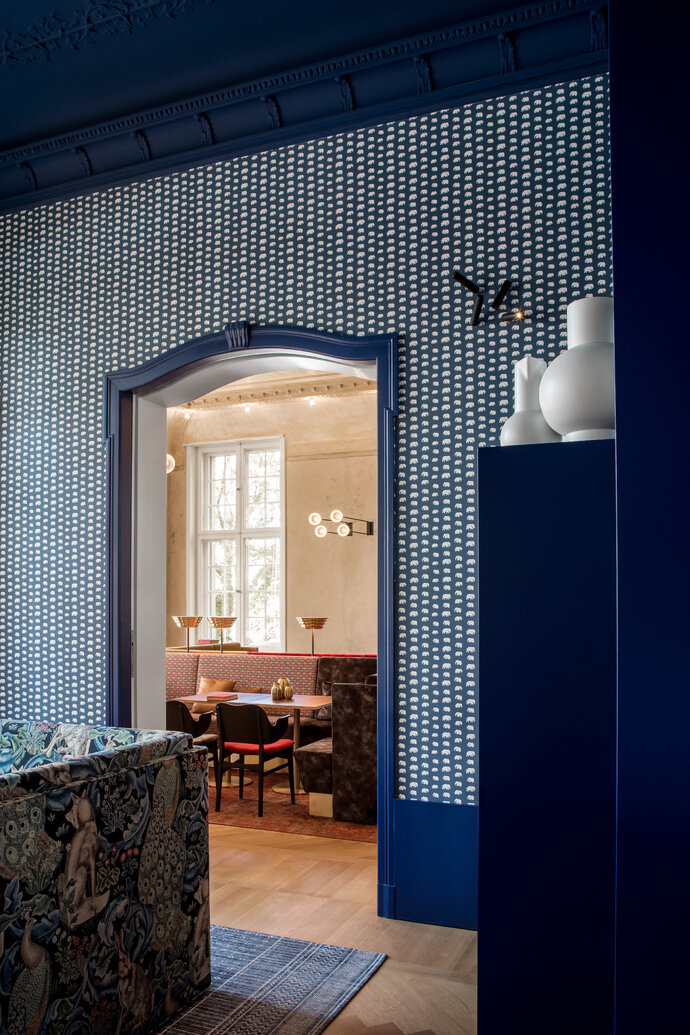
Each room is its own colorful experience based on contemporary interpretations of historic colors: blues, greens, and beige tones. The main dining room, the Alte Fritz Saal, preserves the light beige textures and colors of the old building; the Green Dining Rooms are saturated in a harmony of carefully selected hues; the Elephant Room is a cozy lounge in Prussian Blue for languorous views of the Lake.
The design idea is to present each of the historical rooms as its own unique rich chromatic experience. Saturated in different hues, each room celebrates the historic legacy of the Villa and furnishes it with comfortable settings made from carefully curated materials and textures. The rich and contrasting fabrics for the chairs and custom benches come from different companies to make a playful collage of colors and textures: from Dedar, Kvadrat, Gaston y Daniela, and Fidivi. The different patterns are likewise a playful montage of materials including vintage designs from from Richard Morris & Co and the Swedish designer Estrid Ericson.
Custom cabinetry by Ester Bruzkus Architekten is made from metal frames infilled with colored and salted wood veneers by Llot Llov. All of the benches are custom designed by Ester Bruzkus Architekten in fabrics and solid brass trimmings, but the freestanding chairs have been selected from other noted designers: the chair in the elephant room was designed by the Danish designer Hans Olsen and is called the Gesture Chair, designed in the 1950s. The other freestanding chair that is used is the Verpan Chair, designed by Verner Panton in 1967.
Ester Bruzkus Architekten have developed the lighting concept together with PS Lab, who have designed and manufactured all of the light fixtures with each specific room of the Villa Kellermann in mind. The different halls have lights that are calibrated to optimize the ambiance of that particular room: the thin lines that extend out of the walls in the Alte Fritz Saal, the low floor lamps in the Elephant Room, the radial patterns cast by glass globes in the lower level, the flower-like (or is it the bottom of a rocket engine?) ceiling fixture that welcomes diners in the foyer.
Creating a restaurant within the historic Villa Kellermann meant that Ester Bruzkus Architekten had to carefully balance issues of preservation with innovation. Paying careful attention to preserving historic building fabric, the designers also restored important interior details: stucco profiles, wooden panels, antique doors and the marble fireplace. The historic lines of each room presents a design dialogue with bespoke furnishings and light fixtures made from fabrics and metals of brass, patterns, textures & colors - vintage and modern. And the furnishings stay respectfully away from the walls so that the conversation between new and old is clear and so that views to the lake are optimized.
The design of Tim Raue’s restaurant in the Villa Kellermann is a play of delightful contrasts and surprises, like his cuisine. It is familiar and new, innovative and based in tradition, comfortable and stylish.
| Location: | Potsdam, Germany |
| Year: | 2019 |
| Client: | Tim Raue |
| Area: | 380 sq m |
| Scope of work: | LPH 1-3, 5-8 Interior Design, Furniture Design |
| Light: | PSLab |
| Photography: | Jens Bösenberg |
| Partner: | Ester Bruzkus, Peter Greenberg |
| Team: | Dana Mikoleit, Gina Marpe, Iwetta Ullenboom, Ana Knezevic, Lucia Amaddeo, Minwon Kim |
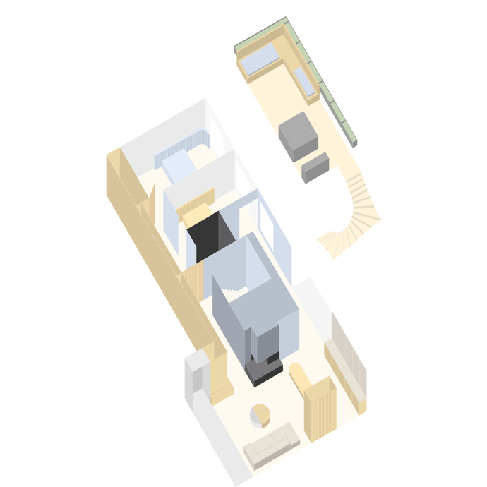
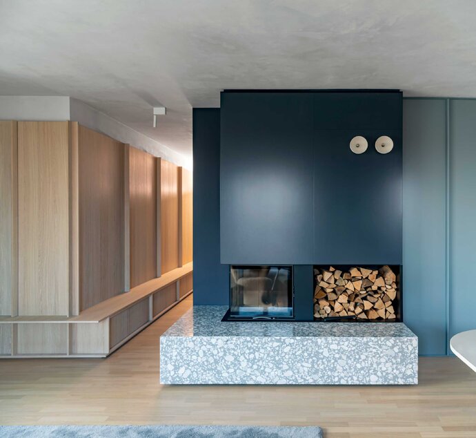
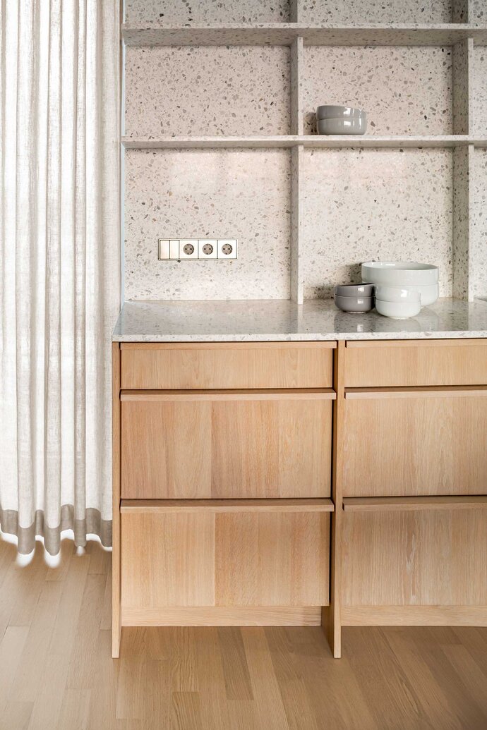
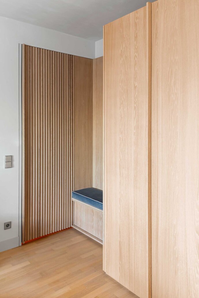
Boxes of carefully detailed millwork play off each other to create subtle use patterns for the penthouse apartment. The residence is designed to expand to accommodate different numbers of users: it is a pied-à-terre for a traveling couple, a place to perhaps host guests when they are there, or the location for a large party on two floors. A millwork door in the hallway serves a double purpose to help choreograph these use patterns: it usually aligns with the hallway but opens perpendicularly to direct guests away from the private quarters to the roof terrace. A second similar door does the same thing and closes off the private bedroom from a guest room. The space is therefore adjustable and expandable according to the particular needs of the users. A reduced palette of waxed pale oak, gray terrazzo and deep blues and grays maintains a consistent contemporary character across the apartment even as the space expands and contracts.
| Location: | Berlin, Germany |
| Year: | 2020 |
| Area: | 110 sq m |
| Scope of work: | LPH 1-9 Interior Architecture, Furniture Design |
| Light: | PsLab |
| Photography: | Jens Bösenberg |
| Team: | Ester Bruzkus, Peter Greenberg, Stephanie Meine, Arianna Petrulli, Henrieke Kayser, Iwetta Ullenboom, Minwon Kim |
Winner of Verlag Callwey's First Prize, Most Beautiful German Apartment, BEST OF INTERIOR 2018.
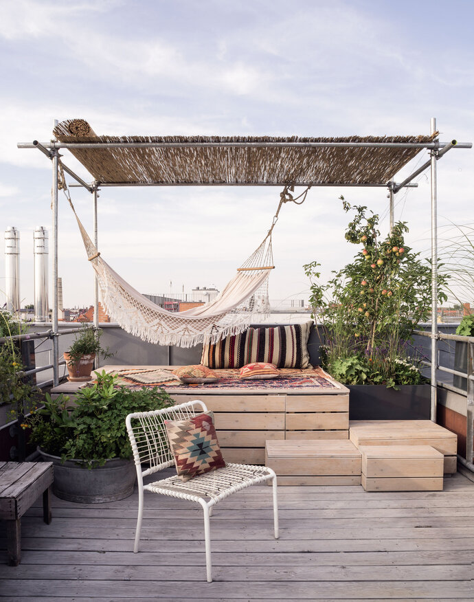
The move from one apartment to another in the same building provided the ideal opportunity for Ester Bruzkus to revisit the identical design problem with fresh ideas (please click on "ester's apartment" to see what she did there) . The new design - Ester’s Apartment 2.0 - is an expression of both restraint and opulence through its efficient planning, its playful use of color, its exceptional lighting, its custom-designed furniture, and its carefully detailed material volumes. The apartment feels bright and spacious like an airy open loft because its space extends from east facade to the west and sunlight enters from sunrise to sunset. It is intricately planned to offer a rich variety of spaces – and to make the most of hidden storage despite its small actual size – just 80square meters inside.
Exterior rooms expand the concept onto the roof terrace, where a variety of outdoor volumes, spaces and framed views create a rooftop garden.
| Location: | Berlin, Germany |
| Year: | 2017 |
| Area: | 80 sq m (inside); 90 sq m terrace and roof garden |
| Scope of work: | LPH 1-9 Interior Design and Landscape, Furniture Design |
| Light: | PSLab |
| Photography: | Jens Bösenberg |
| Partner: | Anja Knoth (Landscape) |
| Team: | Ester Bruzkus, Peter Greenberg, Iwetta Ullenboom, Lukas De Pellegrin, Katharina Müller |
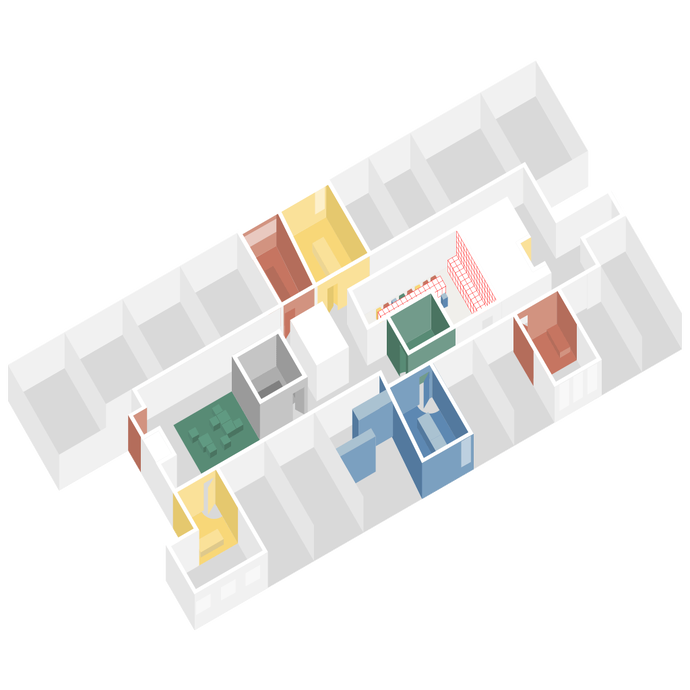
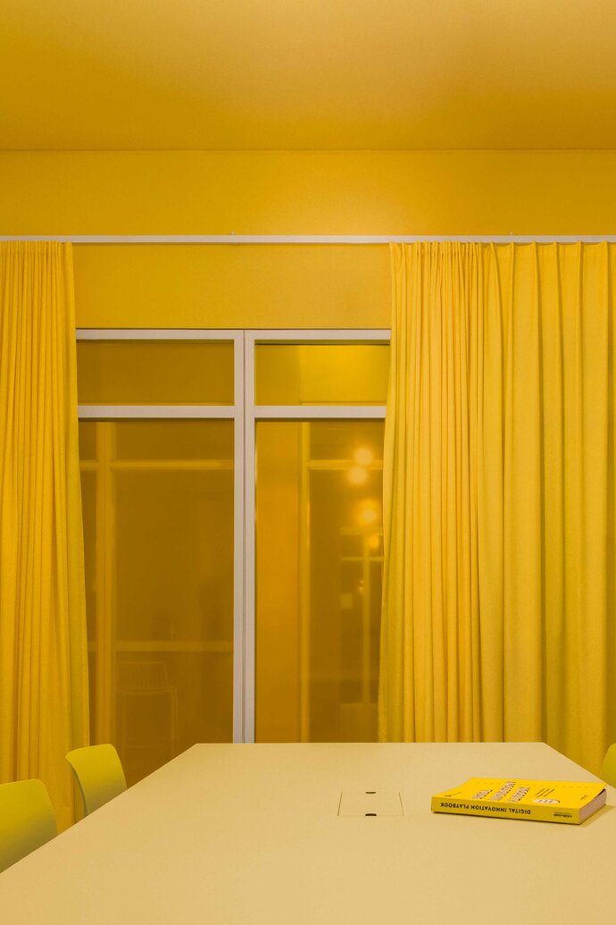
Working with Color! Ester Bruzkus Architekten use a strong color concept to bring the workspace for Futurice into a bright future. The design strategy gives each team space its own distinctive color: everything in the team rooms is unified by a common hue - wall paint, carpet, furniture, lighting, film on corridor glass panels, and fabric curtains. Custom meeting tables are made from painted steel frames with linoleum tops in different colors; workshop chairs have been purchased in the different colors of the rooms. As employees walk along the corridor, the team rooms present themselves a diverse choice of colorful and surprising shop windows.
The design strategy echoes the innovation consultancy Futurice’s own corporate mission: to improve communication and collaboration with new ways of working. Since collaboration with colleagues and with clients is so critical to the work that Futurice does, the team rooms receive most of the design attention: meeting rooms, phone booths, welcome areas, printer areas, storage spaces, kitchens, and multifunctional spaces - rooms for meeting in person as well as for conference calls. The focus on colorful team spaces is also a cost-effective strategy designed to maximize the impact of the renovation budget: individual work spaces are left more muted to be a deliberate contrast to highlight the importance of collaboration and teamwork.
The transition from the hallway into the team spaces receive special design attention. A quarter-circle sweep of the door marks the entrance to each team room as the floor color changes to toned carpet. Colorful fabric curtains also play an important role in the design of the team rooms. In each room, differently colored curtains create a soft plane of fabric along the corridor window and introduce acoustic dampening, potential privacy from the hall, and a soft domestic touch. By simply drawing the curtains, the users can transform the feeling of each team room.
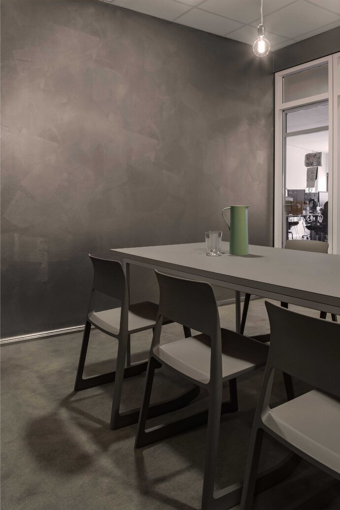
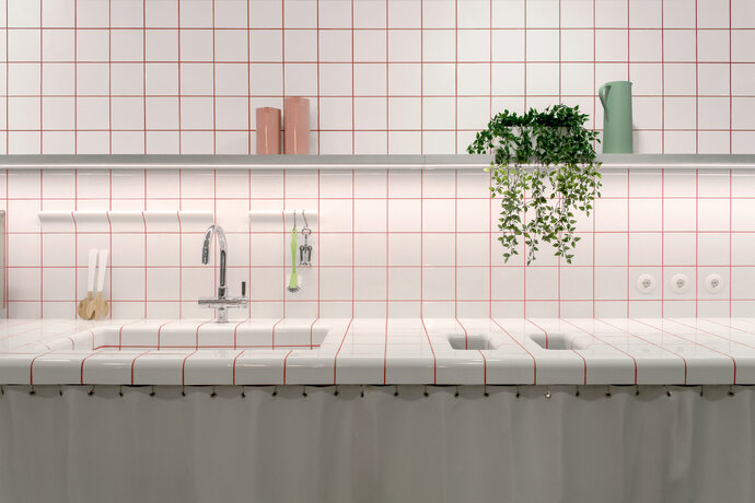
At the center of the office is the cheerful communal kitchen. Here, all the employees come together – and all the colors come together. When you mix all colors of the meeting rooms you get gray, so a gray kitchen works as a neutral background for colorful chairs and colorful cabinet door handles. All the colors are brought together by the red lines of the steel table supports as well as the grout between the tiles.
A large room on another floor has been developed as a multi-function space and company canteen. In addition to the color concept coming together in this space, an existing ceiling has been transformed by a dense installation of Japanese paper lamps. An extra-long curtain can separate the kitchen space from the assembly space for big event events and conferences – or to just change the mood. Movable folding tables and stacking chairs can be rearranged to generate different scenarios - lunch breaks, skype meetings with other companies, game nights, lectures, all sorts of events.
Using bright colors, custom furniture, clever purchases and cost-effective transformations, Ester Bruzkus Architekten have enlivened, unified and updated the collaborative workspace for Futurice.
| Location: | Berlin, Germany |
| Year: | 2019 |
| Client: | Futurice GmbH |
| Area: | 550 sq m |
| Scope of work: | LPH 1-9 Interior Design, Furniture Design |
| Photography: | Jens Bösenberg |
| Team: | Ester Bruzkus, Peter Greenberg, Stephanie Meine, Ana Knežević, Dana Mikoleit, Minwon Kim |
Refreshing as a dip in the pool! For the design of an American Poke restaurant in the Mitte part of Berlin, Ester Bruzkus Architekten have designed the interior of the new restaurant L.A. Poke without resorting to predictable or sentimental iconography. "We were inspired by the chill mood of the American West Coast," says architect Ester Bruzkus. So the design idea was to make a Poke restaurant that was as relaxed as a day at the pool. Using color and material contrasts, the architects playfully toy with horizon lines, framed vistas and surprising one’s expectations.
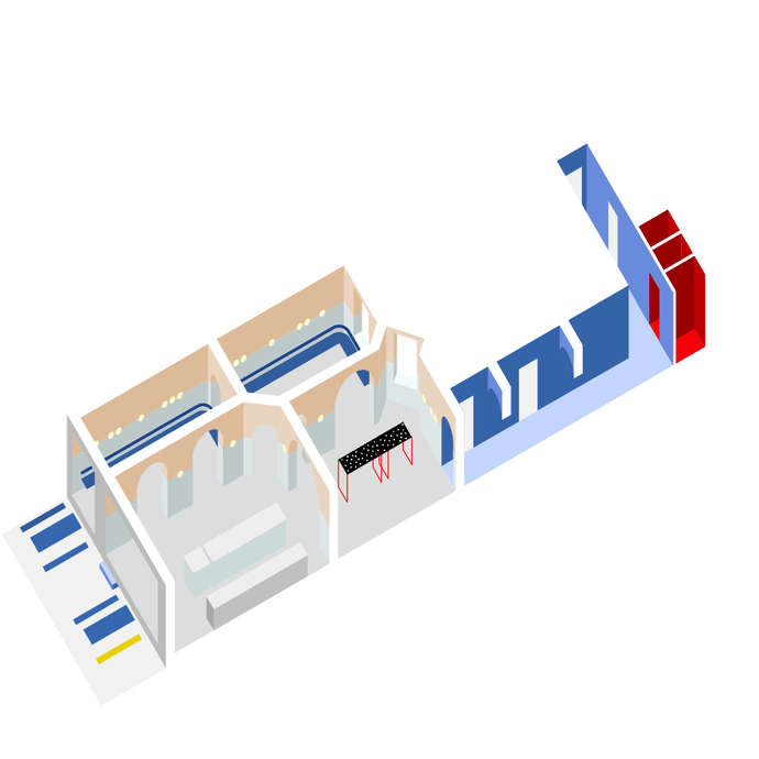
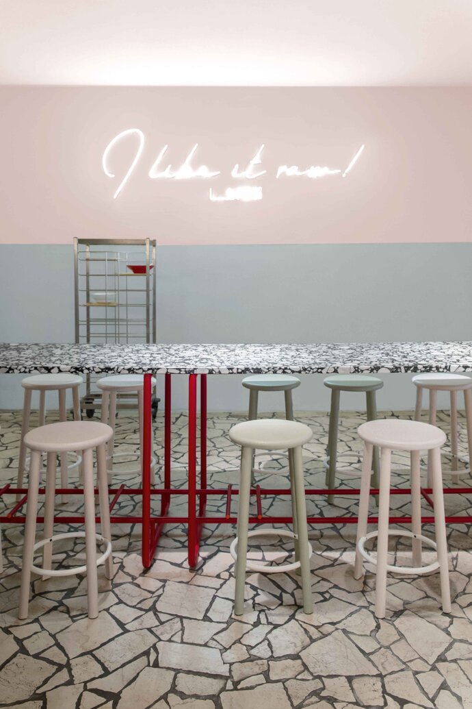
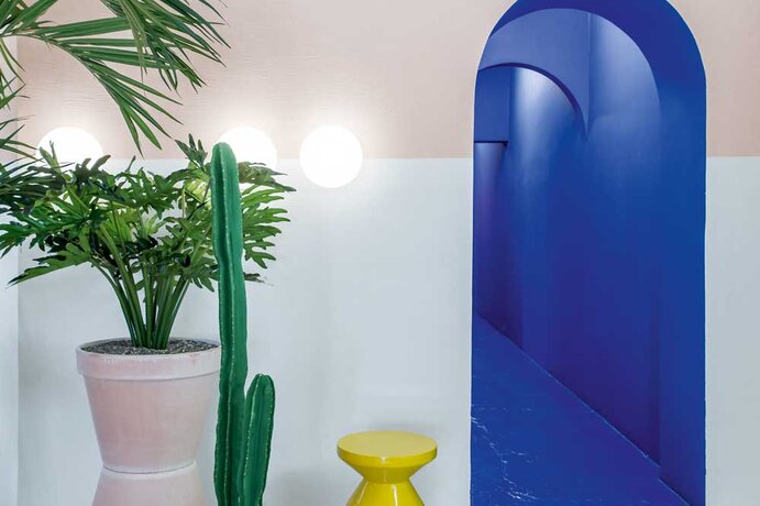
The interior design of the L.A. Poke makes use of contrasts of thick and thin, sharp and soft, curved and straight, rough and smooth. Vistas and views framed by plaster arches bring the eye deep into the space, define open and intimate spaces, and tease the sense that there are mirrors, even though there are not. Another playful use of symmetry is the horizon line that bisects all front rooms exactly at eye level. Here, Ester Bruzkus Architekten play with color and texture: below the line, perhaps it is the pool that is recalled, with blue shades in the Le Corbusier color outremer gris, smooth texture, custom tubular steel furniture and reflective horizontal surfaces. Above the horizon line, on and the walls as well as the ceilings, they use the color terre sienne pâle, this time on a rough surface, which suggests the summer sun striking a clay wall - Le Corbusier describes it as "sandy, subtle and restrained." The two color zones are connected by round outdoor glass lights that sit exactly on the horizon line.
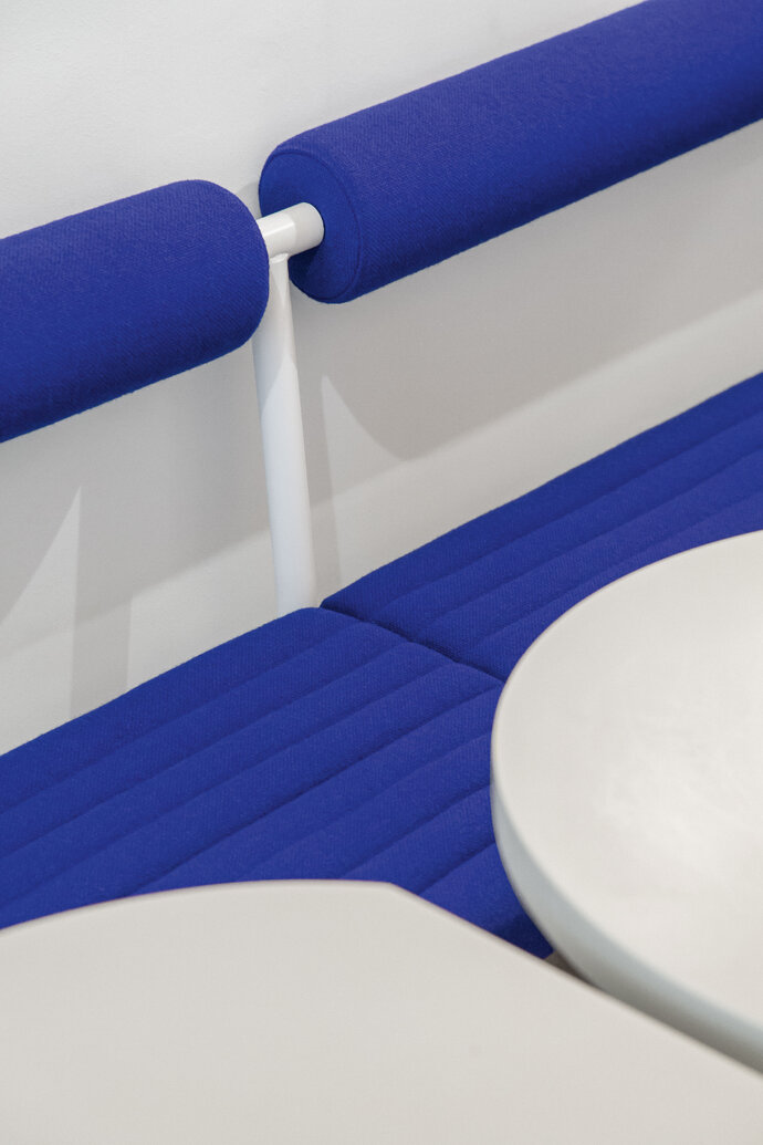
In the seating niches, guests dine on tubular upholstery in Yves Klein blue; the shape is soft and round like an air mattress. In the central room, a large custom table with a red metal frame supports a black-and-white terrazzo top as a colorful and surprising contrast. "I enjoy working with unexpected moments of surprise," says Ester Bruzkus. "This brings excitement to the interior." This attitude is also reflected in the rear of the restaurant: on the walk past the kitchen to the washrooms one is entirely enveloped in the intense glow of the same Yves Klein blue as the seat cushions – on the walls, ceiling and floors. The contrasting bright red toilet rooms are a total surprise. The lively black and white terrazzo is used again as a surface for the sinks.
Besides one wall ornamented with neon script, the only decorative elements in the restaurant are large plants in terracotta pots – and the colorful palette of the poke food choices themselves. Resisting the temptation to resort to predictable narrative decorations, Ester Bruzkus Architekten’s characteristic contrasts of round and straight, thick and thin, restrained and lush, give the interior a playful, relaxed and opulent feel.
| Location: | Berlin |
| Year: | 2018 |
| Client: | L.A. Poke Bowls |
| Area: | 140 sq m |
| Scope of work: | LPH 1-8 Interior Architecture, Furniture Design |
| Photography: | Jens Bösenberg |
| Team: | Ester Bruzkus, Gizzem Cinar, Iwetta Ullenboom, Damla Baykaldi, Minwon Kim |
WINNER of the 2019 FRAME Magazine Awards Entertainment Venue of the Year!
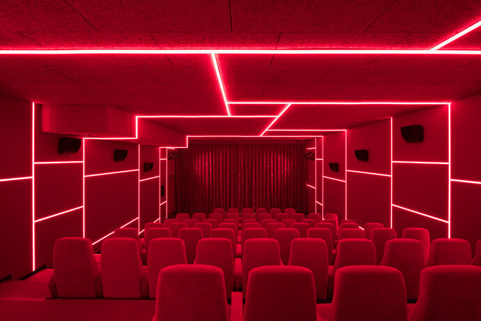
Located among the art and cultural institutions of West Berlin’s Banhof Zoo district, the distinctive cinema for the Yorck Gruppe is designed as a new cultural landmark for independent film. The design concept was to make each hall excitingly different to challenge the idea of a room for cinema as a neutral “black box.”
Each cinema hall has its own colorful and surprising identity, though they are united by careful design details and thematic variations. The inside of each of the screening rooms has its own identifying color and its own characteristic lighting pattern. The interior of one is a deep “theater red”; another is blue, another green, another is pitch black. The exterior of the halls also have their own identities and acta s a kind of individual storfront for each room: the wall of one hall is covered with hand-painted wooden tiles in various shades of pink, while another is covered with knotty pine cladding; others use transluscent polycarboate sheets that refract signage lighting . Textile wall coverings expertly hide sound distribution and dampening materials, ensuring optimal sound separation and audio quality.
Thin strips of lighting are arranged in angular patternst that do not necessarily correspond to the geometry oft he rooms. This lighting strategy unifies the inside of the cinema halls with the public corridors. In the evenings, when the cinema is full of patrons, these striplight reflect in the exterior glass walls to create mirrored patternst that appear to float on the opposite city walls.
The cinema has seven screens, six hundred seats, an extensive public lobby, and two service areas.
| Location: | Berlin, Germany |
| Year: | 2017 |
| Client: | Yorck Gruppe |
| Photography: | Marcus Wend |
| Team: | Ester Bruzkus, Patrick Batek, Martina Durrant, Minwon Kim (for Bruzkus Batek) |
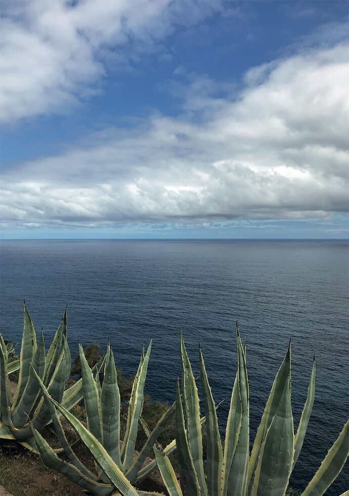
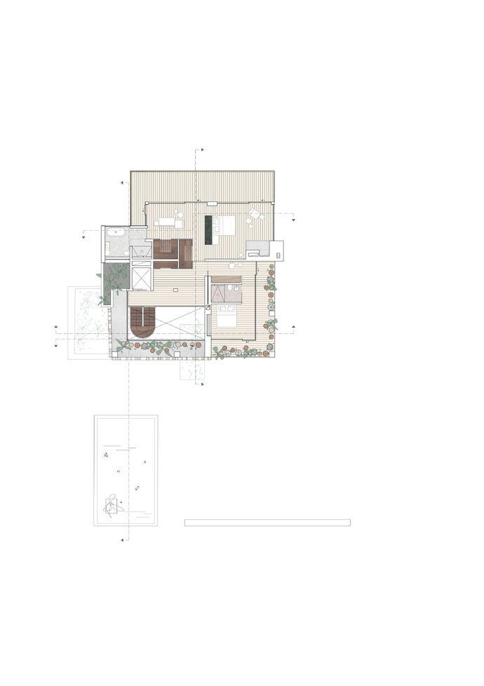
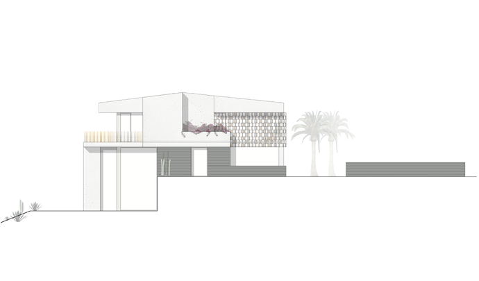
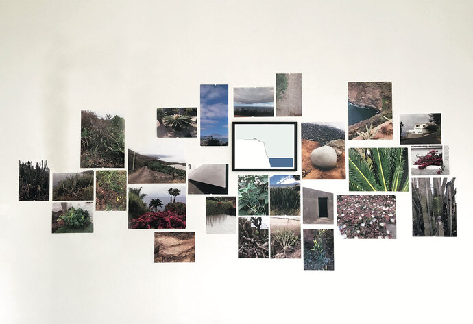
The villa in Tenerife is located on an extraordinary perch overlooking the Atlantic ocean, an immediate view of sun and sea that is divided by the very present horizon line. The challenge of the project was to transform an existing mediocre house that could not be demolished because of strict preservation laws and to integrate it into a newly designed garden of native plants. The approach was to selectively poke holes in the house, to excavate it, and to blur the separation between inside and out, architecture and landscape. Rather than see the existing building as a house in a garden, we saw the garden inside the house and the garden as the house. We literally broke down walls and floors, extended them into the land, and found spatial relationships that introduce immediate views of the outside, flowing circulation patterns, inside gardens, and local volcanic materials used both inside and out. EBA designed both the house and the garden as a continuous open flow of space and material.
| Location: | Santa Úrsula, Tenerife, ES |
| Year: | 2018 - 2019 |
| Area: | 525 sq m house, 3 875 sq m garden |
| Scope of work: | LPH 1-5 Architecture, Interior Design, Garden Design |
| Team: | Ester Bruzkus, Peter Greenberg, Gizzem Cinar, Martina Durrant, Stephanie Meine, Damla Baykaldi, Ana Knežević |
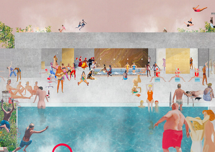
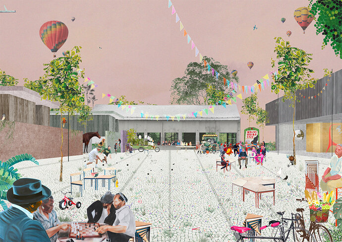
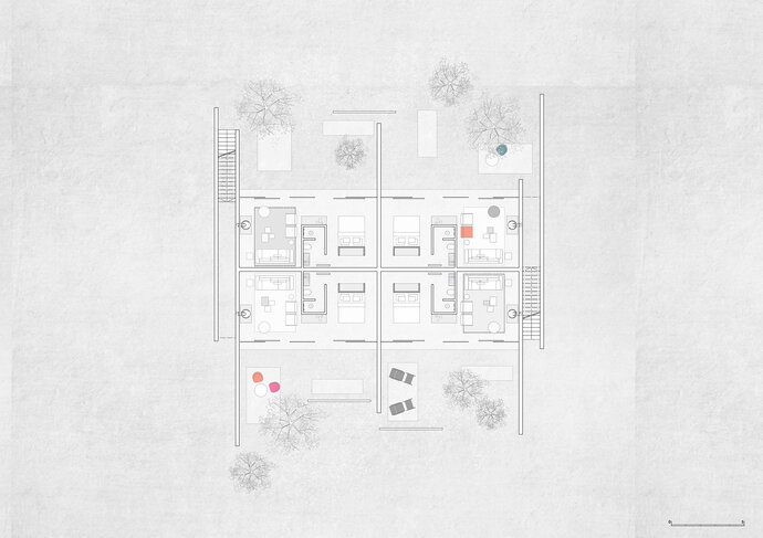
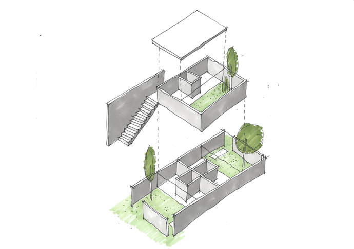
The invited competition asked how to reimagine an estate of lakeside forested land with existing structures from many phases of German architectural history as a private retreat center, spa, conference facility, and family home. EBA’s design proposes to unite distinct areas of the site with a sweeping path to connect all the buildings with the lake - but also to create separate precincts for guests, a clubhouse for gatherings, a shared spa facility, and a family house transformed from a very ugly building into something surprisingly transparent and amazing. Originally built as a retreat for the Stasi secret police, the institutional hotel building was to be stripped of its plattenbau down to its concrete structure and built up again by selectively removing floors and walls and introducing surprising spatial relationships and direct contact between the inside and out. The interiors of the adjacent original Manor House were to be transformed with an approach of Both/And: by retaining the character of its historic architecture but challenging it with modernist flow and contemporary fixtures. Rooms for overnight guests were designed in a separate area of the site as aggregate courtyard houses each with their own walled garden, inside and out separated only by a plane of glass. A neighboring conference area defined a series of plazas, gardens, and shared spaces for many uses. Together, the ensemble was intended to create a dialogue between structures and sites to bridge across time.
| Location: | Gühlen, Brandenburg, DE |
| Year: | 2019 |
| Area: | 6 040 sq m residential buildings |
| Scope of work: | Invited Competition Winner |
| Awards: | Invited Competition Winner |
| Team: | Ester Bruzkus, Peter Greenberg, Lucia Amaddeo, Henrieke Kayser, Laios Sotirios Vittis |
Star Chef Tim Raue’s dream for his first restaurant was an architecture that “should be as precise and clear as my dishes.” It took a mere fourteen weeks to transform the former Crone Art Gallery into a restaurant that reflects this chef’s culinary style: sophistication scaled down to the essentials. The restaurant is divided into a “white cube” on the ground floor with a “black box” below. In the white cube, oiled walnut tables stand on a polished mastic asphalt floor surrounded by differing tones of blue. Benches in Prussian Blue frame the boundaries of the space.
Down the stairs, the salon is furnished with brightly colored carpets and oiled walnut slats. Here guests can have an aperitif in an intimate atmosphere illuminated by a sky of 500 light bulbs. On special request, guests are welcomed into the show kitchen at the bar’s white Carrara marble counter to have a private dining experience. The highlight of the restaurant is the “Krug Table” with its hand made metal marqueterie. Made of the same oak typically used for champagne boxes, its location directly next to the kitchen allows guests a perfect view into the interior of Tim Raue’s sanctuary.
| Location: | Berlin, Germany |
| Year: | 2010 |
| Client: | Marie & Tim Raue |
| Area: | 280 sq m |
| Scope of work: | LPH 1-9 Interior Design |
| Photography: | Wolfgang Stahr |
| Team: | Ester Bruzkus, Patrick Batek, Felix Bentlin (for Bruzkus Batek) |
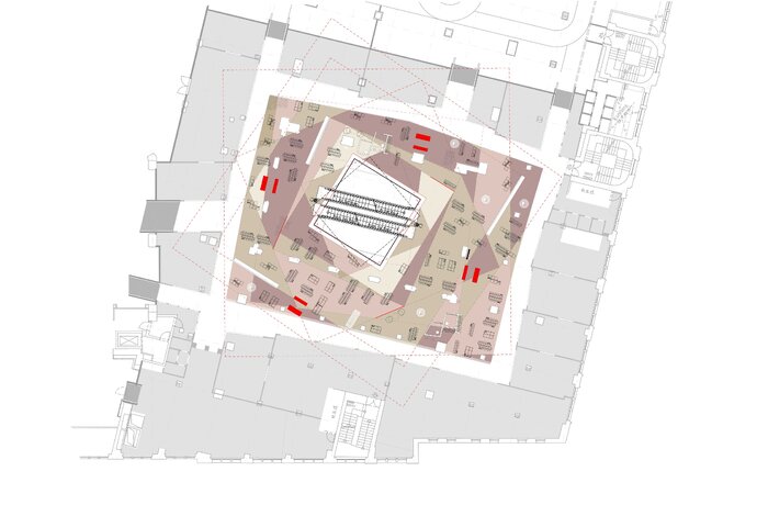
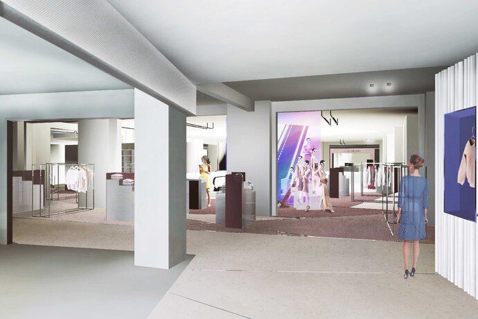
The design of the interiors for the KaDeWe Flagship Retail for the contemporary women’s fashion department is an ongoing collaboration between Ester Bruzkus Architekten and Batek Architekten. The project will transform the inside of Berlin’s premier department store by creating a new marketplace in the European tradition of innovative urban retail architectures: market squares, plazas, arcades, and high streets. These dense centers of exchange are defined by edges, paths and colorful displays and the new planning introduces a contemporary vision of a "street" between "façades" of contrasting materiality, surrounding an open "marketplace" - all marked by color, texture, transparency and reflectivity.
The design begin with OMA’s Master Plan which separates the building into four quadrants, each with its own distinctively geometric atrium. The planning of the fashion area rotates and overlaps the OMA square to offer users angled views and to establish inner and outer planning zones. The outer zone will be defined by façades for the different brands that will have distinctively different material presences: metals, polycarbonates, laminates, colored glasses, etc. The inner zone becomes a "marketplace" of lower, more open and transparent fittings.
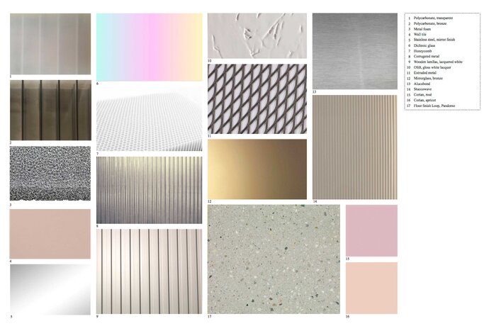
The overall space will have a distinctive material presence: major separation walls will be made from polychromatic glass which change their level of transparency based on where one views it from. Each shop facade will be composed of its own distinctive material. The bespoke furnishings of the interior will screen off the atrium to make rooms-within-rooms that simultaneously create transparency and space definition. The rich material palette of extruded and foamed metals and resins is contrasted with special polychromatic elements to suggest featured moments of product presentation.
| Location: | Berlin, Germany |
| Year: | 2016-ongoing |
| Client: | KaDeWe |
| Area: | 1 945 sq m |
| Partner: | Batek Architekten |
| Team: | Ester Bruzkus, Patrick Batek, Anke Müller |
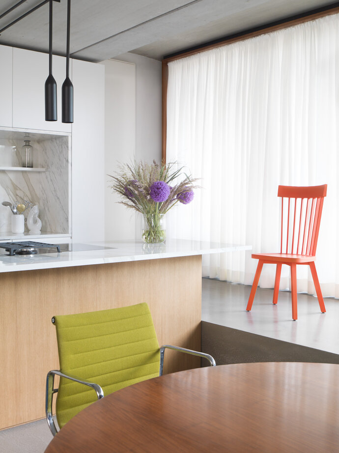
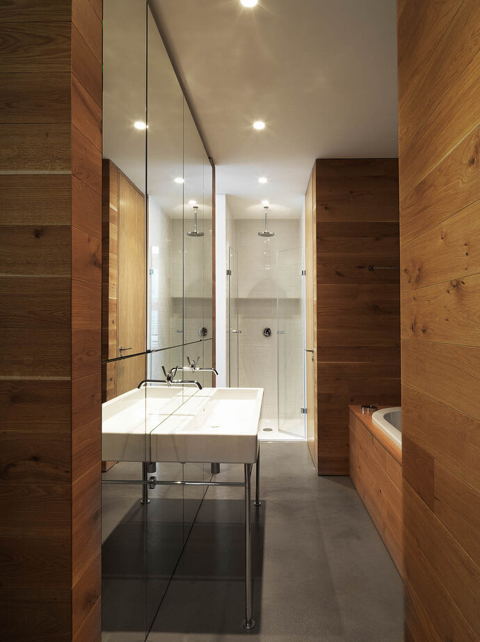
EBA’s first apartment in the building totally transformed the original idea of the flexible loft by introducing a series of fixed and specific boxes made from rich materials and colors: white statuario marble, warm woods, deep pinks, jet blacks: all contrasted with the exposed concrete. While the ceilings were left as the underside of the prefabricated concrete structural members, the original bright blue epoxy was coated with a cool gray concrete topper. The idea is that the cool palette of the parallel planes of concrete offsets and contrasts with the warmer palette of color and material. And unlike the original open generic loft, rooms would be introduced of specific and different characters. For example, in contrast to the public spaces which are sandwiched between planes of concrete, the sleeping area is located on a raised platform near the windows where all surfaces, including ceiling and floor, are clad with warm oak – in panels, planks and slats. Inspiration for the wood sleeping box came from the traditional Japanese house where changes in room heights are used to differentiate public from private space.
The apartment is inside one of the very first ground-up buildings built in the Prenzlauer Berg neighborhood of East Berlin after the fall of the Wall. The apartment house, originally designed by Wolfram Popp, creates flexible and open lofts with raised platforms at the windows called estraden. The original material palette consisted of bright blue epoxy floors, wood exterior doors, metal grating and exposed concrete. EBA’s design completely transformed the generic open loft into a set of specific and richly material spaces.
| Location: | Berlin, Germany |
| Year: | 2014 |
| Client: | Ester Bruzkus |
| Area: | 107 sq m |
| Scope of work: | LPH 1-9 Interior Design, Furniture Design |
| Light: | PSLab |
| Photography: | Jens Bösenberg |
| Awards: | Finest Interior Award 2014 |
| Team: | Ester Bruzkus, Zlatan Kukic |
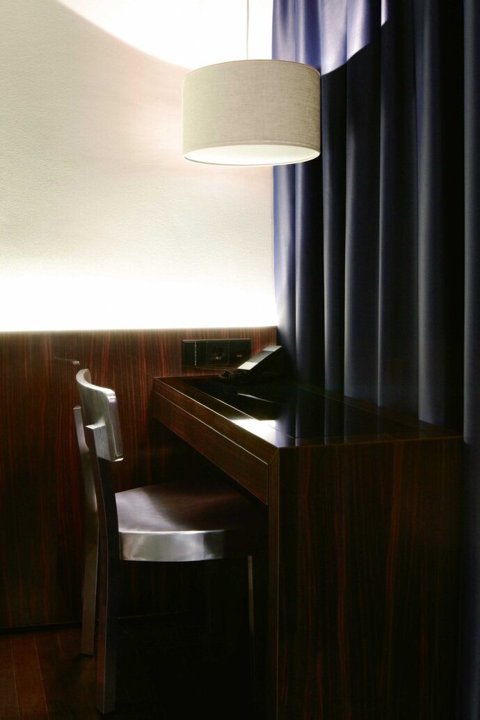
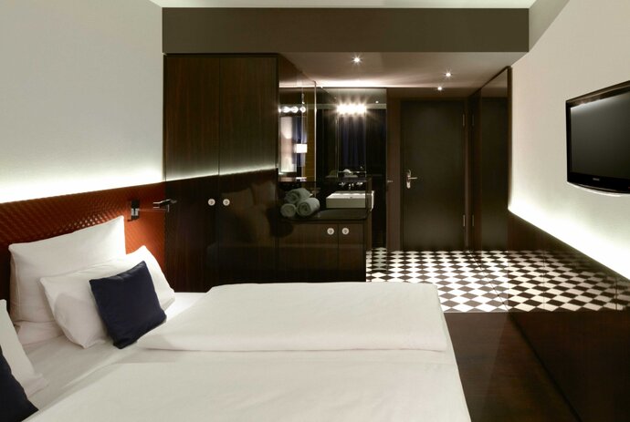
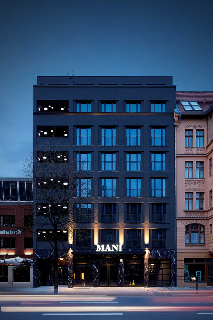
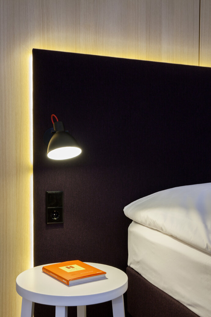
A dark and reflective palette is used to make the stylish interior of the compact boutique hotel. The material palette is dominated by glass, polished wood walls, leather, wood parquet, and marbles to create a sultry ambiance for hanging out and dining in. On the exterior, the unadorned dark gray façade contrasts with the surrounding buildings, and guests enter through a dark marble base that boasts its innate material opulence through simple detailing. Inside, the public spaces offer a dark and seductive sequence of reflective surfaces that lead past the day-lit library and reception area, through the glossy ebony-lined bar and open kitchen to a sculptural fireplace of green marble and glass. This fireplace occupies the center of the restaurant that opens laterally to a jungle-like courtyard garden. Upstairs, the 63 guest rooms are carefully detailed in contrasts of dark and light, ornamented with woven leathers, dark woods and reflective materials.
| Location: | Berlin, Germany |
| Year: | 2011 |
| Client: | Amano Group / R&S Hotelbetriebsgesellschaft mbH |
| Area: | 63 rooms 320 sq m |
| Scope of work: | LPH 1-9 Interior Design |
| Photography: | Attila Hartwig, K+W Photography |
| Team: | Ester Bruzkus, Patrick Batek, Sabrina Cegla, Christian Raukatz, Denise Schulz (for Bruzkus Batek) |
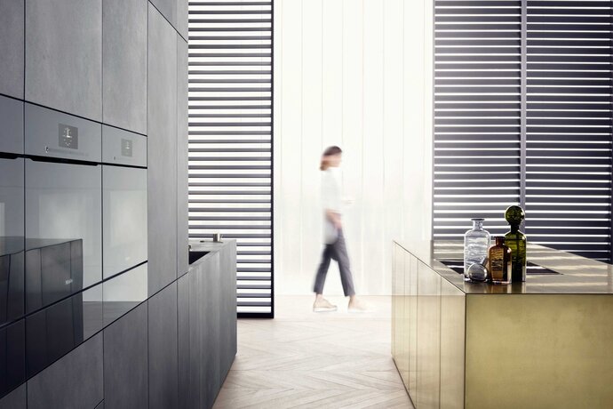
Set designs for Miele's Artline were used to present the new Miele products. Photographs of the sets were used in international campaigns to advertise Miele's top-of-the-line minimalist products.
| Year: | 2015- |
| Client: | Miele |
| Team: | Ester Bruzkus, Lukas De Pellegrin, Julia Mair, Minwon Kim (for Bruzkus Batek) |
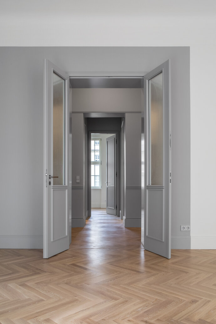
A modern dream of old Berlin! Inside the historic Haus Cumberland in Berlin-Charlottenburg, Ester Bruzkus Architekten have created an apartment that interprets a historical sense of quality and space with contemporary materials, color and exquisite detailing. The design vocabulary is made from a refined palette of rich materials to translate tradition into a modern idiom: thin, opulent, modern and elegant.
The Haus Cumberland had undergone many uses and alterations since its construction in 1911 - grand hotel, post office, government ministry, cinema, film set - so the first challenge was to reestablish the apartment’s grand original planning order and sense of scale. A central hall organizes the apartment and leads to spacious and bright light-filled rooms. The hall is designed to be a minimalist modern interpretation of the old space - unifying tall doors emphasize the majestic original height, custom panel detailing recalls traditional craft in a contemporary idiom, and integrated wardrobes transform the thickness of the walls into fine cabinetry.
The color in the cabinetry unifies the hallway core with a single gray tone. The gray is also introduced as fields of color just inside the brighter exterior rooms which otherwise have a warm white tone. New oak herringbone parquet integrates the apartment with a pale, cool consistent flooring. Color and careful detailing calmly and elegantly unify doors, cabinetry and rooms across the apartment.
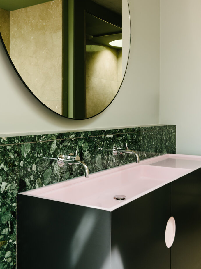
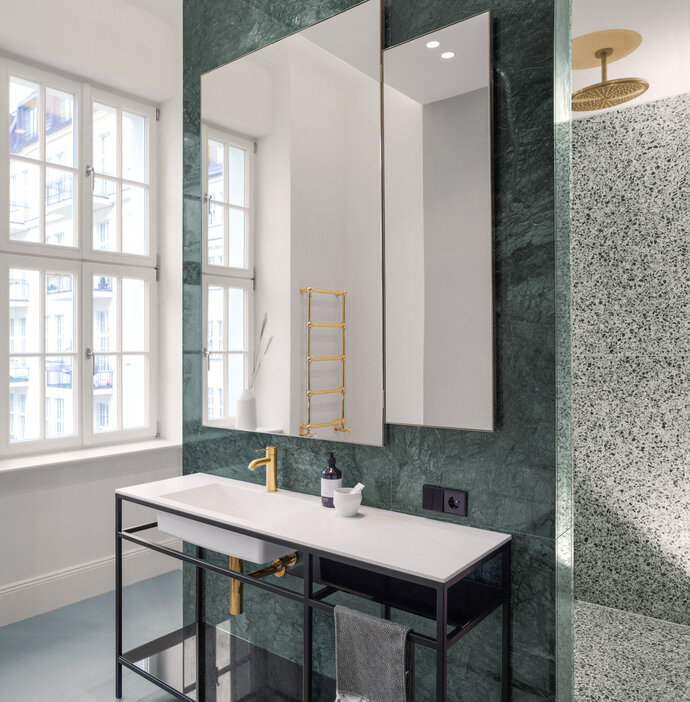
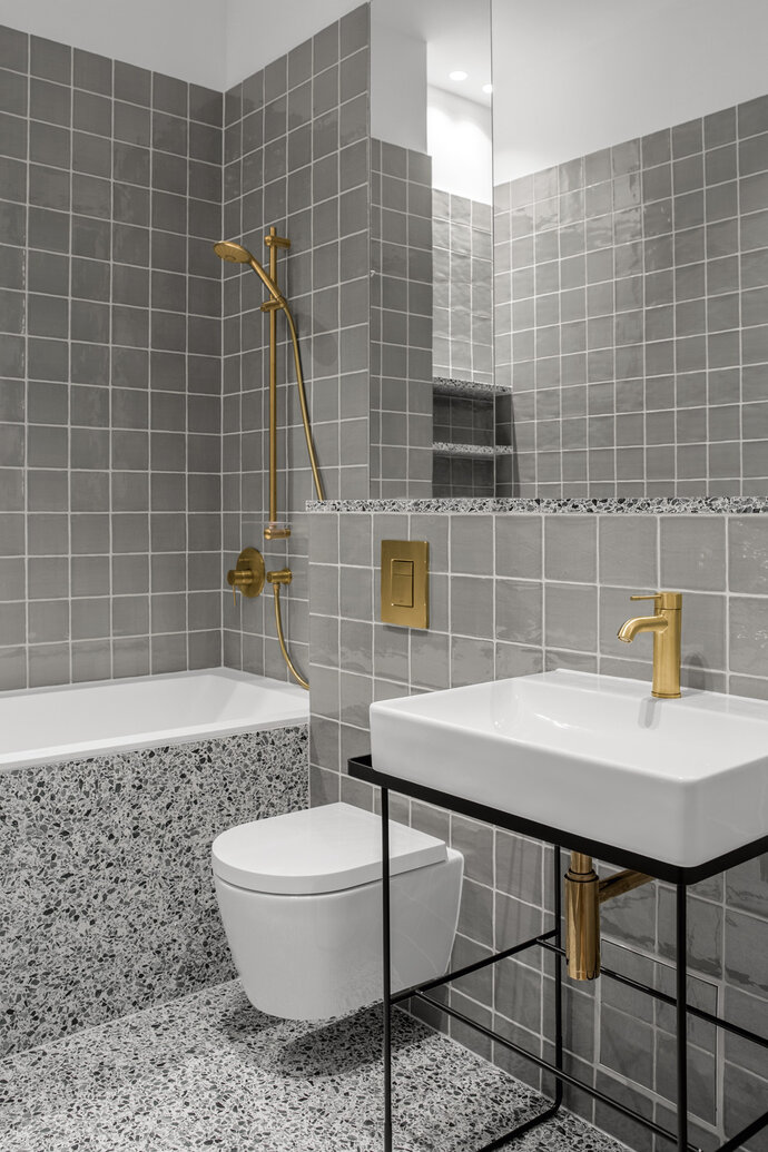
The two bathrooms are opulent compositions of lush material contrasts and surprises. The master bath is composed from green marble and terrazzo, textured glass, and custom mirrors and sink basin. In the other bath, one finds sage-colored ceramic tiles, terrazzo and mirrored glass. Restored stucco ceilings and contrasting simple clean planes emphasize the play between old and new.
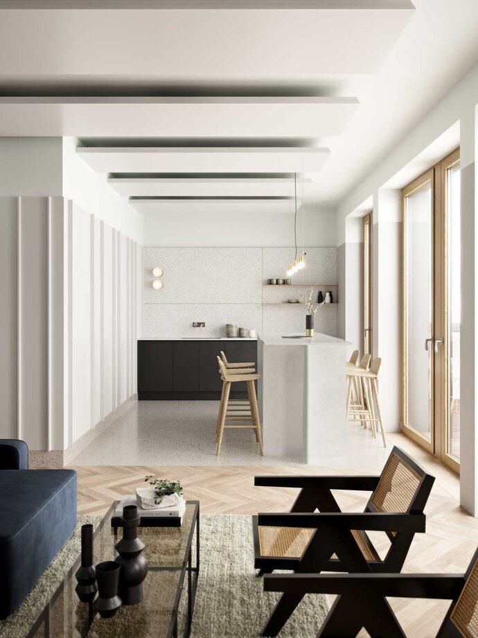
The kitchen is an explosion of spectacular black and white granite - with a pattern that recalls Jackson Pollock’s black splash paintings. The kitchen cabinets share the detailing of the core hallway and doors so that it is treated like an elegant piece of built-in furniture to anchor a spacious and open kitchen/living/dining area.
Throughout the apartment, exquisite detailing and material selection offer a minimalist interpretation of an old possible design. A modern dream of an old Berlin that is the best of old and new.
| Location: | Berlin, Germany |
| Year: | 2018 |
| Area: | 155 sq m |
| Scope of work: | LPH 1-9 Interior Design |
| Photography: | Jens Bösenberg |
| Team: | Ester Bruzkus, Iwetta Ullenboom |
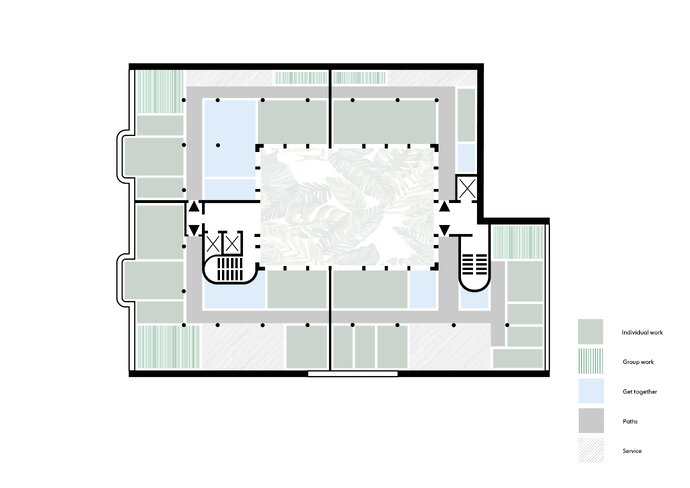
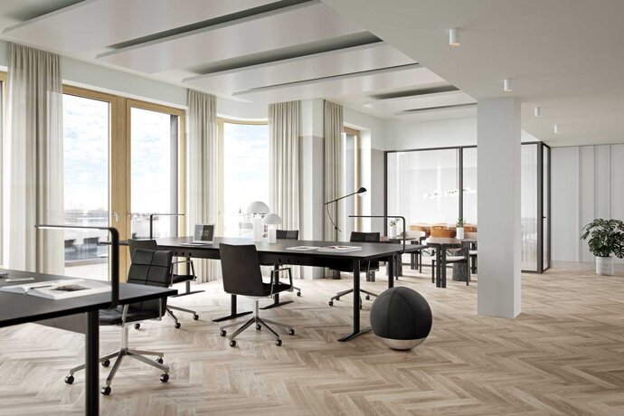
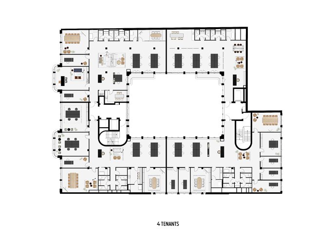
To help their potential clients envision modern high quality office space, the Becken Development Group asked Ester Bruzkus Architekten to plan and design the same office space for various kinds of tenant users. We developed different schemes with the same furniture components to optimize the flexibility, individuality and team spirit for different kinds of work styles.
Different plans accommodate those firms whose work involves mostly collaboration to those whose work process requires focused, concentrated individual work. Or, like many contemporary offices, a complex mix of all of these ways of working, together with kitchens, planned and spontaneous meeting spaces, relaxing social areas. The plan alternatives also demonstrate how a tenant could use an entire floor, or parts of any floor.
The designs represent our understanding of how contemporary work is done and how well-planned workspace can enhance a company’s effectiveness, reinforce employee satisfaction, and project the right image to new customers.
We developed a menu of architectural components where, with our guidance, each tenant can select the appropriate mix of interior design elements that is appropriate for their work process. There is a kit of parts for individual work, group work, social spaces and service spaces - each with a specific set of furniture components and work accessories.
The workspace at Neo also combines Ester Bruzkus Architekten’s extensive experience with hospitality design. These offices are designed with the sensibilities and service concept of a fine hotel - options for open kitchen blocks, hot-desking, and comfortable lounges.
| Location: | Knesebeckstraße, Berlin, Germany |
| Year: | 2018 |
| Client: | Becken Development GmbH |
| Area: | 8 000 sq m |
| Photography: | Eve Images |
| Team: | Ester Bruzkus, Peter Greenberg, Iwetta Ullenboom, Minwon Kim, Ana Knežević |
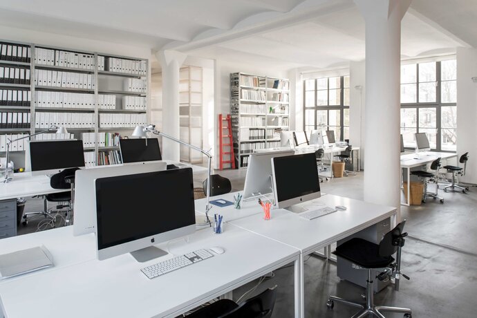
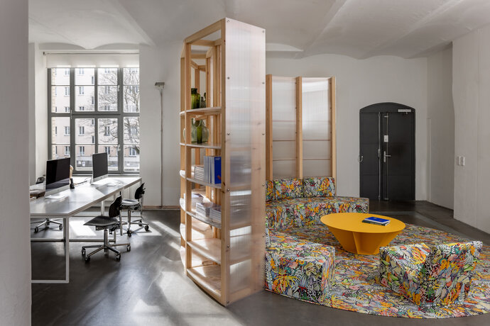
Our own offices convert the space of a 19th century former chocolate factory in Berlin Mitte. Precise spatial and material interventions transform the industrial loft into effective work space by introducing a limited palette of solid and translucent materials. Two opaques “boxes” structure the main office space: the white box houses offices and meeting rooms; the black box conceals the restrooms and the server room. Polycarbonate panels define the kitchen, which is at the heart of the office. Very tall doors approach the vaulted ceilings.
| Location: | Berlin, Germany |
| Year: | 2014 |
| Area: | 300 sq m |
| Scope of work: | Interior Design, Furniture Design |
| Photography: | Jens Bösenberg |
| Team: | Ester Bruzkus, Patrick Batek, Ulrike Wittenbach (for Bruzkus Batek) |
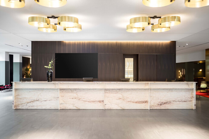
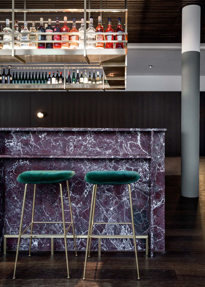
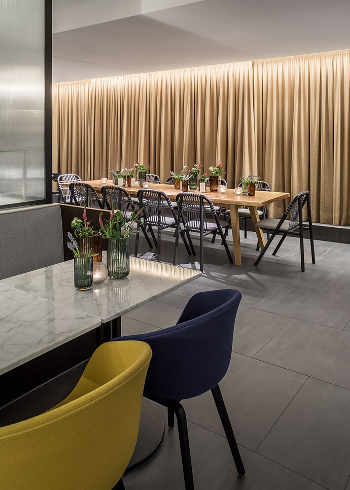
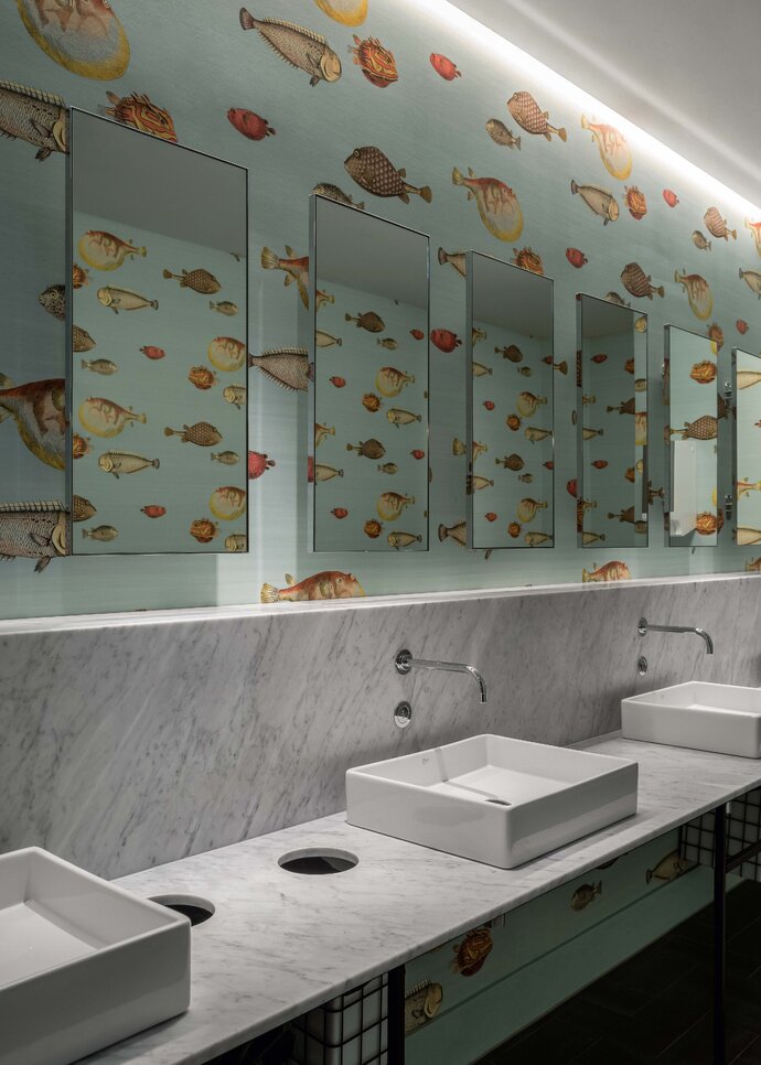
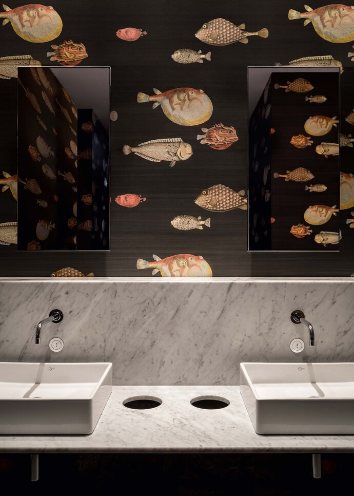
Distinct volumes of rich materials, clearly zoned spaces, and attentive detailing makes the ground floor of the Mercure Hotel in Wiesbaden warm, inviting and fresh. The entrance lobby is designed as a composition of volumes of distinct material identities: the central reception desk is made from pink marble and stands in dialogue with other volumes clad in woods and brass. Farther into the hotel, materials are similarly used to create the lounge, the dining room and the conference center. The bar is detailed in a similar way to the reception desk but is rendered in a deeply veined red marble, also with brass. Black marble window seats merge into steps to make the transition to two outside patios. A third patio area is at the edge of the dining room, which is made from calm gray tones and translucent glass. The bathrooms have the surprise of mixing white marbles with playful wallpapers ornamented with patterns of big fish.
The lighting was designed by internationally renowned lighting experts PSLab. Minimal but expert use of light gets the most important areas to shine. Large illuminated brass light fixtures welcome the guests as they arrive. The brass in both the lighting and the interior architecture compliments the red, pink and green color scheme, and harmonizes with the chestnut paneling and various natural stone counters.
| Location: | Wiesbaden, Germany |
| Year: | 2018 |
| Client: | AP Investhotel Wiesbaden GmbH |
| Area: | 2 700 sq m |
| Scope of work: | LP 1-9 Interior Design, Furniture Design |
| Light: | PSLab |
| Photography: | Jens Bösenberg |
| Partner: | Hochbauarchitekten PSP Weltner Louvieaux Architekten GmbH |
| Team: | Ester Bruzkus, Patrick Batek, Ulrike Wattenbach, Holger Duwe, Iwetta Ullenboom, Julia Mair, Minwon Kim, Alina Holtmann (for Bruzkus Batek) |
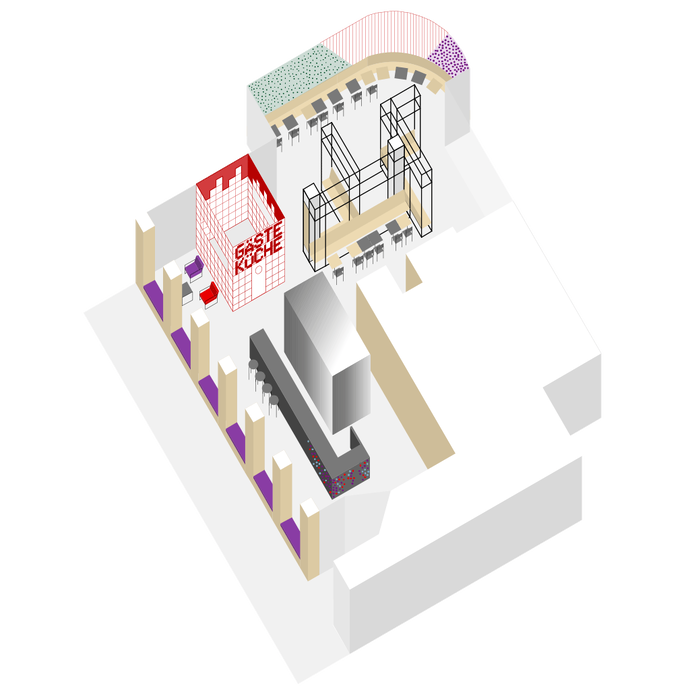
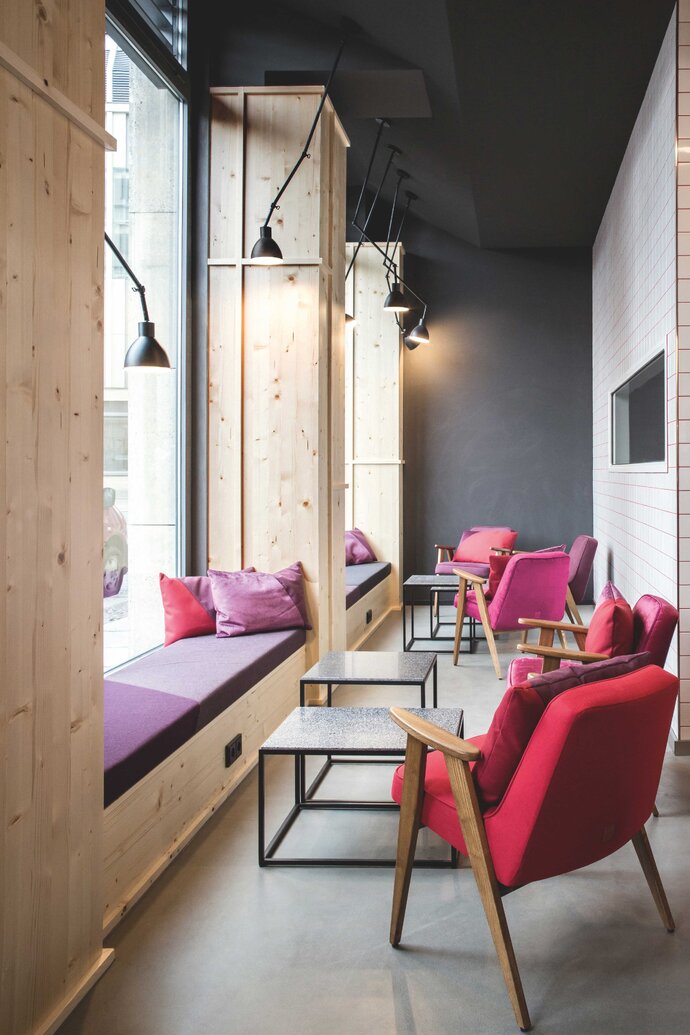
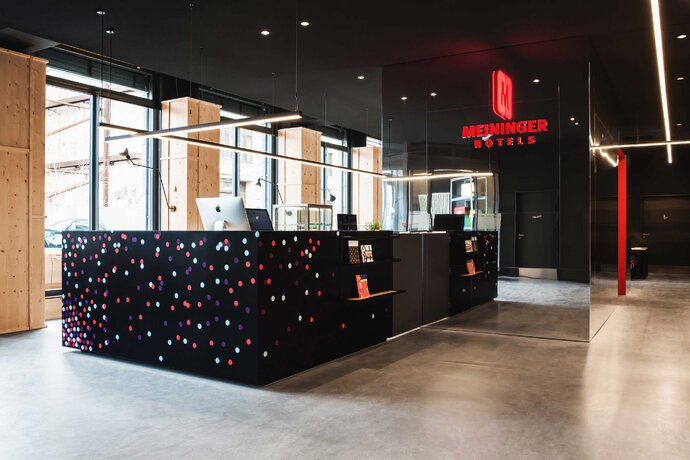
Winner of the 2019 German Design Special Award, Meininger's hotel in Leipzig, a city famous for its artistic dynamism, follows the concept of “art in process.” The hotel design playfully suggest an art project that is not yet complete. Various installations in the lobby invite the participation of the user and encourage guests to help shape its appearance: for example, guests are invited to put colored stickers directly on the black reception desk, gradually altering the appearance of the piece as the days pass.
The design is based on strong material contrasts: the office area adjacent to the reception area is clad in mirrors that conceals functional elements (the bar buffet, self-service refrigerators and storage lockers) and constantly changes with reflections. In the breakfast room one encounters a scaffolding-like piece made of steel tubing and matte lacquered plywood panels called the GameFrame. Colors and patterns and textures and materials meet to create a dialogue between discrete pieces of the design.
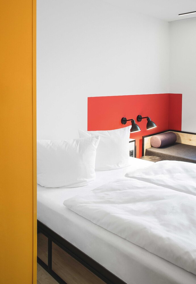
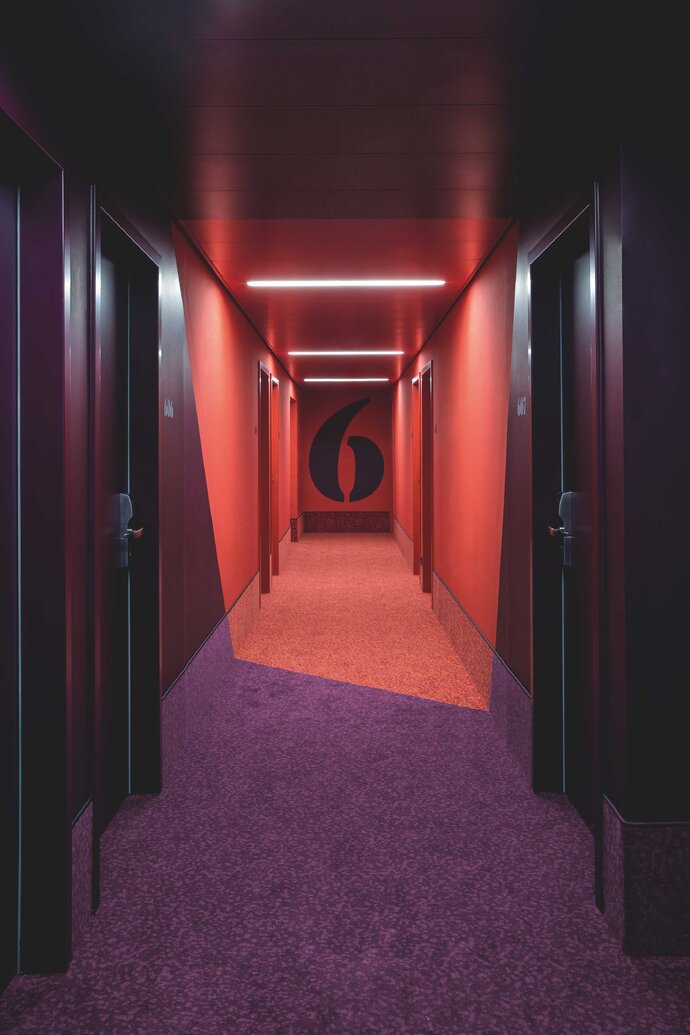
On the floors with hotel rooms, corridors each have distinct colors that extend over the walls, ceilings and floor - and extend into the guest rooms, where they end with the contrasting bright white.
| Location: | Leipzig, Germany |
| Year: | 2017 |
| Client: | Meininger Holding GmbH |
| Area: | 3 265 sq m |
| Scope of work: | LPH 1-5 Interior Design, Furniture Design |
| Photography: | Jens Bösenberg |
| Partner: | Bailey und Bailey (Graphic Design) |
| Team: | Ester Bruzkus, Julia Mair, Martina Durrant, Grégoire Hubert, Dominika Taklova, Minwon Kim (for Bruzkus Batek) |
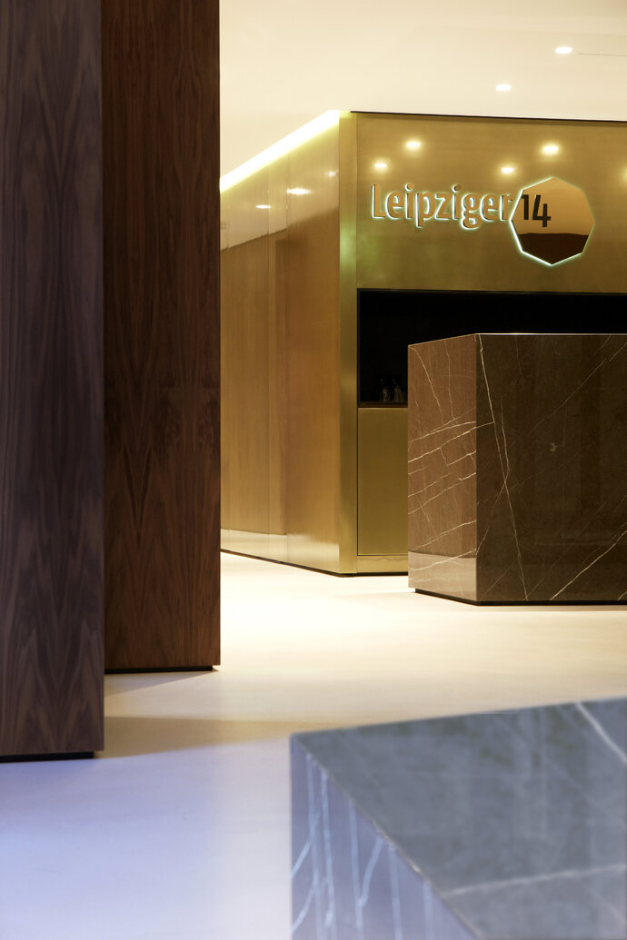
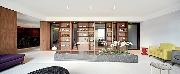
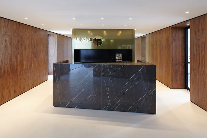
The offices for an orthopedic and physiotherapy practice in Berlin’s Leipziger Platz recall the atmosphere of an elegant hotel lobby more than a waiting room in a doctor’s office.
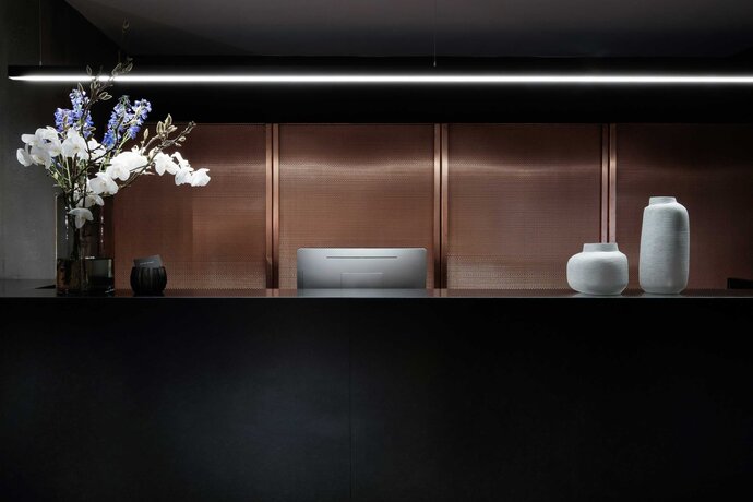
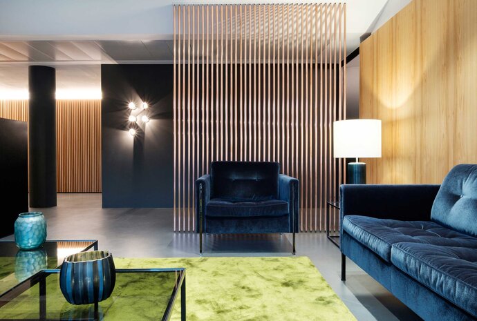
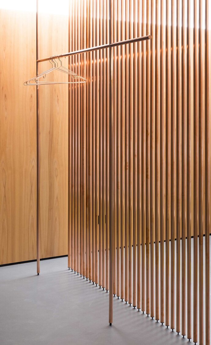
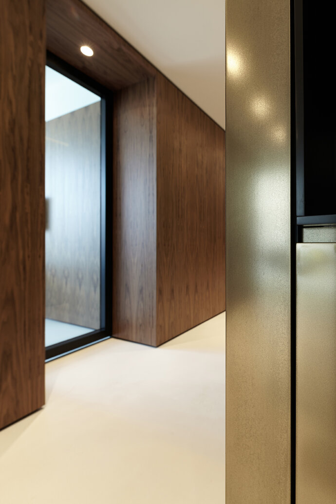
The design results from a dialogue between volumes of distinct material identity. Visitors enter in the center of the space, where they are greeted by the reception desk - a polished cube of black stone. Behind the reception area is an expansive storage area, fronted by copper mesh sliding doors that contrast with the stone of the desk. To the left, a divider consisting of delicate copper tubing stretches between the high density concrete floor and the angled ceiling. The walls are and sliding doors are clad with vertical wooden slats so that they blend together into a rich material plane.
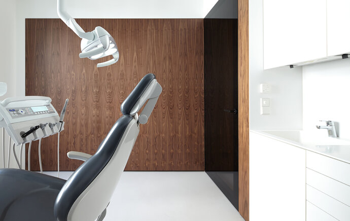
A central hallway runs between the cabins and leads to the treatment rooms, each of which are completely white. Each treatment room has a fully featured fitted medical work area, with Fenix smart nanotech surfacing. The opposite hallway is colored dark anthracite and features light installations from PSLab.
| Location: | Berlin, Germany |
| Year: | 2017 |
| Client: | Eller & Kellermann |
| Area: | 500 sq m |
| Scope of work: | LPH 1-9 Interior Design |
| Photography: | Markus Wend |
| Team: | Ester Bruzkus, Patrick Batek, Martina Durrant, Minwon Kim (for Bruzkus Batek) |
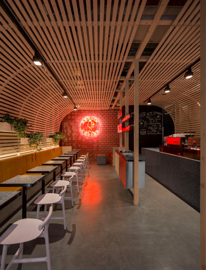
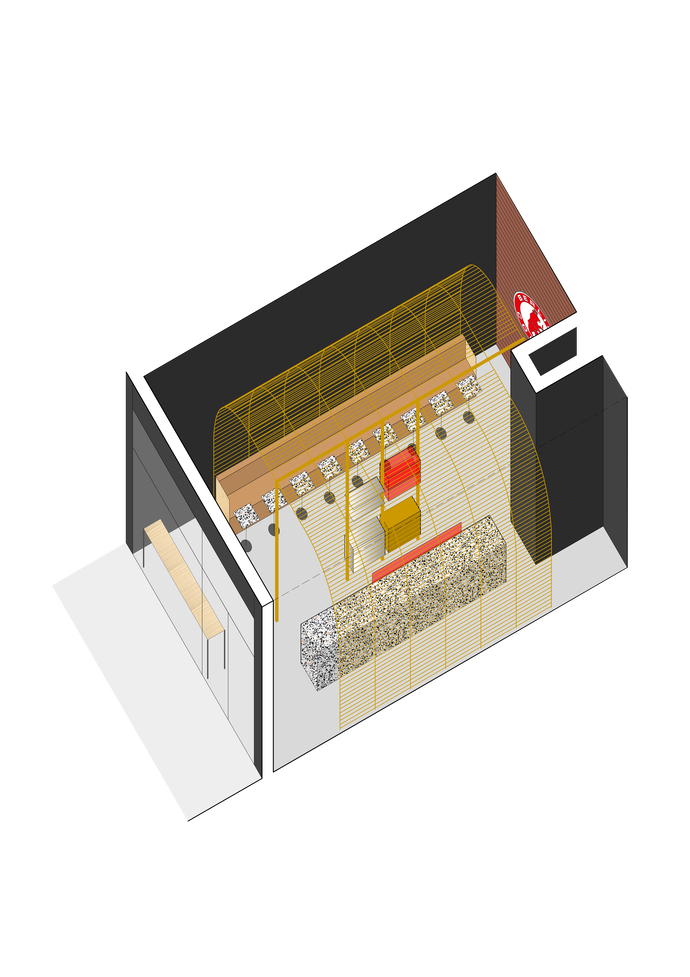
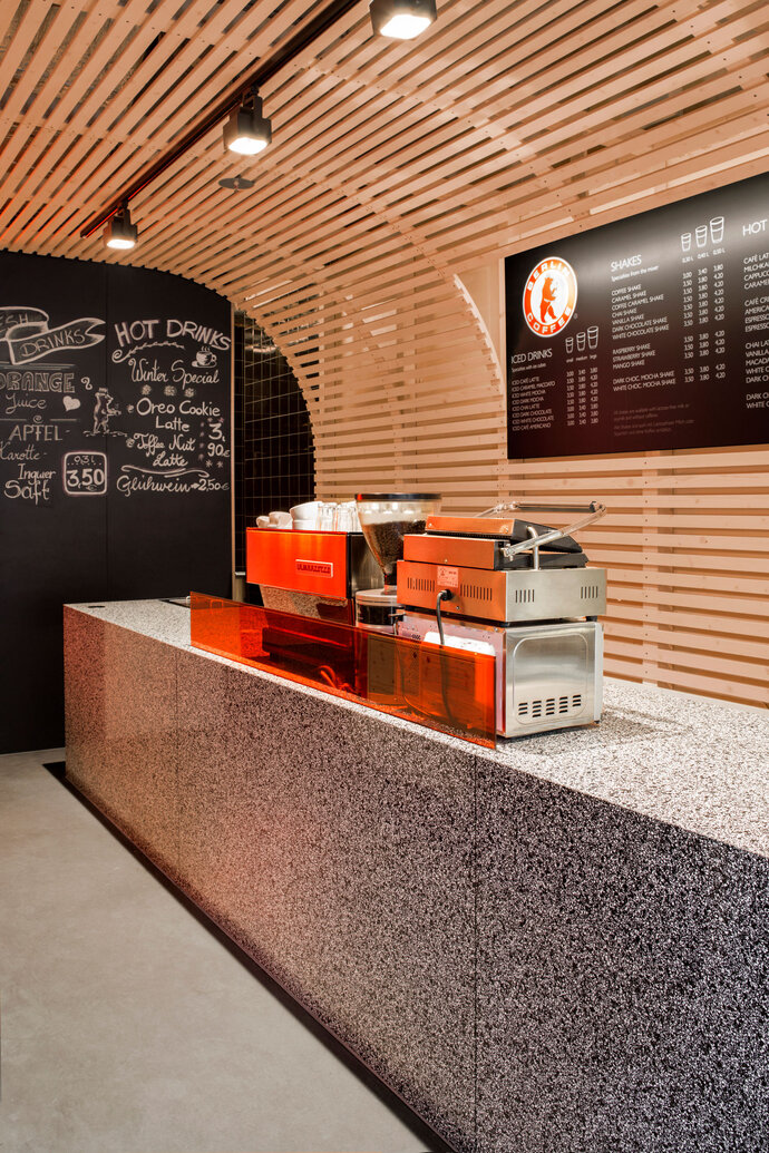
An arched wooden slatted structure was inserted within a simple bare interior space, simultaneously creating clear spatial definition as well as a sense of spaciousness . The walls of the interior space are simply made from a curved grid of wooden slats that frame the red neon-lit logo on the interior wall. A central service bar divides the room into separate zones: a solid terrazzo service counter and a seating area with square tabletops, a brown leather seating unit and individual wooden rose-colored chairs. The wooden slats that form the lattice walls also support planters and other smaller objects.
This small cafe is located near busy Friedrichstrasse, very close to the Gendarmenmarkt.
| Location: | Berlin, Germany |
| Year: | 2017 |
| Client: | Klässig’s Systemgastronomie Holding GmbH |
| Area: | 60 sq m |
| Scope of work: | LPH 1-6 Interior Design, Furniture Design |
| Photography: | Jens Bösenberg |
| Team: | Ester Bruzkus, Patrick Batek, Ulrike Wittenbach, Minwon Kim (for Bruzkus Batek) |
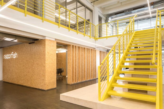
The elements of the new office design enclose the building’s structure without disturbing it, and feature bold, durable, and inexpensive materials.
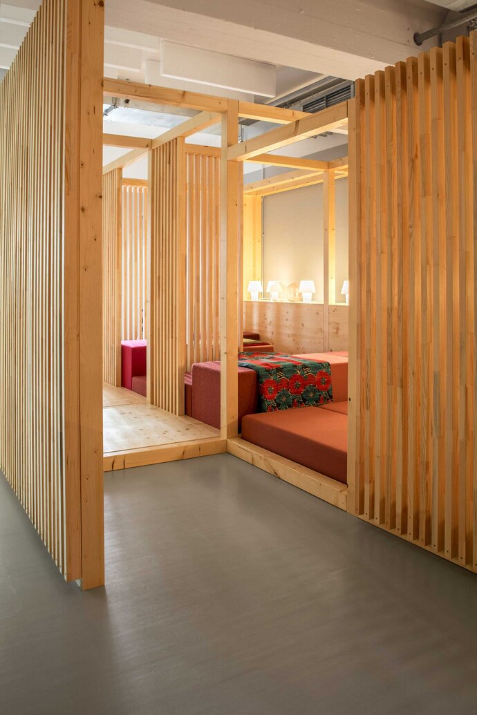
A bright yellow coating transforms an existing stair and a wooden meeting room, wrapped in unfinished OSB, form the center of the new design. The edge of the meeting room has wide vertical wooden slats, providing some privacy but also connection with the rest of the space.
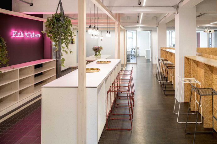
The upper floor houses the actual office space. Light metal framed custom-designed desks create airy workspaces. The kitchen area is the center of the upstairs area and features a long freestanding counter with seating, inviting communication between staff as they enjoy their food or as an informal meeting area. Near the kitchen area is a second staircase that doubles as a seating area that forms the centerpiece of weekly meetings, transforming circulation into an event space.
A wood framed Japanese tea-house style area with soft furnishings provides a more casual space for meeting or informal work.
| Location: | Berlin, Germany |
| Year: | 2016 |
| Client: | Razorfish |
| Area: | 2 500 sq m |
| Scope of work: | LPH 1-9 Interior Design, Furniture Design |
| Photography: | Jens Bösenberg |
| Team: | Ester Bruzkus, Patrick Batek, Anke Müller, Minwon Kim (for Bruzkus Batek) |
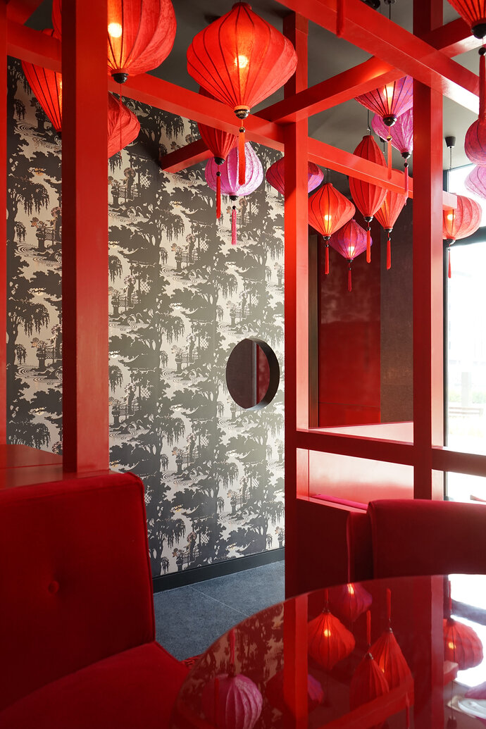
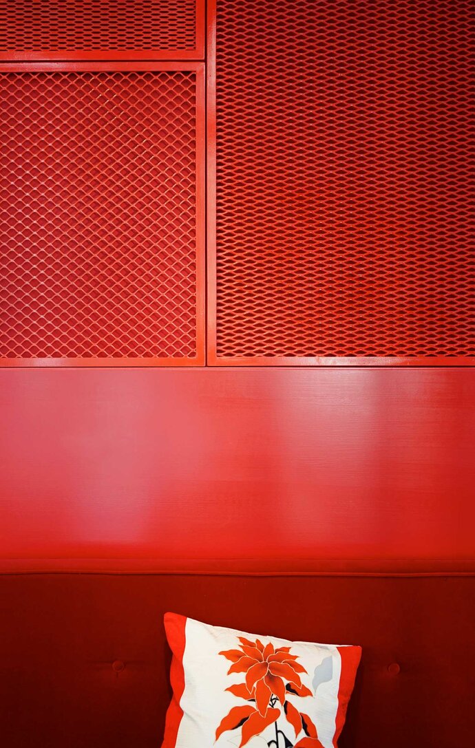
Dragonfly was the first venture outside of Germany from Michelin Star Chef Tim Raue. The design concept recalls the bright red theatricality of the Chinese temple.
The approach of the restaurant’s cuisine is represented in the interior architecture: opulent decoration, vintage Asian furniture, bold colors, and coordinated combinations of simple and lacquered materials. The centrepiece of the restaurant area, which has a two level floor, is a simply constructed bright red pedestal with a framework reminiscent of a classical tea house.
| Location: | Dubai, United Arab Emirates |
| Year: | 2017 |
| Client: | Tim Raue, Meraas Holding |
| Area: | 270 sq m |
| Scope of work: | LPH 1-6 Interior Design |
| Light: | PSLab |
| Photography: | Dragonfly, Anke Müller |
| Team: | Ester Bruzkus, Patrick Batek, Anke Müller, Minwon Kim (for Bruzkus Batek) |
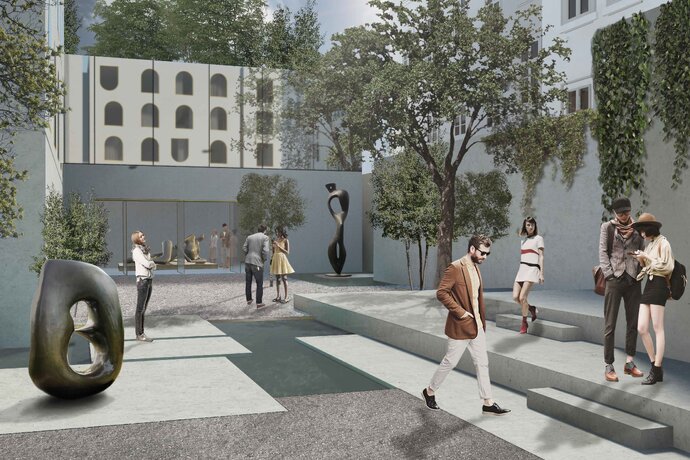
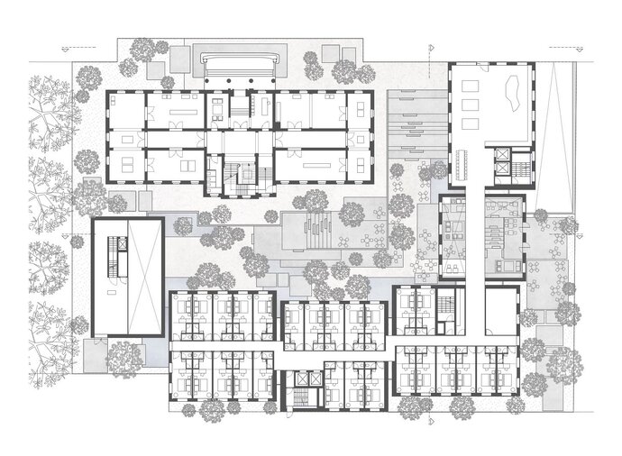
An invited competition for a hotel offered the opportunity to create a design based around a lower internal courtyard. This courtyard was envisioned as an exterior sculpture garden room surrounded by volumes of different materiality: a historic masonry building, plaster-clad hotel suites and an art gallery with a reflective facade.
The mass of the hotel is broken into separately articulated volumes with playful fenestration patterns; the art gallery serves as one edge of the garden and its reflective wall mirrors the image of the garden at the upper level. Garden platforms and wide stairs mediate the difference between the levels.
| Location: | Darmstadt, Germany |
| Year: | 2017 |
| Area: | 11 300 sq m |
| Team: | Ester Bruzkus, Peter Greenberg, Gizzem Cinar, Lukas De Pellegrin, Damla Baykaldi, Dominika Taklova |
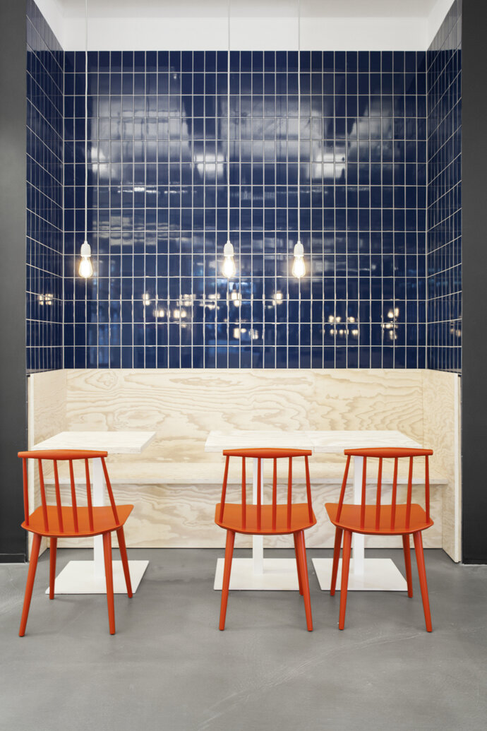
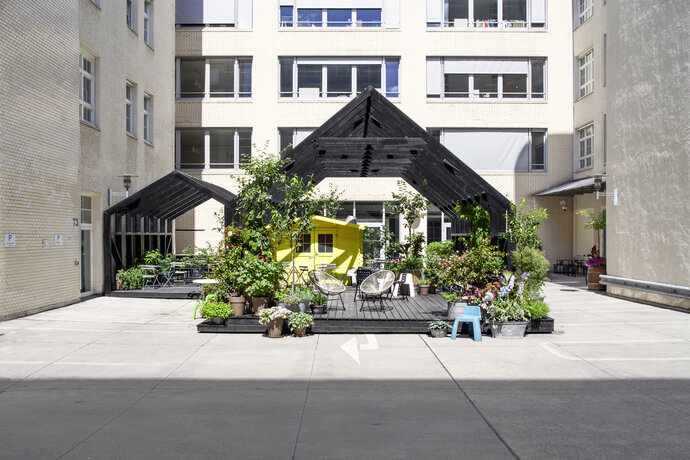
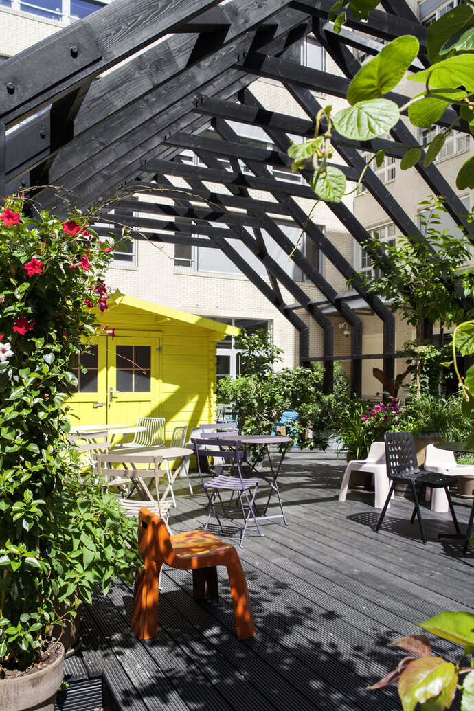
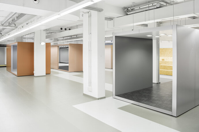
The historic Knorr-Bremse factory in Berlin-Friedrichshain is transformed into a modern canteen and “fashion hub” for online retailer Zalando.
The fashion hub is a central event space that serves as an incubator for creative projects. Freestanding cubes made of different materials - aluminum, copper, tiling or polycarbonate sheeting - provide showcases for the dynamic presentation of new fashion collections. Bright neon lighting evokes the sense of an art gallery, while individual exhibits and points of interest have their own subtle accent lighting.
Seating in the canteen is constructed from inexpensive Oriented Strand Board (OSB) and contrasts with dark blue tile walls and the austere, industrial design of the host building to create both a warm and a cool atmosphere. On the courtyard terrace a large area of wooden decking and bright yellow garden huts extends the interior conversion to the outdoors, providing opportunities for parties and functions as well as for lunch and coffee.
| Location: | Berlin, Germany |
| Year: | 2016 |
| Client: | Zalando SE |
| Area: | 1 000 sq m |
| Scope of work: | LPH 1-9 Interior Design |
| Photography: | Jens Bösenberg |
| Team: | Ester Bruzkus, Patrick Batek, Holger Duwe, Lukas De Pellegrin, Minwon Kim (for Bruzkus Batek) |
The three buildings along Finnländische Straße in Prenzlauer Berg are contemporary, densely urban, and characterised by breaks and contrasts. The façade composition is made with projections and recesses from materials like reinforced concrete, metallic mesh and wood panelling. The interior apartments are made from warm surfaces of parquet flooring and natural stone tiling.
| Location: | Berlin, Germany |
| Year: | 2018 |
| Area: | Buildings 1-3 |
| Team: | Ester Bruzkus, Patrick Batek, Anke Mueller (for Bruzkus Batek) |
Three brasseries were developed for the star Berlin chef in Munich, Berlin and Konstanz.
Parisian brasseries are brought to mind in the décor, thanks to hand-selected antique furniture such as brasserie chairs, marble tables, brass bars and elegant vintage wooden train benches. The walls are clad in dark woods and mirrors, and are covered with framed art and memorabilia. The designs combine the antique and the new in familiar and surprising ways. The feel is modern, familiar and friendly.
| Location: | Berlin / Munich / Konstanz, Germany |
| Year: | 2015 / 2016 |
| Client: | Tim Raue / Tertianum Group |
| Area: | Berlin 200 sq m / Munich / 260 sq m / Konstanz 306 sq m |
| Scope of work: | LPH 1-9 Interior Design |
| Photography: | Nils Hasenau |
| Team: | Ester Bruzkus, Patrick Batek, Anke Müller, Lukas de Pellegrin, Minwon Kim (for Bruzkus Batek) |
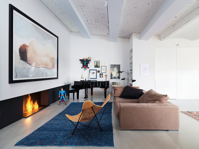
A New York couple’s Berlin pied-à-terre was redesigned as a quiet retreat with muted colors.
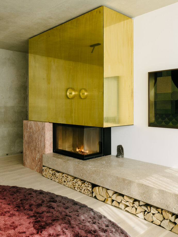
In the design, discrete volumes are in dialogue - the fireplace, the kitchen, furniture - to scale and zone the large public room. Arriving by elevator, one comes first to the kitchen, and then to the corner fireplace, designed to conceal an immobile concrete column. The kitchen cupboards, constructed of light-colored wood, blend into a single volume until the doors are opened. The living area is monochrome with vintage furniture in chartreuse and gray; the sculptured, golden side-table provides the only color accents. The extensive arrangement of large potted evergreen plants on the outside terrace extend the relaxing atmosphere past the window wall.
| Location: | Berlin, Germany |
| Year: | 2016 |
| Area: | 125 sq m |
| Scope of work: | LPH 1-9 Interior Design |
| Photography: | Jens Bösenberg |
| Partner: | Anja Knoth (Landscape) |
| Team: | Ester Bruzkus, Holger Duwe, Miriam Nicolai, Minwon Kim (for Bruzkus Batek) |
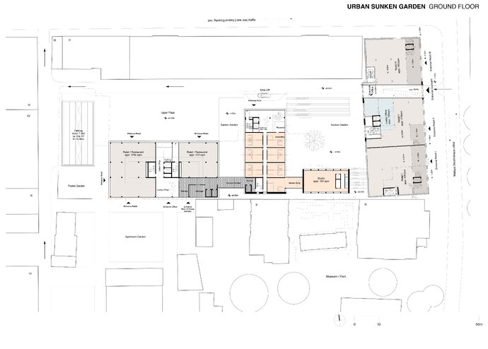
Bruzkus Batek was commissioned to add a hotel and offices to an existing industrial structure in Moscow. The strategy involved introducing a set of lowered outdoor rooms to make sunken gardens which extend access and light to lower levels of the existing building.
| Year: | 2013 |
| Scope of work: | LPH 1-3 Interior Design |
| Partner: | 2D+, Capatti Staubach (Landscape) |
| Team: | Ester Bruzkus, Patrick Batek, Lukas De Pellegrin (for Bruzkus Batek) |
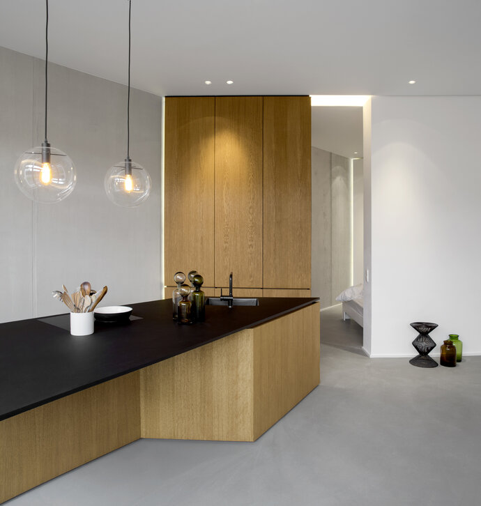
This exclusive city residence is on the ground floor of a new apartment building, completed in 2015, located in Gartenstrasse, central Berlin. An area of garden is inclusive.
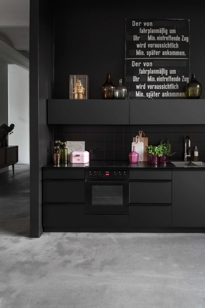
The unorthodox layout of the interior space is overseen by an angular bathroom area with dividing wall. The design unites and regulates, with three main elements combining minmalism and coordination in concert. Clever use of ceiling panels and interior lighting provide subtle divisions between the areas. There is a classic mix of light grey concrete and elegant, oiled oak for the floor, combined with a striking matt-black kitchen surface. The steep angles of the kitchen furniture offset the combination with perfect coordination, looking out onto the open dining area and dividing the sleeping quarters behind. This sleeping area is connected to the bathroom by a passage behind a sensibly designed screen wall of high quality laminate, with built-in wardrobes completing the ensemble.
The shower has a dividing wall encrusted in beautiful black mosaic tiles, accenting the area with understated style. Expert design with creative verve, has given this space, though small in area, the spacious character of a gallery.
| Location: | Berlin, Germany |
| Year: | 2016 |
| Area: | 97 sq m |
| Scope of work: | LPH 1-9 Interior Design |
| Photography: | Jens Bösenberg |
| Team: | Ester Bruzkus, Patrick Batek, Ulricke Wattenbach, Minwon Kim (for Bruzkus Batek) |
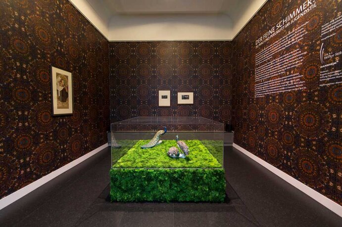
We developed a tailor-made architecture for the exhibition "The Delicate Glow", which is dedicated to beauty.
The spaces of 1907 have not been rebuilt, but associations set it up. The "Library" refers to former "Study"; The "Vanity room" is based on space of lady. For example, in entire long side of Library is covered with display shelving, which equipped with the February issue of magazine "Jugend" of 1906, the title of "pea hen“ by Leo Putz (1869-1940), and art-Nouneau font of Otto Eckmann (1865-1902).
| Location: | Mannheim, Germany |
| Year: | 2015 |
| Client: | Kunsthalle Mannheim |
| Area: | 330 sq m |
| Scope of work: | LPH 1-8 Interior Design |
| Photography: | Alina Holtmann, Laura Brechtel |
| Team: | Ester Bruzkus, Sarah Przibylla, Alina Holtmann (for Bruzkus Batek) |
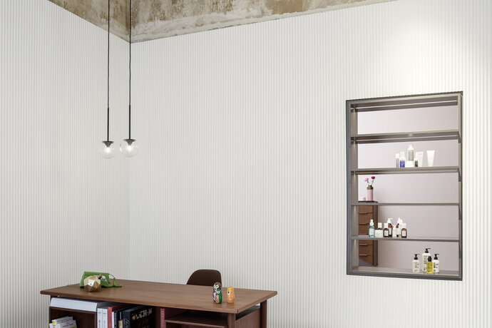
Ahmet Bilir, Stuttgart hair stylist who frequently takes part in international haute couture fashion shows, has named his new salon “BILIR SALON PRIVÉ”. The small elegant salon conjures the character of a boudoir and creates a homey, intimate atmosphere.
Three neat steps lead from the street directly into the reception and waiting area, whose walls are clad with micro-fluted white panels, bringing historical stucco to mind. The adjacent salon with its four styling chairs is seen through two openings in the dividing wall. Beneath each mirror is a red marble console table on a brass pedestal. The furnishings were designed specifically for Ahmet Bilir’s salon. The differentiated lighting concept was developed for the salon by PSLab.
The so-called “colour laboratory” is located in a separate “box”, whose walls are fully clad with Persol mirrors. Thank to the shadow gaps around the circumference, the box is perceived as an independent modern element that stands in contrast to the existing building, while simultaneously reflecting it.
| Location: | Stuttgart, Germany |
| Year: | 2015 |
| Client: | Ahmet Bilir |
| Area: | 63 sq m |
| Scope of work: | LPH 1-9 Interior Design |
| Light: | PSLab |
| Photography: | Jens Bösenberg |
| Team: | Ester Bruzkus, Patrick Batek, Anke Müller, Lisa Plücker (for Bruzkus Batek) |
A penthouse for a married couple near Ludwigkirchplatz in Berlin Wilmersdorf.
Excepting the external dimensions and the staircase and elevator core, the ground plan and design of this apartment was completely in the hands of the architects. The elevator opens directly into the apartment. The living and dining area – lit from two sides – and the kitchen, are grouped around the elevator core. There are no dividing walls here: functions merge seamlessly into each other and can, if needed, be visually separated by sliding doors. As soon as one enters the apartment, one’s eye falls on the fireplace wall with its built-in cabinets and drawers. A of Pietra gray marble bench in front of the fireplace continues over the entire width of the living and dining room and becomes a generous seating and shelf space.
An exclusive herringbone pattern oak floor runs through the entire apartment. A walnut-panelled box containing additional features such as the wardrobes, guest bathroom, library, and kitchen cabinets, encloses the elevator core. In contrast to the living area, the zone for private retreat is smaller-scale in structure. A central hallway separates the two bedrooms, each with an en-suite bathroom.
| Location: | Berlin, Germany |
| Year: | 2015 |
| Area: | 210 sq m |
| Scope of work: | LPH 1-9 Interior Design |
| Photography: | Jens Bösenberg |
| Team: | Ester Bruzkus, Ulrike Wattenbach, Zlatan Kukic |
Our office been developing the interior corporate identity for the AZIMUT Hotel chain for more than three years.
The set of standards developed by these both are adapted anew to the plans of each hotel, and integrated into any existing site conditions. The concept is reviewed for each hotel as regards design and optimization of the budget, while also asking whether quality and guests’ comfort can be raised even higher; each hotel is therefore an update and constant improvement on the original design.
Ester Bruzkus and Patrick Batek have carried their new concept for the international hotel chain AZIMUT through to the eastern terminus of the Trans-Siberian Railway, transforming the AZIMUT Vladivostok into a modern, charming 4-star hotel with a warm yet simple atmosphere.
| Location: | Vladivostok, Russia |
| Year: | 2015 |
| Client: | Azimut Hotels Company Moscow |
| Scope of work: | LPH 1-5 Interior Design |
| Photography: | Jens Bösenberg |
| Team: | Ester Bruzkus, Patrick BateK, Anke Müller, Minwon Kim (for Bruzkus Batek) |
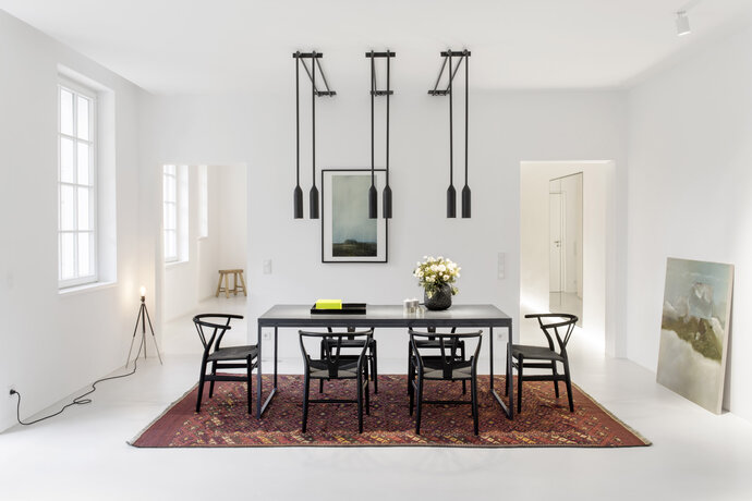
This Moscow-based couple’s second home is located on the ground floor of a classical villa in the Grunewald district of Berlin. Its doors lead directly to a generous garden.
As part of the new design, the space was first simplified to the essentials by removing all decorative surface elements such as stucco, friezes, trim and coffering — especially since these were damaged or in poor condition. The result presents clear gallery-style rooms. The atmosphere is accentuated by a minimalistic lighting concept from PSLab.
The furniture and fittings are positioned like exhibits in front of sheer white walls. A pale gray concrete floor is combined with soaped ash and nero marquina marble on the kitchen island and in the bathroom, as well as on the long built-in bench in the living room that becomes a fireplace. Between the kitchen and the entrance hall stands a “box” containing wardrobes, kitchen cupboards and a surprise power room with mirrors on all surfaces. In the kitchen, a central counter block integrates seating for breakfast with a view to the garden.
The clarity of the design is underlined by hiding all hardware and by completely avoiding the use of door handles. Even the refrigerator door opens simply via gentle pressure – and with the help of an integrated motor. A wall with two entrances divides the kitchen from the living/dining areas where a large dining table sits under special light fixtures and the living area is defined by marble on two walls.
| Location: | Berlin, Germany |
| Year: | 2014 |
| Area: | 140 sq m |
| Scope of work: | LPH 1-8 Interior Design |
| Light: | PSLab |
| Photography: | Jens Bösenberg |
| Team: | Ester Bruzkus, Patrick Batek, Holger Duwe (for Bruzkus Batek) |
Ester Bruzkus and Patrick Batek developed the new vision for the AZIMUT international chain of hotels. Remaining true to their high aspirations and to their restrained style, the architects have created a series of modern and charming three-star-plus hotels with a warm yet unpretentious atmosphere.
Azimut St. Petersburg was created in an 18-story high-rise building built in 1967 on the banks of the River Fontanka.
The new concept was implemented storey by storey, respecting the architecture of this, the first skyscraper in the city. The station-like aspect of the entrance area posed a particular challenge, but here the idea of the “living lobby” proved to be ideal, providing designated areas for sitting, working and relaxing even for large numbers of guests – in high-season up to 2000 people per day – using furniture and lighting designed by Ester Bruzkus and Patrick Batek. The highlights of the lobby are the typical Azimut gold-coloured reception block and the eye-catching signage installations that show the way to the reception, restaurant or bar.
| Location: | St. Petersburg, Russia |
| Year: | 2014 |
| Client: | Azimut Hotels Company Moscow |
| Area: | 13 000 sqm |
| Scope of work: | LPH 1-8 Interior Design |
| Photography: | Jens Bösenberg |
| Team: | Ester Bruzkus, Patrick Batek, Anke Müller, Alina Holtmann, Julia Mair, Veronika Chikova, Katja Schuster, Minwon Kim (for Bruzkus Batek) |
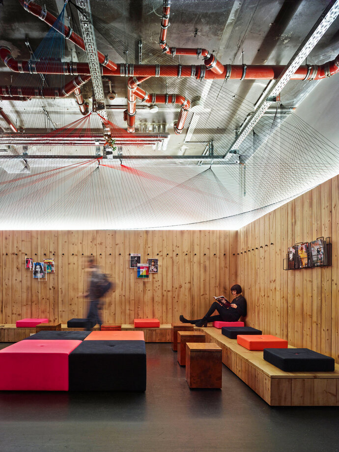
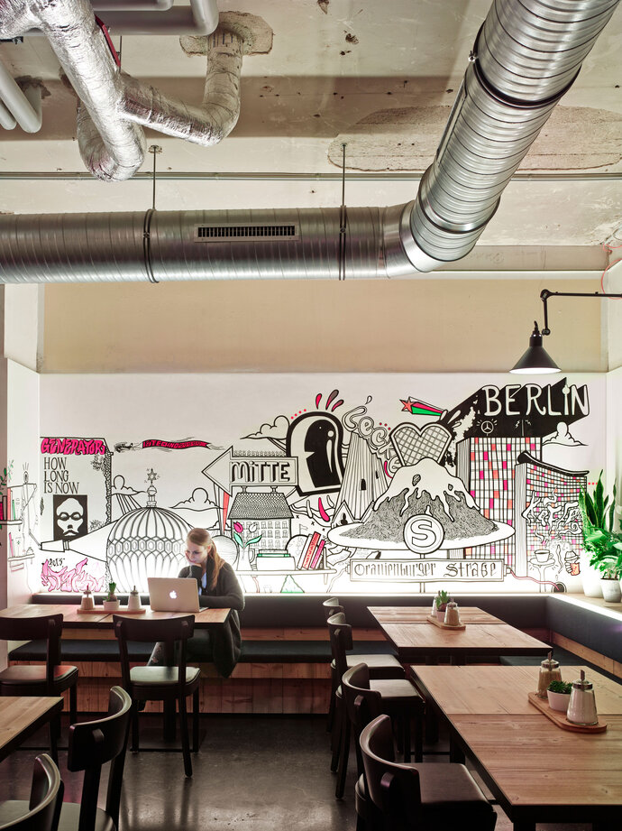
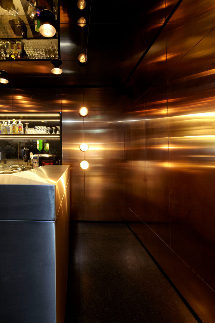
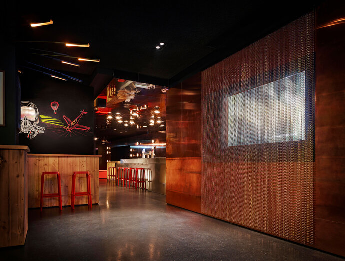
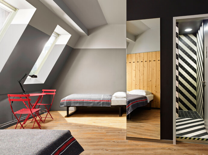
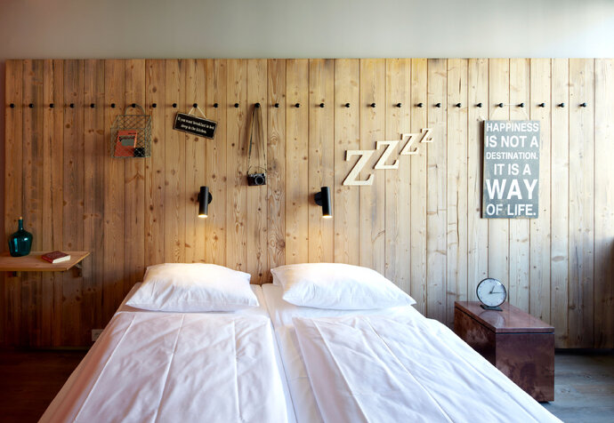
To immerse travelers in the unique character of Berlin - a city of incredible contrasts - the hostel presents a series of rooms of different material identities - through layers of art, materials and textures. Contrasts of bright and dim, rough and sleek, and old and new are playfully expressed through rough wood paneling, open ceilings, raw copper panels, pink and red textiles, black painted walls, patterned tiles, and mirrored ceilings. The work of artists is used at an architectural scale to recall Berlin’s street art scene: Thierry Noir’s work is similar to what he painted on Berlin Wall; room-sized work by Luke Embden and Sebastian Preschoux are in dialogue with exposed pipes, conduits and walls. This interior architecture represents the demanding cool attitude of youth and the contrasts that are Berlin.
| Location: | Berlin, Germany |
| Year: | 2013 |
| Client: | Patron Mitte Properties GmbH |
| Area: | 500 sq m |
| Scope of work: | LPH 1-9 Interior Design |
| Photography: | K+W Photography |
| Partner: | The Design Agency and WAF Architects |
| Team: | Ester Bruzkus, Ulrike Wattenbach, Alexandra Spiegel, Zlatan Kukic |
Like the symbiosis of Berlin Mitte – both old and new – DEAN is gray on the outside but surprisingly glamorous inside. Behind the coal-black entrance, an elegant bar shimmers beneath a shining gold ceiling. The floor is black mastic asphalt; the walls are of dark timber and mirrored slats. Guests are guided, as if on a catwalk, along the length of the black marble bar to the dance floor, past soft seating in niches clad with dark-gray velvet – a perfect place to indulge in the excellent DEAN cocktails. And while the guests move towards the music, golden lights pulse above them in sync with the beat. Behind the dance floor, the lounge with its mirror slats offers drinks in a cool, relaxed atmosphere.
| Location: | Berlin, Germany |
| Year: | 2013 |
| Client: | Amano Group |
| Area: | 255 sq m |
| Scope of work: | LPH 1-8 Interior Design |
| Photography: | Stjepan Sedlar |
| Team: | Ester Bruzkus, Patrick Batek, Ulrike Wattenbach, Zlatan Kukic |
The main focus of this design is to create a space which doesn't reflect standards features of a dental practice.
The foyer welcomes patients with a special ambience: materials such as American walnut tree, Pietra Grey marble, bronze metallic surfaces and seamless industrial floors dominate. The purist style is defined by a clear and precise spatial structure. Structural elements seem detached from the ceiling and floor by use of partially backlit shadow gaps, giving the space a sense of lightness. Translucent entrances, recessed into niches, underline the structural aspect of the wood-panelled volumes, while letting light into the reception area.
The waiting area recalls a hotel lounge with its library, marble planter and furniture - dental treatments and implants are forgotten here. In the doctor’s office, medical equipment is concealed behind handleless cabinets from white Corian, flush with backlit wall panelling. Chestnut wall cladding ensures a calming environment that makes this dentist practice quite unconventional. Under soft light, against a chestnut wall, even the dentist chair appears non-threatening.
| Location: | Berlin, Germany |
| Year: | 2013 |
| Client: | Zahnarztpraxis Leipziger 14 |
| Area: | 320 sq m |
| Scope of work: | LPH 1-7 Interior Design |
| Photography: | K+W Photography |
| Team: | Ester Bruzkus, Patrick Batek, Holger Duwe, Kerstin Günther (for Bruzkus Batek) |
The AZIMUT Ufa lies at the entrance to the Ural, in the capital city of the Republic of Baschkortostan. The concept was installed storey for storey, and openened to greet guests in 2013 with golden reception block, dark floors and lighter oak panelling welcome the incoming guests. Lighted vintage-lettered signs in different colours and sizes combine to create eye-catching installations that show the way to the reception, restaurant or bar.
In the "Living Lobby" distinctive areas defined by carpeting, bookshelves and glass walls, form zones where guests, mostly business travellers, can work or relax. In contrast to the bright atmosphere on the ground floor, the corridors are kept dark.
| Location: | Ufa, Russia |
| Year: | 2013 |
| Client: | Azimut Hotels Company Moscow |
| Scope of work: | LPH 1-8 Interior Design |
| Photography: | K+W Photography |
| Team: | Ester Bruzkus, Patrick Batek, Julia Mair, Veronika Chikova, Katja Schuster (for Bruzkus Batek) |
The design for a photographer’s Berlin loft is a convergence of the architect’s and the photographer’s vocabulary: a conversation between light, form and materials – and the opportunity to infuse black and white with color. The design strategy introduces architectural volumes of different material qualities that act in dialogue with each other: the spaces between create the settings for domestic life - or for an awesome party.
The apartment occupies a well-lit L-shaped space of a former hat factory in Berlin-Kreuzberg. The existing container was treated to maintain the feeling of its original industrial character - floors are concrete and the ceiling structure was left exposed. In between, though, a warmer palette of woods, metals and stones create a set of contrasts that define the living space.
Small rooms are treated as “boxes” that play off the industrial shell – a block of generous storage rooms is painted white – and a guest toilet, completely mirrored on its interior, is painted black. This play between black and white sets the framework for other colors and materials. A warmer wooden “box” straddles a neutral white container and becomes the main bathroom. Built-in cabinetry and furniture are treated like large masses too – the kitchen is a large block of green forest marble; the couch and piano define a living area around a stripe of stone that becomes a hearth. Carpets define zones that act as rooms within rooms.
The formal strategy takes best advantage of the overlap between the interests of the photographer and the architect: the relationship of volumes and light. Or, as Le Corbusier famously wrote in 1923: “Architecture is the masterly, correct and magnificent play of volumes brought together in light.”
| Location: | Berlin, Germany |
| Year: | 2012 |
| Area: | 165 sq m |
| Scope of work: | LPH 1-8 Interior Design |
| Photography: | Armin Zogbaum |
| Team: | Ester Bruzkus, Patrick Batek, Ulrike Wattenbach (for Bruzkus Batek) |
AZIMUT Moscow was the first project in which a new vision for a modern and fresh international chain of hotels was put into practice. Located in the gutted shell of an old textile factory from 1867, guests are welcomed by the brick ambience of the industrial revolution. As a special feature many of the rooms at Azimut Moscow are decorated with whitewashed brick walls – a tribute to the old textile factory.
| Location: | Moscow, Russia |
| Year: | 2012 |
| Client: | Azimut Hotels Company Moscow |
| Area: | 2 955 sq m |
| Scope of work: | LPH 1-5 Interior Design |
| Photography: | Patricia Parinejad, K+W Fotografie |
| Team: | Ester Bruzkus, Patrick Batek, Julia Mair, Veronika Chikova, Katja Schuster (for Bruzkus Batek) |
The interior design concept for the Amano Hotel was “mix & match.” Just as the new architecture complemented Rosenthaler Straße’s older existing buildings, the interior was conceived as the combination of harmonizing and contrasting elements. The lobby is a modern interpretation of historic grand hotels with velvet-covered furniture, antique-style carpets and panelled back-lit columns.
In the adjoining breakfast area, neon-red handmade vintage chairs and a wooden table dominate the space. The mix of styles continues in the upper floors. In the simple, pure white corridors, a purpose-made patchwork carpet of "classical" hotel patterning ensures a contemporary and refreshingly new interpretation of the grand hotel motif. The 115 standard rooms and 48 apartments are furnished using a clear, modern formal language and a restrained color scheme. A very selective use of exquisite vintage-style furniture introduces striking accents of color and continues the "mix & match" idea.
| Location: | Berlin, Germany |
| Year: | 2009 |
| Client: | R&S Hotelbetriebsgesellschaft mbH |
| Scope of work: | LPH 1-9 Interior Design |
| Photography: | Attila Hartwig, Alexander Gnädinger |
| Team: | Ester Bruzkus, Jacqueline Pehlemann |
The Lauder National Outreach Center was established to offer Jewish youth from all over the world a place to stay, and participate in workshops when visiting Berlin. Ronald Lauder made it possible through his Ronald S. Lauder Foundation. The building is located in Prenzlauer Berg and was made available by two members of the community.
This meeting and educational institution with a multifunctional space, for celebration, prayer and food, was designed by the Ester Bruzkus. A neutral colour scheme with dark brown linoleum and yellow chairs emphasizes the spaciousness of the public areas. Long built-in benches, which are placed along the walls, ensure there is plenty of space even for large groups.
| Location: | Berlin, Germany |
| Year: | 2008 |
| Client: | R.S. Lauder Foundation |
| Scope of work: | LPH 1-9 Interior Design |
| Photography: | Martin Tervoort |
| Team: | Ester Bruzkus, Jacqueline Pehlemann |

